Up next in 10

Hey everyone, my name is Mason, and welcome to FilterGrade.
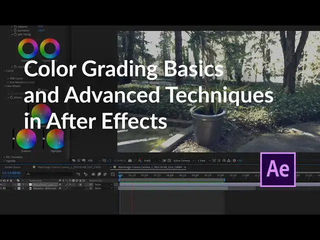
When you think about color grading, you might think of Premiere Pro or another program dedicated to color grading like Davinci Resolve. But of course, Adobe Creative Cloud programs have a lot of overlap, and today we’ll be using After Effects for our color grading.
If you already know how to color grade then this should be an easy transition for you. Color grading in After Effect uses a lot of the same tools and concepts as Premiere Pro.
In this video Mason covers:
* Basics of color grading in After Effects
* Working with LUTs and effects
* White balance and temperature adjustments
* Tone, exposure, and color adjustments
* Vignette and shadows; highlights reduction
* Using Color Wheels and adjusting the Midtones, Shadows, and Highlights
Watch After Effects Masking techniques: https://www.youtube.com/watch?v=Rpqa5ks1Qpc
Downloads and more!
Show More Show Less View Video Transcript
0:00
[Music]
0:04
hey everyone my name is Mason and
0:06
welcome to filter grade if you think of
0:09
color grading you might think of
0:10
Premiere Pro or another program
0:11
dedicated to color grading like DaVinci
0:13
Resolve but of course Adobe Creative
0:15
Cloud programs have a lot of overlap and
0:17
today we'll be using After Effects for
0:19
our color grading if you already know
0:22
how to color gray then this should be an
0:23
easy transition for you color grading in
0:25
After Effects uses a lot of the same
0:27
tools and concepts as Premiere Pro in
0:29
fact today we're going to be focusing on
0:32
the luma tree color effect to apply
0:35
color grading to our footage this is
0:37
something that exists in Premiere Pro
0:38
and is an awesome addition to Adobe
0:40
software if you're just getting into
0:43
color grading this is a perfect place to
0:45
start and again like most Adobe programs
0:48
there are a lot of different ways to
0:50
approach this the approach in this video
0:52
is not the be-all end-all and it's
0:54
certainly not the only way but I think
0:56
it's a great start and this should give
0:57
you some basic knowledge you need to get
0:59
better at color grading so we're gonna
1:02
start with a little clip from an indoor
1:07
shoot that was relatively well lit but
1:09
this camera did not absorb the light
1:12
very well however there's a lot we can
1:14
do to color correct it so we're gonna
1:16
drag in this footage and then we're
1:17
going to right click on our timeline go
1:20
to new adjustment layer this way we can
1:23
be as non-destructive as possible to our
1:25
original footage and we can see a before
1:28
and after so we're going to search our
1:32
effects and presets for lumetri color
1:33
and drag that on to our adjustment layer
1:36
then we'll see all these options on the
1:38
side here go and open up basic
1:40
correction first the very first thing
1:43
that we see here is input LUT and input
1:46
Lutz generally don't look very good but
1:50
there's a variety of different things
1:51
you can do and maybe it's a look you're
1:54
looking for in this case none of these
1:56
look very good so the first thing we're
1:58
gonna do here is white balance this is a
2:01
great tool that you can use to
2:03
automatically white balance your scene
2:05
if out of camera doesn't look very good
2:07
there's temperature and tint which you
2:09
can adjust yourself but to make it easy
2:11
you can grab the eyedropper and click on
2:13
thing light in your scene and that'll
2:14
balance it out I'm going to undo that
2:18
and then bring up the exposure so we can
2:20
kind of see more what's going on here
2:21
you can see that the scene is a little
2:23
orangish so if we grab the eyedropper
2:25
and click on the white wall we see that
2:28
it gets a little more blue takes out
2:30
some of that red that's a little too
2:33
much so I'm going to go maybe here or
2:37
maybe about here I think right there is
2:43
good so it's a little more blue as we
2:45
can see it turned the tint up more into
2:47
the magenta and turn the temperature
2:48
down more into the Blues that's a good
2:50
starting point so that brings me to
2:53
exposure which is the first thing you're
2:54
gonna want to do I'm putting this back
2:55
to zero we can see this is way too dark
2:58
we need to brighten this up a lot so
2:59
we're gonna bump up the exposure don't
3:01
be afraid to bump it up so far that it
3:04
over exposes things because we can we
3:07
can mess with some of that later so we
3:10
can bring that up a little bit and to
3:12
get rid of some of these overexposed
3:13
parts we're actually going to mess with
3:15
the highlights so I'm gonna start by
3:16
dragging those all the way down that
3:18
looks a little weird may bring it back
3:20
up a little bit
3:21
find a good balance it might need to
3:23
lower our exposure in this case and that
3:30
looks pretty good
3:31
you want to make sure the blown out
3:32
parts aren't too blown out but you also
3:34
want to make sure your footage still
3:35
looks natural
3:38
now take let's take a look at what
3:40
contrast does if we bring down our
3:42
contrast then it makes everything kind
3:45
of gray we bring it up there's a stark
3:46
difference between black and white in
3:50
this case it looks pretty good at zero
3:51
we might want to bring it up just a
3:53
little bit hide some of that artifacting
3:56
from bringing up the exposure I think
4:04
actually now that I'm looking at this
4:05
I'm actually going to change the white
4:06
balance to make the temperature a little
4:08
cooler again it's becoming a little a
4:10
little bit too read and then shadows in
4:15
this case I don't think we're gonna want
4:16
to mess with much if we drag them up
4:17
that'll increase and brighten up the
4:19
shadows and bring it down and make the
4:21
shadows darker in this case
4:24
okay we'll bring them up a little bit
4:26
but really they're pretty good where
4:28
they are actually yeah let's just set
4:31
them at zero White's will change the
4:34
intensity of whites so if we drag it up
4:36
that'll make all the white spots even
4:38
brighter in this case we're we can't
4:41
drag them down too much because that
4:42
makes the scene a little bit darker so
4:46
we're gonna leave those at zero as well
4:47
the main thing that shot Nina was
4:48
exposure and the blacks would the same
4:50
thing with the blacks it's quite a
4:52
dramatic effect so we're just gonna
4:55
leave that where it is and then
4:57
saturation of course increases the
5:00
saturation of colors I might want to
5:04
bring this down a little bit in this
5:05
case just because some of those skin
5:08
tones are pretty crazy but overall it's
5:11
not bad and now quickly the before and
5:15
after it's a much better shot and now we
5:21
can see all the lighting that was
5:22
actually in the scene ended up having a
5:25
good effect once we can actually color
5:26
correct it it's a few other things you
5:30
can do
5:31
going into the creative tab there's
5:32
things like faded film that sort of do a
5:36
similar thing to if we upped the blacks
5:40
there's just some certain effects you
5:42
may or may not want to achieve
5:43
sharpening can help a lot you don't want
5:47
to overdo it because that looks weird
5:49
and like a painting but if we just up
5:50
our sharpening a little bit sometimes
5:54
that can make our subject pop a little
5:56
bit more set that around 20 that makes
6:01
the subject here pop quite a bit more
6:03
than the before and here's that at zero
6:06
again and 20
6:12
here we have more things like saturation
6:14
and vibrance so vibrance work similar to
6:17
saturation but it boosts the colors that
6:19
are not saturated first and then we have
6:22
the more complex things like curves
6:24
we're not going to be using curves today
6:26
but if you wanted to adjust curves you
6:28
could change things like shadows
6:29
highlights and mid-tones as well as the
6:31
same thing for every color with these
6:33
curves so there are a lot of options and
6:36
you can do the same with all the colors
6:38
but again that's similar to some of the
6:41
things we're doing up here especially in
6:42
terms of exposure and shadows so really
6:46
whatever you're comfortable with if you
6:47
have prior experience color grading you
6:49
may want to use some of those things and
6:51
then of course if you want to get very
6:53
creative you can go into color wheels
6:54
and change the actual colors of shadows
6:56
mid-tones and highlights directly here
6:58
so in this case that's not something
7:00
that we want to do but let's say we want
7:01
to make those highlights green then we
7:06
would get this image here which is
7:09
obviously not what we want but if you do
7:12
it in subtle ways like the classic teal
7:14
and orange you know we make our make our
7:18
shadows a subtle teal and make our
7:22
mid-tones a subtle orange and that
7:29
accomplishes a very popular filmic look
7:38
so there's a lot you can do to customize
7:40
exactly what you're going for so feel
7:45
free to definitely play around with all
7:47
of these things because there's a lot of
7:48
options and you might stumble upon
7:50
something that you like some things to
7:52
avoid you got to make sure that you
7:55
understand your knowledge level with
7:57
color grading it takes a long time to
7:59
figure out how to color grade well and
8:01
to get an eye for it in this case I
8:04
don't think that this looks good with
8:06
all of these changes we just made so of
8:08
course I'm gonna set that back to where
8:09
it looks a lot better and more natural
8:11
you know it takes a long time to figure
8:14
out what looks natural
8:16
in general the human eye and human brain
8:18
are pretty good at understanding what a
8:20
natural skin tone looks like as well as
8:22
things like grass and sky those are
8:24
things that we know well and can tell if
8:25
they're color graded oddly but still
8:28
with that in mind it can still be hard
8:30
to figure out what looks unnatural
8:31
sometimes you need to take a step back
8:33
because you can end up taking it too far
8:36
so with some of these lessons in mind
8:38
that we've looked at let's go ahead and
8:39
take a look at some other clips so
8:42
here's another quick clip we can look at
8:44
that is decently exposed but we can see
8:47
in the background there's quite a bit of
8:49
bright overexposed light so let's go
8:52
ahead and see what we can do with this
8:54
so we're gonna go to make an adjustment
8:55
layer and then we're going to drag luma
9:00
tree color onto that adjustment layer
9:02
now the first thing that I want to do
9:05
here is of course look the white balance
9:07
there's nice lines here so that can I
9:10
can show the white balance but overall
9:13
it seems like a pretty well-balanced
9:16
scene even if I go to some of these
9:18
other whites it's a it overall is pretty
9:21
good so see I'm gonna say that's pretty
9:25
good so the first thing I might want to
9:27
do here is go into the highlights turn
9:30
them away down now all the way down
9:32
doesn't look good but if I turn them
9:35
just you know that's all the way up as
9:37
all the way down so if we turn them down
9:39
most of the way if that helps a lot
9:44
and then we can adjust the whites so
9:49
it's still bright enough overall
9:50
exposure is good I don't think we need
9:52
to mess with that
9:52
but contrast contrast maybe down a
9:56
little bit but doesn't make too much of
9:58
a difference shadows we might want to
10:02
increase to sort of increase that
10:04
contrast and then blacks I think blacks
10:10
in this case it really depends on what
10:11
you're going for I think they look good
10:12
both all the way down and all the way up
10:15
in this case I think I'm gonna bring
10:16
them up a little bit give more of a gray
10:19
tone and then increase the vibrance a
10:25
little bit to give this green a lot more
10:27
pop at zero this green really doesn't
10:30
look like much we're going to increase
10:32
that a little bit now let's watch the
10:35
footage back yeah it looks a lot more
10:37
lush a lot better now let's take a look
10:40
at those color wheels again and I think
10:43
there's some opportunity to mess with
10:44
them here so let's go to our mid-tones
10:48
which is a good chunk of our footage
10:51
let's try to give that a different look
10:53
so you know we have this green look but
10:55
let's say we want to let's say we want
10:57
to give it a cold look you know maybe
10:58
it's early in the morning it's a little
11:01
chilly out still so we want that green
11:04
in there but we also want a fair bit of
11:06
blue so we can change the highlights
11:08
over to blue we want to be subtle here
11:15
mid-tones can be we don't want them to
11:20
be blue also because then we get very
11:21
much a blue tone so we can make those
11:24
ever so slightly green yellow to kind of
11:28
counterbalance that and then the shadows
11:30
that's something that can definitely be
11:33
blue as well we want that to be very
11:37
subtle in this case the highlights
11:41
really add a lot of the blue in this
11:44
case and it helps take away some of that
11:46
yellow light and the yellow fringing
11:48
around the trees so here's before and
11:51
here's after
11:55
they'll get a much cooler looking scene
11:58
but also more lush at the same time so
12:01
now this kind of shows how you can
12:03
really use these three color wheels to
12:05
play around a lot and fundamentally
12:07
change your footage and looking at the
12:09
original footage this is very warm very
12:11
neutral colored which is a great
12:14
starting point for color grading and now
12:17
here we can see that we've accomplished
12:19
something that's much more pleasing to
12:20
the eyes in general another thing that
12:23
we can do here is a vignette and the
12:26
first option on vignette is a mount if
12:29
we drag that up we get a white vignette
12:32
if we drag it back we get a black one so
12:36
if we drag that all the way to the left
12:38
then that gives us this nice little
12:40
focus
12:41
you know we have some vignette around
12:43
the edge and they just focus more on our
12:44
subject this can be very useful in some
12:47
cases you know it's a stylistic choice
12:49
you can also change the feather to
12:51
change how intense it is obviously
12:53
you'll never want to do this but you can
12:55
make it more intense by decreasing the
12:57
feather I think something like that
13:00
looks good so yeah you can adjust that
13:08
as you see fit but it definitely adds a
13:10
lot more focus keeps the eyes away from
13:12
those corners makes you focus in on
13:14
what's going on at the center of frame
13:16
now lastly let's look at this interior
13:19
shot similar to the first shot we're
13:21
looking at but this one's a little
13:23
better exposed right out of the gate and
13:24
it's only light sources are some light
13:29
shining from outside and some overhead
13:31
light whereas the previous one was only
13:34
you know fluorescent lights on the
13:36
ceiling and then some artificial light
13:38
from soft boxes and things so this is
13:41
all natural no photography lights here
13:43
let's go and add our adjustment layer so
13:48
we're gonna go grab our loom entry color
13:50
and we're gonna go to basic correction
13:53
the first thing we're gonna do is the
13:54
white balance selector this is gonna
13:55
make a big difference in this shot
13:56
because you can see this wall it seems
13:58
like it's supposed to be white or maybe
14:00
off-white and this whole scene is very
14:02
warm and yellow so if we do our white
14:04
balance over here
14:06
look how much that fixes this shot I
14:09
think that in this case the white
14:11
balance makes this shot
14:12
look infinitely better so we've really
14:15
cooled down the temperature and then
14:16
made it a little more magenta exposure
14:19
it's pretty good we're gonna bring it up
14:21
a little bit not so much they blow out
14:24
that wall but just like two or three
14:26
ought to do it and overall I'm pretty
14:30
happy with this shot this walls a little
14:31
blown out so we're going to take the
14:32
highlights and drag them down a bit so
14:35
it looks more natural I think that looks
14:37
pretty good and really there's not a lot
14:39
that we need to do here and bring down
14:42
the blacks just a little bit just barely
14:46
because if we have it at zero
14:48
you know this door is pretty detailed
14:50
but what if we want to put that more in
14:52
shadow something like that I think we
14:55
can darken the shadows here and then we
14:58
can decrease the blacks to get a more
15:00
pure black so in this case I'm doing
15:03
this we can barely see that line on the
15:04
elevator but I also want to make sure we
15:08
have enough light in this corner that we
15:11
can still see the plant and everything
15:12
that's going on over there so bring up
15:17
the exposure and bring down the
15:18
highlights a little bit more drag down
15:22
the whites slightly and now I'm actually
15:25
feeling like the color temperature is a
15:26
little too warm again so I'm gonna drag
15:31
it down a little bit it's a little
15:36
better let's go into the color wheels I
15:38
want my shadows to not be so yellow I
15:41
want them to be more blue toned I think
15:46
that yellow looks pretty gross you know
15:48
it's an office scene a lot of the lights
15:49
kind of make it make everything look
15:51
yellow so I want to turn that on turn
15:54
that blue not green but blue
15:59
and mid-tones since this wall is orange
16:02
I kind of want to go for an orange town
16:04
opposite of the blue again I don't want
16:08
those shadows to turn green like
16:11
something like that looks pretty good
16:12
and then four highlights yeah I'm not
16:18
sure let's kind of mess around with that
16:19
I think something in the red area would
16:22
look pretty good but really we don't
16:24
want to do too much with the highlights
16:27
here maybe just some light blue if that
16:31
wall a little bit more of a blue tone it
16:36
looks pretty solid so here's the after
16:43
and here's the before a little too blue
16:46
now I think that looks pretty good so we
16:49
had a very kind of dark shot you know
16:53
not a lot of light in pretty yellow
16:55
pretty warm and now we have something
16:57
that's a little more neutral almost on
16:59
the cool side doesn't look as badly like
17:03
it's a lot lit with fluorescent light
17:05
and a big thing is that you know some of
17:09
the details we've either captured or or
17:11
hidden so that elevator not important so
17:14
we've kind of darkened it up in that
17:16
corner is a little mysterious a little
17:20
higher contrast but it just looks like a
17:23
much more neutral scene let's go ahead
17:25
and go into creative again let's try to
17:27
sharpen this up a little bit that can
17:31
sometimes help we don't have a clear
17:32
subject in here but sharpening will help
17:35
us a little bit and then
17:39
looks like we're good without vibrance
17:41
and then a little bit of faded film and
17:45
give us a little more of a vintage look
17:47
but it's not too too important in this
17:50
case we don't want to you can see the
17:52
blacks are already kind of struggling
17:54
here on the elevator so I might turn
17:57
both those down a little bit
17:58
just give it a subtle look and I think I
18:00
think we're done looks a lot better so
18:04
thank you all for watching this tutorial
18:05
on color grading in After Effects the
18:08
Lindt recolor panel and After Effects is
18:10
exactly the same as it is in something
18:12
like Premiere Pro so feel free to learn
18:14
whatever software you want but you may
18:16
find that you're spending spending a lot
18:18
of time in After Effects and that you
18:20
want to learn how to color grade in it
18:22
as well let us know your questions or
18:25
comments down below let us know if you
18:28
want to make any further videos on color
18:30
grading or on After Effects and we'll be
18:32
sure to do so thanks for watching and
18:34
we'll see you in the next one if you
18:37
enjoyed this video be sure to LIKE and
18:39
subscribe and leave a comment down below
18:40
and if you're looking for professional
18:42
Luntz lightroom desktop and mobile
18:44
presets Premiere Pro templates and more
18:46
photo and video education visit filter
18:48
grade comm today
18:49
[Music]