Up next in 10

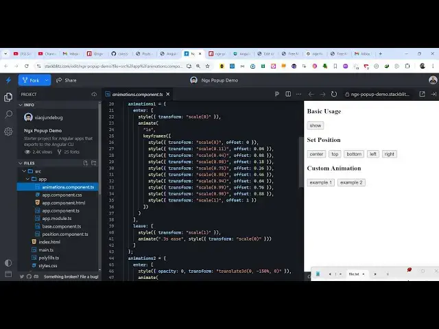
Angular ngx-popper Example to Create Tooltip & Popup Menu on Hover of HTML Elements in Browser
Jan 30, 2025
Get the full source code of application here:
https://codingshiksha.com/angular/angular-ngx-popper-example-to-create-tooltip-popup-menu-on-hover-of-html-elements-in-browser/
Hi Join the official discord server to resolve doubts here:
https://discord.gg/cRnjhk6nzW
Visit my Online Free Media Tool Website
https://freemediatools.com/
Buy Premium Scripts and Apps Here:
https://procodestore.com/
Show More Show Less View Video Transcript
0:00
uh hello guys welcome to this video so
0:02
in this video I will show you a angular
0:05
package which allows you to show this
0:08
popup nice little tool tip Windows when
0:11
you hover onto any HTML element so let's
0:14
suppose if you have a long page and you
0:17
want to bind a on Hover tool tip windows
0:21
so as I hover onto this
0:22
[Music]
0:25
element you will see this window will
0:28
show side by side explaining about this
0:32
you can do integrate this inside your
0:34
application so whenever user comes to
0:36
this element just clicks on it and this
0:39
tool tip window will show and you can
0:42
control this position color
0:44
everything so you have seen these
0:46
windows appearing whenever you hover on
0:48
click on individual element so they
0:52
explain you what this actually does it's
0:55
a nice little side by side window which
0:57
shows more information about this object
0:59
it can be anything it can be image textt
1:02
but the Prime Focus is that we show this
1:04
window side by side to that element so
1:06
that the user clearly understand what
1:08
this topic is all about so in this way
1:11
you can show this windows so there is a
1:13
package here in angular which allows you
1:15
to show these windows so the package
1:18
name is
1:19
ngx poer so if you go to npmjs.com and
1:23
just search for this package ngx p o p e
1:27
r so this is actually the name of the
1:31
package uh the name the command is very
1:34
simple uh this is actually the command
1:36
I've already installed this and it's
1:39
almost having 3,000 weekly downloads so
1:42
you can go to my website where I have
1:44
written a step bystep detail blog post
1:46
on how to use this so the very first
1:49
thing we need to do we need to go to
1:51
this app. module. TS file of your
1:54
angular
1:55
project and here we need to add the
1:57
import statement so we simply say import
2:01
ngx proper module and we need this will
2:05
be coming from this package ngx poer so
2:09
we simply import this package here at
2:12
the top and then we go to the Imports
2:15
array and simply add this line right
2:17
here so this is just the configuration
2:19
process which is required for this
2:21
module and now you can close this file
2:23
and start using this and then now to use
2:26
this you come to your template file app.
2:29
component HTML file and right here
2:32
wherever you need to display
2:36
it you come to it and
2:39
just so let me display it in this div
2:42
tag
2:44
so so we need to
2:48
give so this we are giving this class
2:55
here this is just a custom CSS class
2:58
that I have given here pop up
3:01
placeholder and then after that we need
3:03
to give this attribute here which is p o
3:06
p r poer and this will be the tool tip
3:12
content window so we are directly
3:14
attaching this property
3:17
here and then it actually contains more
3:20
properties about the positioning and the
3:22
background color of the window so here
3:24
using these options you can directly
3:26
control it where it appears what is the
3:30
trigger here so once someone clicks it
3:34
then only it will show this
3:40
window and then after that inside this
3:43
you actually display whatever that you
3:45
want to display in this window so in
3:48
this case we are displaying a simple
3:50
paragraph which is you can see
3:53
that's and we have multiple paragraphs
3:56
right here
3:59
so now this is actually the element here
4:02
and as soon as I click this element this
4:05
window will side by side show so the
4:08
trigger is click here you can even
4:10
change this to
4:12
hover so now the user will as soon as
4:15
they hover onto this the window will
4:16
show they did not have to click the
4:19
element right here so as they hover as
4:22
the place their Mouse on that element
4:25
the window
4:26
will automatically show so this you can
4:30
control it and here you can change the
4:33
position to bottom here so now the
4:35
window will show at the bottom position
4:37
not the top position so you can even say
4:41
right so now the window will show right
4:43
here or
4:46
left so in this way you can control all
4:50
these parameters and whatever is your
4:53
you will give this tool tip content
4:55
right here
4:59
you can even show images as well
5:01
alongside with text as well so in this
5:03
way this is actually the
5:06
module where you can show these tool tip
5:09
Windows using this package ngx poer so
5:12
thank you very much for watching this
5:14
video and also check out my website as
5:17
well free mediat tools.com uh which
5:19
contains thousands of tools regarding
5:21
audio video and image and I will be
5:24
seeing you guys in the next video