Up next in 10

Power BI - Table styles
Watch more Videos at https://www.tutorialspoint.com/videotutorials/index.htm
Lecture By: Mr. Akshay Magre, Tutorials Point India Private Limited
Show More Show Less View Video Transcript
0:00
Hello, friends and welcome
0:02
Now in our previous video we have already seen that how to create tables and metrics, right
0:08
Now in this video I'm going to show you how to give the table styles and what are the different
0:13
table styles that are available with PowerBi. Now once you have created the table, you simply have to go under the format section
0:21
and under that format section you can have the bunch of options which you can choose from
0:26
where you can give the background color, change the text, text alignment change the text size change the text font as well and create a better table
0:36
style in such a way that it looks appealing for the people or to the user who will be viewing
0:42
that particular report so let's go ahead and see how to give different kind of table styles
0:47
in our practical approach hello friends and welcome in this video we are going to see what
0:54
are the different table styles are there in power bi and how to apply them to a particular
0:59
table projection all right so we will quickly go ahead and see how it is done
1:04
now for the same reason what I've done I have pulled out the same report that
1:09
we have pulled out for our previous video that is while creating a table
1:14
right so while creating this particular table format I have used the same
1:18
example in which I'll be having different categories segment manufacturer and its revenue all right now as we have already created the table let's quickly
1:27
go ahead and see how the formatting does take place all right in order to do the
1:33
formatting I have to move to the format pane out here and simply click on it now
1:38
under this format pane you can see the bunch of options that are available with us
1:43
now let me tell you quickly that how it is done and now I will start off with
1:47
this value section the reason being I would like to see the values inside this
1:53
particular table in a certain font let's say it should be not
1:57
that big or it should be not that small and how I decided I have simply have to go
2:03
under this value drop-down menu and select the text size of this particular text
2:09
so if I increase it it will give a bigger text right and if I decrease it it will give me a text of my font right So let keep it till 12 so that it is visible for everyone
2:22
All right. Also, we can go ahead and increase the column header size as well so that it matches up with the value size
2:30
So in order to do that, I will go under the column headers. And under the column headers, you can see there is an option to increase the text size
2:38
we will make this dwell as well alright there is various other option in which I can
2:44
select the background of the column headers the font of the ball column headers with
2:51
the help of this drop-down menu under the column header section so let's say
2:54
that I will give it a format let's say a light yellowish format at the behind
2:58
right so this is giving me a light yellowish background at the column headers also if
3:04
I wish to change the text of font colors I can take it
3:08
change it from here but the black and yellow combination looks good as of now so I
3:12
will not change it I'll keep it as simple as I can alright now there is something
3:17
called as table style with the help of which I can also change the color of the
3:22
table with a different color combination right if I would like to check that I
3:27
will simply click on this table style drop-down menu and under this I have style
3:32
as of now it is default which means there is no heavy formatting given to this
3:38
set of entries all right so in order to change this particular style I will
3:43
simply click on this drop-down menu and which I will be seeing a bunch of
3:47
option which I can select ROM so if I select minimal it sarà it will
3:52
showing them as minimum bare barely minimum any formatting being applied out
3:57
here so that's the what about minimal what it does if I move on with the next
4:03
one that is bold headers it will give you headers in a bold category and it is
4:08
giving a background color as black by default. I can also change this colors if I go under the column header common and if you see as of now
4:17
the background color is black and the font color is white, I can simply change from here
4:22
as well and change the background color according to my own need So it not necessarily that the style that you give out here and the color combination that is present out here will be constant no we can definitely change it by hovering around the different
4:37
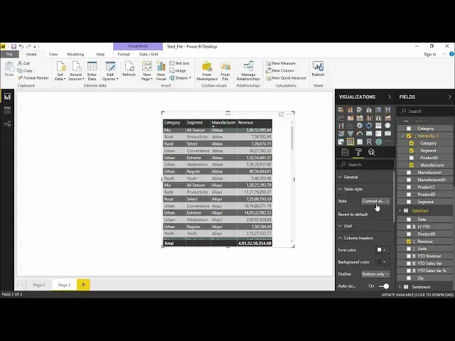
styles that we are going to apply all right quickly I'll go to showing you
4:42
contrasting alternate rows so I have contrast alternate rows a little bit flashy all right if I click on this drop-down menu and
4:53
Klikon Sparse so basically I'm getting a normal layout report layout with a darker
5:00
column header and the total header right so this is how you can change the styles that
5:05
we are having at us in the table style drop down menu all right you can also
5:11
select different we can also apply different kind of conditional formatting to this
5:17
particular data set by just going under this fields pane and under this field
5:22
I see something called as revenue if I click on the drop down of the revenue you see
5:28
there's an option call as conditional formatting so we can set a certain condition
5:33
upon upon what color that they are carrying upon what values they are having
5:38
let's start off with the background color scales and see what it does so I say
5:43
background color scales so it should be based on the revenue value color by the
5:48
rules if you apply the rule and it the colors is being being applied it will only
5:52
show the color and not the values inside it. I would also like to see the value so
5:57
that's the reason I kept it unchecked. Now out here it is starting from the bare
6:02
minimum so the minimum value will be represented by the color pinkish and the maximum
6:08
value will be represented by this blue color. Now there is an option of diverging
6:14
as well now see what happens if I click on this checkbox for diverging the moment I
6:18
click on this divergent box you can see a center is also being added so that
6:22
that I can get three varieties of color that is pinkish blue yellow I'm sorry and blue
6:29
right so I can determine that which value should be the which value should be in
6:36
yellowish which value should be in lowest and which value should be in highest I can also mention it by the number by mentioning the number selecting the drop menu for the number and select giving the value let say 1 or 10 or 1 lakh depending on what is your
6:53
data set is talking about right so we can be specific whether which number is
6:58
representing which color or we can directly go on this drop-down menu and select
7:02
highest value so it gives you the color accordingly. The moment I hit okay now you can
7:07
see there is a change color in the revenue drop-down revenue column right so you out here you can
7:13
simply see that for the minimum it is a little orangeish though for the for the
7:19
made that is the middle one it is orangeish for the minimum it is pinkish and if we
7:26
have yes the green one which is the most highest that is when I'd sell manufacturer
7:32
has given the maximum amount of revenue in this particular segment and category
7:38
Alright, so this is how you can apply conditional formatting in various range. I click on this drop-down menu go to conditional formatting again
7:44
There is something called as data bars as well there's something called as font color scales as well
7:50
Let me quickly show you what does this data bars is doing so I will simply click on this data bars
7:55
It is showing the lowest value would be a And lowest value to the highest value. Lowest value will be in the
8:02
Positive bar that will be in blue and the negative bar will be in red and this will be my axis
8:08
okay let's sit okay now you can see the data bars are being applied to some of the
8:13
section right so it is picking up the highest range and comparing it with the
8:17
every value in this particular column so it will automatically put out the highest
8:23
that is the maximum from this range and in compared to that maximum value how the
8:28
rest of this records or rest of the entries are giving me the performance right
8:34
so this is how you can introduce data bars you can apply conditional
8:38
formatting and make your table as attractive as can as beautiful as you can so that it looks very much appealing to the user who are using it all right guys so this is how you can apply different kind of styles to your table and that's what we have learned in this video
8:54
So hopefully you guys like this video see you until next time
#Business & Productivity Software