Up next in 10



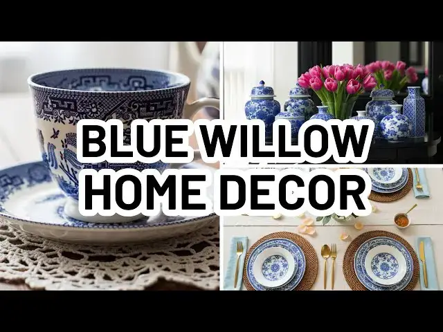
Bring timeless charm into your home with the classic beauty of Blue Willow decor. In this video, I’ll share stunning ways to style Blue Willow china, accent pieces, and accessories so they feel fresh, elegant, and perfect for today’s homes. Whether you’re a collector or just love the crisp blue-and-white color palette, you’ll find inspiration for every room.
✨ Related Blog Post: https://diannedecor.com/blog/advice-tips/styles-decor/blue-willow-decor/
| LINKS |*
GALT 14in Chinoiserie Ginger Jar - https://sovrn.co/4vbfhi1
Porcelain Ginger Jar with Chinoiserie Design, Brown, 7" - https://sovrn.co/4fbbvr4
Chinoiserie Scene Tissue Box, Brown - https://sovrn.co/xg911me
#BlueWillow #HomeDecor #BlueAndWhiteDecor #chinoiserie #DecoratingTips #InteriorDesign
*Disclaimer: Some links in this description are affiliate links. I may receive a commission if you make a purchase through my links.
Show More Show Less View Video Transcript
0:03
Hi, it's Lindsay Diane from
0:05
dianecor.com.
0:06
In this video, we're going to talk all
0:08
about the blue willow decor trend. What
0:11
is it? Where did it come from? And how
0:14
to style it in your home. Let's get
0:16
started. Blue willow decor is inspired
0:20
by the blue willow china pattern that
0:23
first became popular in England in the
0:25
1700s.
0:27
Now, this features a classic blue and
0:30
white color scheme with intricate scenes
0:34
of pagotas and willow trees and birds
0:39
and flowers. It is a classic example of
0:44
western shininoasery design. In recent
0:48
years, the blue willow pattern has made
0:50
a major comeback, but it's not just in
0:54
dinner wear anymore. It's also in other
0:57
home decor items. Now, this is not the
1:00
first time that it has been popular.
1:03
Shinwaserie as a style was popularized
1:08
long ago, and this is where we
1:10
originally saw these
1:13
jewel toned colors mixed with metallics.
1:17
So, blue and white was a classic
1:19
combination, but we also saw a rich like
1:22
jade green and white. You see a brown
1:25
and white as well. There are different
1:27
color patterns available for shinasery
1:31
and different motif or scene patterns
1:34
also available outside of blue willow.
1:37
But nowadays the term blue willow is
1:40
being used as a catchall for sheenery.
1:44
So let's jump into what exactly
1:47
shinaserie is so that you can find it
1:50
other places without sort of pigeon
1:53
holing yourself to blue willow.
1:55
Shininoaseri is a European
1:57
interpretation of Chinese and East Asian
2:00
design. And this gained popularity
2:03
around the 17th and 18th centuries. And
2:06
it often included elements like stylized
2:09
landscapes, mythical creatures, pagotas
2:12
and pavilions, ornate flowers, birds and
2:15
butterflies, and of course, willow
2:18
trees. Originally, it was found in
2:21
wallpaper, porcelain, furniture, and
2:25
even linens, and it was used in both a
2:29
classic traditional style as well as in
2:32
a more whimsical and eclectic style. And
2:35
while its roots are historic, today's
2:37
shinaseri decor can feel surprisingly
2:39
modern when it's styled correctly. So,
2:42
let's talk about how to style
2:43
shininoaserie decor. Number one is to
2:47
stick with your color palette. This is a
2:51
very busy, bold, in-your-face pattern.
2:54
And it's best to show it as a unified
2:58
collection. And a part of creating that
3:01
unity is to stick with a color palette.
3:04
So the classic like the blue willow is
3:08
blue and white, but there are other
3:10
colors available as well. You can find
3:13
pink and white. You can find soft
3:18
yellows. You can find greens and even
3:21
brown and tan and white patterns as
3:24
well. The key to using these highly
3:27
patterned pieces in your home is to
3:31
ground it with some neutrals so that you
3:34
don't have these elements competing for
3:37
attention all over your space. that will
3:40
create a lot of visual busyiness that is
3:43
just really not pleasing to the eye.
3:45
Instead, you want to make sure that
3:47
these very busy high contrast patterns
3:50
are balanced out with some neutrals. So,
3:53
for example, if you want to go with a
3:57
set of, you know, blue and white
4:00
shinasery vases that are on your
4:03
entryway table, make sure that you have
4:06
a more neutral table. Let it be all
4:09
white or an all wood tone or an all
4:11
metallic as opposed to it being a marble
4:16
topped piece that has lots of swirling
4:19
and veining of other colors mixed into
4:21
it as well. Those two items would be
4:24
competing against one another. So
4:26
instead, you want to go for something
4:27
that's a little more neutral. Whether
4:28
it's a just neutral wood tone stain or
4:32
it's a solid color, go for something
4:35
that's a little bit more neutral to pair
4:37
with your shinasery pieces. Number two
4:40
is to choose your placement carefully or
4:42
to choose the right canvases. You want
4:45
this to be a statement spotlight as
4:49
opposed to a full-on backdrop in your
4:52
home because it can be again too busy.
4:55
So, for instance, a wallpaper with a
4:59
sheen washery pattern plastered on all
5:02
four walls is going to be incredibly
5:05
busy to look at. It's just going to be
5:07
overpowering. Instead, you'd want to
5:10
stick to, you know, one or two statement
5:13
areas. So, you could do an accent wall
5:16
or you could do a um use it as the back
5:22
panel of a bookcase or something like
5:24
that. Use it sparingly in your space so
5:28
that it doesn't overpower everything
5:30
else that's going on there. So, think
5:32
about one or two statement areas where
5:34
you want to incorporate it in a space
5:35
and leave it at that. Some ideas are a
5:38
shininoasery panel or a framed mural in
5:41
an entryway, a pair of ginger jars on
5:44
your mantle, or blue willow dishes that
5:47
are displayed on some open shelving or
5:50
glass front cabinet. By being
5:52
intentional about where you place
5:54
shininoas, you can create impact without
5:57
overwhelming your space. And number
5:59
three is balance. Make sure that you
6:02
leave breathing room when it comes to
6:04
this pattern. Shinwaserie is intricate
6:07
and detailed and it shines best when
6:11
it's given some space to do so. So, like
6:14
we said, we don't want to let it compete
6:16
with other things. This is why we would
6:19
place it in a neutral space. Let it be
6:21
the spotlight. Let it be the focal point
6:24
of wherever you're placing it. So if you
6:27
are placing it on a you know on a
6:30
console table let it be the focal point
6:34
of that mix shinwashery with solids,
6:37
clean lines and natural materials like
6:40
wood raton or linen. For example, you
6:43
can pair a sheen washery vase with a
6:45
stack of neutral books or use a pattern
6:48
pillow on a plain linen sofa. A little
6:50
sheen washery goes a long way. So, make
6:53
sure that you give it that breathing
6:54
room that it needs so that it can really
6:58
make a statement without overpowering
7:01
your space and you are good to go.
7:03
That's it for this video. I hope you
7:05
found it helpful. Don't forget to visit
7:07
me at dandor.com. I post all about home
7:10
decorating ideas and inspiration over
7:12
there. If you like this video, please
7:14
give it a like and consider subscribing
7:16
to my channel. Thank you so much for
7:18
watching and I'll see you in the next
7:20
one. Bye.
7:24
[Music]
Hobbies & Leisure
Home & Interior Decor
Home & Interior Decor
Home Furnishings