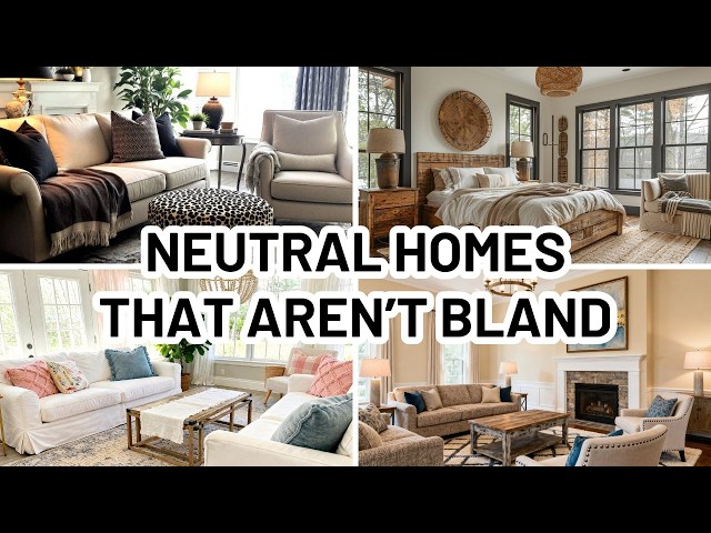
0:03
Hi, it's Lindsay Diane from dandor.com.
0:06
In this video, let's talk about how to
0:08
use neutrals without making your home
0:11
look bland. Now, neutrals are the
0:14
cornerstone of timeless design. But they
0:17
often get a bad reputation for looking
0:20
boring or flat. But when used
0:24
thoughtfully, neutrals can create a home
0:27
that feels warm, layered, and
0:30
intentionally styled rather than cookie
0:32
cutter. So, let's jump in to how you can
0:36
use neutrals in your home without making
0:39
it seem bland. In this video, we're
0:41
going to break down what the neutral
0:43
colors are, why they're so popular in
0:46
interior design, and four proven ways to
0:49
use neutrals in a way that is not bland
0:52
or boring. Let's get started. So, what
0:56
is a neutral color? A neutral color is
0:59
typically defined as a shade that does
1:02
not strongly lean toward any particular
1:05
hue on the color wheel.
1:08
Common neutrals include white, ivory,
1:12
beige, taupe, gray, gray, brown, and
1:17
sometimes black. Many neutrals have
1:20
subtle undertones like warm, cool, pink,
1:23
green, or yellow. And these dramatically
1:27
affect how they appear in a space. For
1:30
example, a warm beige with yellow
1:32
undertones will feel cozy and inviting,
1:36
while a cool gray with blue undertones
1:39
can feel crisp and modern. Understanding
1:42
these undertones is essential when
1:44
decorating with neutrals, especially if
1:46
you want your home to feel cohesive
1:48
rather than mismatched.
1:51
It's also worth noting that some colors
1:53
traditionally considered non-neutral,
1:56
like muted blues, soft sages, or dusty
2:00
blush tones, can act as neutrals when
2:04
they're desaturated enough. So, why are
2:07
neutrals so popular in interior design?
2:10
Neutrals have remained popular interior
2:13
design for decades because they're
2:15
timeless, adaptable, and approachable.
2:18
One of the biggest reasons homeowners
2:21
gravitate towards neutrals is their
2:25
While bold colors can feel exciting at
2:28
first, they often feel dated faster.
2:31
Neutrals, on the other hand, evolve
2:33
effortlessly with trends. Another reason
2:36
why neutrals are so commonly used is
2:38
their ability to create a calm, visually
2:42
restful environment. In a world where
2:45
we're constantly overstimulated,
2:48
neutral interiors feel grounding. They
2:51
allow the eye to move easily throughout
2:53
a space, which is especially important
2:55
in open concept homes or smaller rooms
2:58
where visual clutter can feel
3:01
Neutrals also photograph beautifully,
3:04
which is why they dominate magazines,
3:06
Pinterest, and Instagram. If you're
3:09
someone who enjoys styling and restyling
3:12
your home, particularly from season to
3:14
season, or you like to dabble in trends,
3:17
neutrals are the perfect backdrop for
3:20
that. Neutrals are also incredibly
3:22
forgiving. They allow you to mix
3:25
finishes, furniture styles, and even
3:28
eras without things clashing. Whether
3:30
you're decorating on a budget or slowly
3:32
upgrading your space over time, neutral
3:35
design gives you the flexibility to
3:36
build a home that feels cohesive,
3:39
layered, and personal. Now, let's jump
3:42
into four ways that you can use neutrals
3:44
in your home without making it feel
3:46
bland. Number one is to use high
3:49
contrast neutrals. One of the most
3:51
effective ways to make neutrals feel
3:54
dynamic is by using contrast. Instead of
3:57
decorating with shades that are too
3:59
close in tone, mix light and dark
4:02
neutrals intentionally. Think of crisp
4:05
white walls paired with deep charcoal
4:07
accents or soft beige upholstery against
4:11
black or dark wood furniture. High
4:14
contrast adds visual structure and
4:17
prevents neutral spaces from blending
4:19
into one indistinguishable shade. It
4:22
also helps highlight architectural
4:24
details like trim, doorways, and
4:27
built-ins. For example, painting
4:30
interior doors and window frames a
4:32
darker neutral can instantly elevate a
4:35
room without introducing color. Contrast
4:38
can also be achieved through finishes.
4:41
Matte walls paired with glossy tile,
4:44
dark metal hardware against light
4:46
cabinetry, or black framed mirrors in a
4:49
cream tone bathroom all add interest
4:53
while staying within that neutral
4:55
palette. If you enjoy a clean but
4:57
impactful look, go for high contrast
5:00
neutrals in your entryways, your dining
5:03
room, and your living spaces. They give
5:06
the room definition while still
5:07
maintaining the timeless appeal that
5:10
neutral lovers crave. Number two is
5:13
incorporating a variety of textures.
5:16
Texture is essential when decorating
5:17
with neutrals. Without it, even the most
5:20
thoughtfully chosen color palette can
5:22
fall flat. Since neutrals rely less on
5:25
color variation, texture does the heavy
5:28
lifting in creating depth and interest.
5:31
Start by layering different materials.
5:33
Linen, wool, wood, leather, stone,
5:36
ceramic, and metal all bring their own
5:39
visual weight to a space. A neutral sofa
5:43
feels far more inviting when styled with
5:45
a mix of chunky knit throws, soft cotton
5:48
pillows, and maybe a subtle woven
5:51
pattern to its upholstery as opposed to
5:54
just a smooth flat kind of on one note
5:58
finish. Natural textures are especially
6:00
effective in neutral homes. So wood
6:03
beams, raton chairs, jute rugs, and
6:06
ceramic accessories add warmth and
6:08
prevent neutrals from feeling too
6:10
sterile. Texture also plays a big role
6:13
in seasonal transitions. So if you have
6:16
some light gauzy blankets or maybe some
6:19
waffle knit blankets in the summer, when
6:21
it comes to the fall, think about
6:23
swapping those out to something a little
6:25
bit heavier like a sherpa or a fleece.
6:27
This is an easy way to refresh your home
6:30
with textures rather than a color
6:32
palette. Number three is neutral bases
6:35
and colorful layers. If you love
6:37
neutrals but worry about them looking
6:40
boring, think of them as the foundation
6:43
rather than the whole story. So keep
6:46
your foundation neutral. So your walls,
6:48
your floors, your large pieces of
6:51
furniture. And then layer in some
6:54
flexible items like decorative
6:56
accessories, pillows, throw blankets,
6:59
artwork. These are things that are
7:01
easily changeable and use those as the
7:06
method by which you bring color into
7:08
your space. This approach is ideal if
7:10
you enjoy changing your home with the
7:12
seasons or trends. So, a neutral sofa
7:14
can look completely different depending
7:16
upon whether it's styled with soft blues
7:19
for the summer, warm rust for fall, or
7:22
rich greens for winter. The neutrals
7:25
keep everything grounded while the
7:26
colorful layers add personality. Artwork
7:30
is another excellent way to introduce
7:31
color without overwhelming a neutral
7:34
space. Even one statement piece can
7:37
bring life and energy to a room
7:39
dominated by beige, white, or gray
7:42
tones. Using neutrals as a base also
7:46
makes decorating more cost effective.
7:48
Instead of replacing large furniture
7:50
items, you can refresh your space with
7:55
Number four is to use animal prints.
7:58
Animal prints are an often overlooked
8:01
way to add interest into neutral
8:04
interiors, and that's because they do
8:06
tend to be tricky to decorate with
8:09
tastefully. If you want ideas on how to
8:11
decorate your home tastefully with
8:13
animal prints, I have a video all about
8:16
that. I will leave it in the description
8:17
box below. But animal prints on their
8:20
own work well with neutrals because they
8:23
often have neutral tones in them. So
8:26
leopard, zebra, cowhide, and snakes skin
8:29
patterns work beautifully with neutrals
8:32
because they're typically made up of
8:34
browns, blacks, creams, or tan colors.
8:38
The key to using animal prints with
8:40
neutrals is moderation. A leopard print
8:42
pillow, a cowhide rug, or a framed
8:46
animal print can add just enough
8:49
interest and pattern to a space to keep
8:52
it from feeling bland without having to
8:54
pile on multiple layers of these things.
8:57
These prints bring organic movement and
9:00
a slightly unexpected edge to an
9:03
otherwise calm interior. Animal prints
9:06
pair especially well with traditional
9:08
and transitional spaces, but they can
9:11
also soften modern rooms by adding
9:14
warmth and character. When layered with
9:16
other neutrals, they read as
9:18
sophisticated rather than bold. If
9:21
you're hesitant, start small. One
9:23
accessory is enough to create contrast
9:26
and visual interest without overpowering
9:28
a room. So, think of animal prints as a
9:31
patternbased neutral. They are timeless
9:35
and versatile and if done right can add
9:38
a lot of beautiful interest and texture
9:41
to your space. That's it for this video.
9:43
I hope you found it helpful. If you
9:46
liked it, please give it a like and
9:47
consider subscribing to my channel. And
9:49
don't forget to visit me at diancor.com.
9:52
I post all about home decorating ideas
9:54
over there. And thank you so much for
9:56
watching and I'll see you in the next