Up next in 10


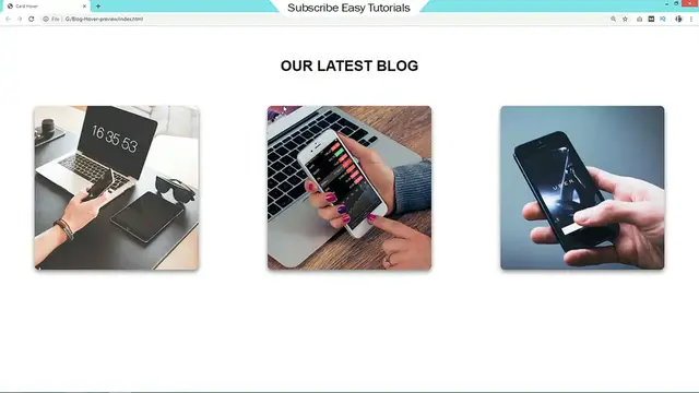
The video "How To Create Image Hover Effect On Website Using HTML CSS" is a tutorial that guides viewers through the process of implementing image hover effects using HTML and CSS. Throughout the tutorial, step-by-step instructions are provided on how to create various types of hover effects, such as changing the opacity, adding a color overlay, or animating the image on hover. The tutorial covers essential CSS properties and techniques to achieve these effects, including :hover pseudo-class, transitions, and transforms. By following along with the demonstrations and explanations provided in the video, viewers can learn how to add interactivity and visual appeal to their websites by incorporating creative image hover effects using HTML and CSS. Whether for portfolio showcases, product galleries, or creative projects, this tutorial offers practical insights into leveraging CSS to create engaging hover effects that enhance the user experience.
Show More Show Less View Video Transcript
0:00
Hi guys, welcome back to the new video of EZ tutorials and today in this video you will
0:04
see how to add a beautiful hover effect on image using HTML and CSS
0:09
As you can see on my computer screen, when I take cursor over this image
0:13
the image divides into four equal parts. Then move upwards one by one and reveal the hidden content
0:20
When I take cursor away from this image, these images again comes down at its original position
0:26
and hide the content. So you will learn to make this awesome image hover effect in this video
0:31
using HTML and CSS. So before starting this video, please hit the like button and also subscribe if
0:38
you are new on my channel. Now let's start this video. So here I have one folder and in this
0:44
folder I have one image, one HTML file and one CSS file. Now I will open my text editor which
0:50
is brackets editor. So this is my HTML file and this one is CSS file. You can see I have already
0:56
connected HTML file with CSS with this line of code. Now we will come to the body area and here
1:03
we will write div class and I'm writing the class name card. In this div we will add span, span open
1:11
and close tag. Let's copy this class name card and write it into the CSS file and for this one we
1:18
will add width 360 pixel and height also 360 pixel. Background it will be black
1:30
Next I'm adding box shadow here. Then margin 10% from top and bottom, auto from left and right. Next position relative
1:41
Then I'm writing border radius, it will be 10 pixel. Now we'll come back to the folder again and open this HTML file with Google Chrome
1:58
So you can see this box over here in black color. Let's copy this span
2:04
and write it into the CSS file. Before that we'll put this class name also
2:15
For this span we'll write height 100% and left it will be 0. In the background we will add
2:24
image so I'm using url and the image file name. Position it will be absolute
2:29
We will add width also it will be 100%. Now you can see one image on this box
2:38
Let's come back to the CSS file again and copy and paste it again. Here we will write nth child 1
2:46
For this one we'll add z index 10, width 25% and remove the width from here. That's it
2:56
Reload the web page and you can see this image only for 25% of width
3:03
Now just duplicate this one three times so that we will get four span
3:08
And come back to the CSS and duplicate this code and here we will write
3:15
2, 3 and 4. So we have four span. For the second one we will write width 50
3:24
width 50%. For third one 75% and last one it will be 100%
3:33
And z index we will change 9, 8 and 7. Let's reload the web page. Now here you can see a
3:40
single image which is actually four parts of one image. Next we will add hover effect
3:47
For that just copy this one and here we will write hover
3:54
So when we take cursor over this card we'll add transform translate y minus 100%
4:05
Transition 0.5 seconds. Let's reload the web page and when we'll take cursor over this card you can
4:13
see this complete image is moving upward by 100%. But all the parts are moving at same time so we
4:23
have to add some delay. And here we'll copy this one and write nschild 1 to select the first span
4:35
And for the first one we'll write transition delay so it will be 0.3 seconds
4:45
And let's duplicate it make it 2 and here delay 0.2 seconds. Now for the next one
4:52
transition delay is 0.1 second and for the last one transition delay is 0
4:58
And for the last one transition delay is 0. That's it. Let's reload the web page and you can see these all four parts are moving one by one
5:14
Right now it is moving very fast so we'll come back to the css and we'll change the value
5:19
So here we'll write transition one second and delay 0.8, 0.6 and this one 0.3. Let's see again. Now it is moving very slow so that you can see it clearly
5:36
that all blocks are moving one by one. When I take cursor away from this card you can see all
5:42
images parts comes down at same time so again we have to add some delay while coming down
5:48
So come back to the css file and here we'll write transition one second
5:56
and in this span we'll add transition delay 0. Let's copy and paste it here it will be 0.3 second and for the next one 0.6 seconds
6:19
And this one 0.8 seconds. Let's reload the web page and you can see these images moving upward
6:26
one by one and again coming down one by one. So this hover effect is working nice. Next we have
6:33
to add some content also. So just come back to the html file and here we will create one div
6:39
and the class name I'm writing content. So in this div we'll add one title so I'm using h2
6:45
So the title is easy tutorials channel. Let's add some text in p tag
6:54
Subscribe easy tutorials youtube channel to watch more videos on website designing, digital marketing and graphics designing
7:08
Let's copy the class name content and write it into the css file
7:12
Here we'll write color it will be white and text align center and let's add some padding 80 pixel and 20 pixel
7:31
Width 100 percent, height 100 percent and box sizing border box. Let's reload the web page. Now you can see this content is hidden when I take cursor over this
7:43
card these images moves upward and reveal the content. Now come back to the css and here we'll write content and p for the text. So color will be 999
7:59
Now you can see gray color for this text. After this p we'll add one link also so I'm using a href and the link text is read mode
8:16
Here we'll write content a and the text is read mode. Here we'll write content a
8:28
Width 100 pixel and text decoration it will be none. Border radius 50 pixel
8:41
and border 1 pixel solid and white color. Display it will be block and we'll add margin auto
8:51
Padding 10 pixel color white. Let's reload the web page. Now you can see one button after this text
9:09
Right now you can see this content is not moving. We have to move the content according to the
9:13
image movement. So we'll come back to the css and here in content we'll add
9:20
transform translate y 100% and transition 2 seconds. Now we'll write card hover then content
9:42
Just copy this one transform and write it here translate y 100
9:49
it will be 0%. Let's come to the card also and here we'll write overflow hidden
9:58
Then reload the web page. Now you can see the content is also moving
10:03
according to the image movement. It is going up with the image and when image comes down it goes
10:10
down. So this was very easy to add this type of effect on your website using html and css
10:17
I hope this video will be helpful for you. If you have any doubt you can ask me in the
10:21
comment section and don't forget to like and share this video. Thank you so much for watching this video
Online Media
Visual Art & Design
Programming
Crafts
Web Services