Up next in 10

The video "Create Online CV Website Using HTML and CSS" provides a comprehensive tutorial on building a personalized online resume website from scratch using HTML and CSS. Throughout the video, viewers are guided through the process of structuring the CV website, adding content sections such as education, work experience, skills, and projects, and styling them using CSS to create an attractive and professional layout. By following along with the step-by-step instructions and code demonstrations, viewers can learn how to customize their online CV to showcase their qualifications, achievements, and portfolio effectively. Whether it's for job hunting, networking, or personal branding, this tutorial equips viewers with the skills and knowledge needed to create a polished and impactful resume website using HTML and CSS.
Show More Show Less View Video Transcript
0:00
Hello everyone, welcome back to the new video of Easy Tutorials
0:04
Today in this video you will see how to make a single page resume website or personal website
0:09
using HTML and CSS. As you can see on my computer screen, I have a demo website here
0:15
On the right side you can see there is a user's image and on the left side there is a user's
0:20
information such as user's name, social media profile links, expertise, some project work
0:29
and there is one inquiry form also and finally we have some contact information and one copyright text
0:38
This website is completely responsive that means it is mobile friendly. After changing the screen size you can see this website is looking perfect on a smaller
0:46
screen also. If you are new to my channel then please subscribe my channel Easy Tutorials because I keep uploading
0:54
this type of tutorials on my channel. Now let's start to create this website using HTML and CSS
1:03
This one is my project folder and in this folder I have another folder and here you
1:07
can see there are so many images that I will be using on this website
1:12
Just come back and here in this folder we will create one file and we'll write the
1:18
file name index.html. Just open this file with text editor, I am using brackets editor
1:26
First I am writing some basic HTML codes. In HTML I'll write head and in this head there will be title
1:46
So the title is Landing Page Design Easy Tutorials. To this head we'll write body
2:00
Just save this file and come to the folder again. Here we will create another file and its file name is style.css
2:10
Again open this file with text editor. First we will write star margin 0 padding 0
2:17
Now we have to connect this CSS file with HTML for that we will write this code link
2:22
rel stylesheet href and the file name. We will add one more code here meta name viewport content-width is equal to device-width
2:44
Initial scale 1.0 This line of code will help us to make the website responsive
2:51
Now we'll come to the body and first we will create one div and the class name I am
2:58
writing profile-img. In this div we will add one image so I am using img tag, source and the file name
3:08
Save these changes and open this web page with Google Chrome. Now you can see this user's image on this web page and it is aligned in the left side
3:26
Come back to the CSS file. First we will write one code here box-sizing-border-box
3:35
Then write body. Here we will add some background color. Some light gray color
3:43
So now you can see this background. Just come to the HTML file and copy this class name profile-img
3:53
Add this class name in the CSS file and for this one we will write width 40% float right
4:01
After refreshing the page you can see this image is aligned on the right side
4:09
Just copy this class name here and after that write img. For this one we will write width 100% height 100%
4:19
Now this image is fixed here. It is not scrolling. After this div we will create another div for the left column
4:30
For that I am using class name as a profile info
4:40
In this div first we will write one name in h1 tag
4:47
After refreshing this page you can see this name here. Let's add some other text here in p tag
4:58
Subscribe EZ Tutorials YouTube channel to watch more videos on web designing, digital
5:03
marketing, graphics designing. Press the bell icon to get immediate notification of new videos
5:13
Now you can see this text on this web page just below this name
5:19
Let's add one class name for this p text. I am writing about
5:29
Just copy this class name and come to the CSS file. Add it here
5:34
Then I am writing margin-left 15px. Now you can see some space from the left side
5:46
Just copy this class name again. Write it here. For this one width will be 60% height 100vh float left
6:00
Let's add some padding 0 from top and bottom 30px from left and right
6:10
Now you can see some padding from left and right. Here we will write font family
6:21
Now you can see this different font
6:32
Copy this one and write it here. Then write h1. Margin top will be 50px and some margin from bottom also
6:45
Now you can see proper space around this name. Now come back to the HTML file and here we will add some social media icons
6:58
For that I am creating one div and the class name is social media
7:03
To add some images I am using img tag and the file name
7:08
Simply duplicate it to add multiple images. So I am adding Facebook, Twitter, and WhatsApp
7:21
Now you can see all these images here. It is too big. So just copy this class name and paste it here
7:30
After that write img. So for this image height will be 30px
7:35
Now you can see these images are small
7:46
Actually we have to place this content in this div in the profile info
7:51
So I will cut and paste it here. That's it. Save these changes
7:58
Now you can see this icon just below this text
8:08
Let's add some margin right 15px
8:18
Copy this class name again and for this one we will write margin top 20px and margin left 15px
8:36
Now you can see enough space for these icons
8:47
After that we will write one more title. I'm writing expertise in H2
8:52
Now you can see this title on this webpage. Let's copy this class name profile info then write H2 and for this one I'm writing margin
9:05
top and margin bottom to add some space from top and bottom
9:11
Now you can see enough space. Next we will create three different columns here
9:21
For that I'm using one class name div class expertise
9:32
And in this class first we will add one image. So I'm using img source and the file name
9:43
will write the some text in p tag. I'm using bold also
9:54
After this title we will add some other text in a small font. For that I will be using small
10:11
After refreshing this page you can see this image and the title and small description
10:16
But this image is too big. So just copy this class name expertise add it here
10:26
Write img and for this image height will be 5%
10:36
Now you can see a small image and the title and description
10:42
Just copy this expertise again. And for this one we will write display inline block
10:55
Width 28%. Adding 30 pixel 10 pixel. Then 2%
11:09
And the text align will be center. We'll add some box shadow also
11:29
And for this one background color will be white. After refreshing this page you can see this box here
11:45
Now we'll write code for this small
12:01
We'll write padding top display block
12:11
Now you can see some space between this title and small description
12:21
Simply duplicate all this content to create the second column. Just I'll change the title
12:31
It is digital marketing and the image file name. Again duplicate it to create the third column
12:41
Just change the image file name and the title. Just save these changes and refresh the web page
12:52
Now you can see three different columns for all the expertise. Next we will add one more title
13:02
So simply I will copy this one and paste it here
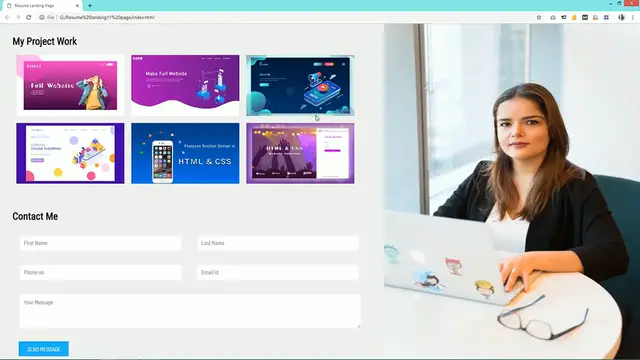
13:12
Just changing the title My Project Work. And you can see this title here
13:26
First we will create one div and the class name is Projects. In this div we will add images
13:32
So simply add one image and duplicate it. So here I have added six images
13:42
Now just copy this class name and come to this CSS file
13:46
Write this class name and after that img. Width will be 31%
13:53
Scrolling 4px. Margin from bottom and left also
14:04
Now you can see six different images for this project work. Now we have to add a scrolling effect for the left column
14:14
For that we will come to the profile info. And here we will write overflow scroll
14:24
And overflow x hidden. Now you can see a scrolling option for this left column
14:34
But we have to hide this scrolling bar. For that just copy this one and after that write webkit scrollbar width 0
14:54
After refreshing this page you can see there is no scrolling bar here and this page is
14:59
a scrolling from top to bottom for this left column only
15:12
Next we have to create the inquiry form for that I'm using div class name Formbox
15:17
Now we'll write form. In this form we have to add two different input field in the same horizontal line
15:26
For that we'll create one div and the class name I'm writing input group
15:31
And in this input group we'll add two different input box. So I'm using input type text
15:41
And placeholder first name. Just duplicate it and change the placeholder last name
15:51
Save these changes and come to the webpage. You can see these two input box here just at the bottom
16:02
Just copy this class name and come to the CSS file. For this one we'll write margin-top
16:14
Now you can see some space from the top. Here also we'll add one title in H2 I'm writing contact me
16:30
So here is the one title and after that form. Next we'll copy this class name input group add it here
16:46
Then copy this input write it here. And for this input we'll write width 45% border 0 outline none
17:07
Adding 10px margin 2% display inline block
17:18
And background will be white. Just refresh this webpage and you can see two input boxes at perfect size
17:35
Now duplicate this one to create another input field. Just change the input type number and this will be phone number
17:47
And the fourth one email input type email and placeholder also email
17:55
Save these changes. And refresh the webpage you can see four different input fields
18:08
Next we'll add one input text area for that I'm creating div class text area
18:19
And in this div I'm writing text area row equal to 4
18:29
And placeholder your message. After refreshing this page you can see this small text input field here
18:41
So just copy this one text area and come to the CSS file
18:50
After that we'll write this one width will be 95% border 0
19:03
Let me copy from here. After refreshing this page you can see this text input area here in the perfect size
19:22
Next we have to add one submit button for that we'll use button type will be submit
19:32
Let's add one class name submitbtn and this one is button text send message
19:43
Just refresh this page and you can see this submit button at the bottom
19:47
Now we have to design it for that just copy this class name submitbtn add it here in the
19:52
CSS file. Just copy and paste it here. We'll change this padding
20:06
We'll add some different background. Cursor pointer
20:17
Now this button is looking like this one. We have to add one more thing
20:25
Color white. After refreshing this page you can see this button is looking perfect
20:42
So after completing this inquiry form area will add some contact information for that
20:48
we'll create one div and the class name is contact. Next we'll add some icons for that I'm using img source and the icon name gmail.png and
21:02
this one is phone.png. Just copy this class name and come to the CSS file
21:10
After that write img width will be 20 pixel. You can see this small icons
21:24
Below this icon we'll write some contact information that is email ID
21:29
So I'm using a span and one demo email ID. Just copy it and paste it here
21:36
This one will write some demo phone number. Here you can see icon and email ID and phone number
21:51
Just copy this span and come to the CSS file. Before that write this class name contact
21:59
For this one I'm writing margin. Copy it again. For this one also we'll write some margin
22:15
And width
22:27
Now you can see some space between these informations
22:36
In this image I'm writing margin minus 5 pixel 10 pixel. This one I'll make 3%
22:54
After this contact information we will write one more text for that I'm using P
23:02
Designed by Easy Tutorials. Let's add one class name for this one I'm writing copyright
23:09
Just copy this class name and come to the CSS file
23:20
So for this one we'll write text align center margin bottom
23:30
Here you can see this copyright text also. So after making all these layouts we'll change the screen size
23:42
So right now you can see this page is completely broken. It's not looking good
23:48
So we have to make it responsive. For that we'll write this media
24:02
Then only a screen. And max width 900 pixel
24:14
So here we'll write some code for device width maximum 900 pixel
24:20
So just copy this class name and write it here. Profile info
24:24
So this profile info class name will become width 100%. Overflow inherit
24:33
And for this profile image also just add it here and this width will become 100%
24:43
Just refresh this page and you can see this full width image and the information also
24:58
Next we'll copy this class name expertise. Add it here and for this one we'll write width 95% margin bottom 10%
25:14
Again copy it and write IMG. Height will be 8%
25:25
And margin. Now you can see full width for this expertise also
25:41
Next we'll copy this class name projects. Add it here. For this one I'm writing width 47%
25:58
Sorry I have to write IMG. Now you can see two images in the one row
26:13
Actually I have to replace this span from here to here in the beginning
26:20
That's it. Just save the changes and refresh the page. And you can see this contact information is looking nice for full screen and but for a
26:32
small screen you can see I need to add some space. For that we'll increase this margin to 5%
26:42
Then add span display block for mobile device
26:54
Now you can see this complete page is responsive. Like this you can easily create this kind of responsive website using HTML and CSS
27:04
If you have any doubt you can ask me in the comments section. I hope this video was helpful for you
27:09
Please like and share this video and don't forget to subscribe my channel Easy Tutorials
27:14
to watch more videos like this one. Thank you so much for watching
#Computers & Electronics
#Web Design & Development
#Career Resources & Planning
#Resumes & Portfolios
#Skins, Themes & Wallpapers