Up next in 10

Vue.js 3 v-dialogs Example to Show Alert Modal Dialogs & Toast Notification in Browser Using TS
Jan 9, 2025
Get the full source code of application here:
https://gist.github.com/gauti123456/d258dd1aad335f0e38c69ce3b15a8dd7
Show More Show Less View Video Transcript
0:00
uh hello guys welcome to this video so
0:02
in this video I will show you yet
0:04
another vuejs 3 uh dialogue notification
0:07
toast Library where you can show these
0:10
nice little alert
0:14
messages you can see that this is toast
0:16
notification with success
0:19
icons you can see this is a warning
0:23
icon can even show model Windows as well
0:26
where you display your data so we are
0:28
displaying user data inside a nice
0:31
little model
0:33
window and we can even show this loading
0:36
progress bar as well so now to load the
0:39
data we can actually show this nice
0:41
little loading progress part so the name
0:44
of the package is v- dialogues if you
0:47
just search on Google it's a
0:50
specifically designed for VJs
0:53
application
0:57
and so this is actually the package
1:02
they have their own website as well this
1:05
is a
1:06
website and uh they have a nice little
1:09
documentation uh the command is
1:12
simple just head over to your vuejs app
1:17
and just install this by executing this
1:21
command npmi v- dialogues I've already
1:25
installed it so after installing it the
1:29
very first step we need to do uh just
1:31
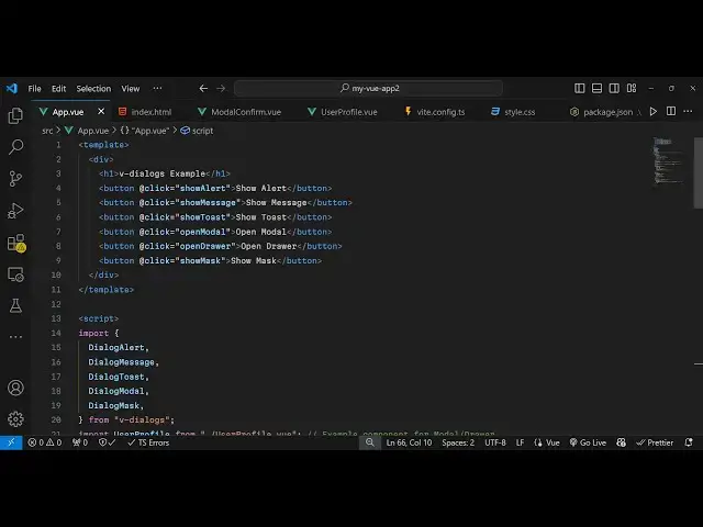
need to go to app. view
1:35
file I will show you step by step so
1:39
right inside this we will have our
1:42
template and inside this we will Define
1:45
some
1:46
buttons to show you example here so
1:49
you'll have a series of
1:52
buttons this will be for showing a basic
1:55
alert
1:57
box we just B an on click listener to
2:00
this add theate click so when we click
2:03
the button so you'll be binding this uh
2:05
function show alert now we just need to
2:08
Define this function in the typescript
2:10
code
2:12
so so be one by one importing all these
2:16
methods which are pre-built inside this
2:19
v-
2:20
[Music]
2:21
dialoges package so one such method is
2:25
dialog alert
2:30
and now for defining the method we
2:32
simply say export default and the
2:35
methods so you'll be defining this
2:37
method show alert so inside this method
2:40
we can directly use this function which
2:43
is dialog alert and here need to provide
2:46
an text whichever text are you this
2:50
is a simple
2:54
alert
2:56
message and then it also takes an call
2:59
back function as well
3:02
so whenever user clicks on the cancel
3:05
button or okay button then we simply say
3:08
alert
3:12
dismissed and also it also takes a third
3:15
argument as well which type of alert box
3:19
it is so it also takes message type this
3:22
will you see all these message alert
3:26
types info warning error success confirm
3:30
let's suppose I am showing a confirm
3:33
alert box so if you refresh if I click
3:37
this you will see these two okay buttons
3:40
okay and cancel this is a confirmation
3:42
you are taking confirmation from user do
3:45
you want to proceed user clicks on okay
3:49
then that call back function executes
3:52
alert
3:55
dismissed and similarly if I change to
3:57
success it will have a
4:00
success alert box with this success
4:05
icon so all types are supported right
4:10
here this is now for the error so it's a
4:13
very handy library for showing alert
4:17
boxes and uh now I will show you one
4:21
other
4:22
type which will be toast so if you want
4:25
to show toast messages as well
4:30
we will bind this function show
4:32
toast so there is a buil-in method which
4:37
is dialog
4:39
toast and we can actually now
4:43
bind another function which is show
4:50
toast so inside this function uh we can
4:53
directly use
4:55
this dialog
4:58
toast and here we can say this is a
5:01
toast notification and it also takes the
5:06
message
5:08
type so we all have
5:11
these it's a success toast notification
5:15
let me
5:16
see if you click it now you will see
5:19
this success notification you can see
5:22
with a green background and an icon as
5:25
well
5:26
so same goes if I change it to error now
5:30
it will have the red background
5:33
color so you can see it very nice
5:37
package which supports all these
5:39
notification dialog boxes alert
5:42
types and if you want to show data
5:45
coming in a model window then also you
5:48
can attach a function here which open
5:51
model so it will now open a model window
5:55
where you it will show the data so I
5:58
binded this open model model function so
6:00
right here we have
6:02
this function dialogue
6:08
model so right here we will bind this
6:11
function
6:15
here show
6:17
model so we defining this function which
6:20
is open model
6:23
sorry so inside this we are using this
6:26
function dialogue model and it actually
6:29
takes the component name uh so I will
6:32
just Define a new component which is
6:34
user
6:38
profile so we Define this component user
6:42
profile
6:43
view so we defined this new component
6:46
user profile view inside this we are
6:48
displaying the user
6:50
information and we just having a
6:54
close so we just passing this component
6:56
as a first argument and then the second
6:58
argument is the
7:00
width which is
7:02
600 height of the window will be
7:05
400 the title will say user
7:09
profile and then the call back
7:13
function holding the data so you simply
7:16
use the dialogue
7:18
Alert model call
7:22
back use the backtick symbol right here
7:36
so you'll see we are displaying this
7:38
data here user profile data and then
7:40
model like
7:41
structure so this Library supports all
7:44
dialog types and uh lastly you can even
7:47
show loading notification as
7:50
well loading progress bar so for showing
7:56
that there is a dialog box which is
8:00
dialog
8:03
mask and for showing this we will bind a
8:07
function show
8:14
mask use this dialog marks and provide
8:18
if loading loading loading so it's a
8:21
loading progress bar and use the set
8:23
timeout function so it will hide this
8:25
after 2 second 2,000 millisecond we'll
8:28
call this destroy
8:31
function dialog
8:37
message after hiding it we will say data
8:40
loaded
8:42
successfully and the message type
8:46
here success so now what happens if I
8:49
click it you will see this loading
8:51
progress bar after 2 seconds you see
8:54
this toast notification data loaded
8:56
successfully so in this easy way you can
8:59
use this
9:00
package V dialoges and vuejs 3 to show
9:04
these notifications dialogue boxes
9:06
loading progress Parts as well so I have
9:08
given all the source code that I used in
9:10
this video in the description of this
9:12
video so thank you very much for
9:14
watching this video and do check out my
9:17
website as well free mediat tools.com uh
9:20
which contains thousands of tools
9:22
regarding audio video and image and I
9:25
will be seeing you guys in the next
9:26
video