Up next in 10

React.js react-hot-toast Library Example to Show Colorful Toast Notification Messages in Browser
Jan 9, 2025
Buy the full source code of application here:
Show More Show Less View Video Transcript
0:00
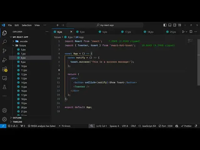
uh hello guys welcome to this video so
0:02
in this video I will show you one other
0:05
toast notification library for react CHS
0:08
so you can see it supports various
0:11
notification messages this is a success
0:13
notification this appears for simply 3
0:16
seconds on the page and then goes away
0:19
it also sees the icon if you see this is
0:21
a success icon this is a simple message
0:23
appearing you can control the look and
0:26
feel of this so the module name is if
0:29
you just go to npmjs.com and just search
0:32
for the module which is react hot toast
0:36
it's
0:37
specifically for react CH
0:40
applications so this is actually the
0:42
command I've already installed it almost
0:46
1 million weekly downloads it's pretty
0:49
popular module
0:51
so now to get started I will show you a
0:54
complete example so just make a simple
0:56
functional component
1:00
so we'll be importing this module so
1:03
import and it contains two
1:06
methods first to actually make the toast
1:10
notification message and then to show it
1:12
for showing it we have this
1:15
toaster the second one is the toast
1:18
method and now to
1:20
actually show the notification message
1:23
we will make a simple custom method
1:26
notify and what this custom method will
1:28
do it will use this built-in
1:31
toast method here you will see we are
1:33
importing it so it contains a function
1:36
for various notification messages one
1:39
such if you
1:41
do success notification message so this
1:45
is for Success so you can just give it
1:48
any message that you want to display so
1:50
this is a success message so for
1:53
displaying it it's very simple you
2:01
wherever you want to display you can
2:03
simply display this toaster like this
2:06
and then we can have a button to bind an
2:08
onclick listener to this button
2:15
so so we have this button here which say
2:18
show
2:19
toast so we just pining this notify
2:22
function right
2:24
here so if you refresh your browser it
2:27
will look something Position will be
2:30
default Position will be Center so if
2:32
you hit this button
2:34
now so very simple notification message
2:38
it can be used in multiple scenarios if
2:39
you are having forms when form submits
2:43
you can show this notification message
2:46
and it's a very lightweight module not a
2:50
only 5 kilobytes of size and it's uses
2:53
promise API
2:55
and so if you read if you want to use
2:59
the full document mentation you can go
3:00
to the website react hot toast.com and
3:04
you can read more about it if you want
3:07
to customize this it also accepts some
3:10
options that you can pass right
3:12
here so if you want to customize the
3:15
look and feel of this so you can inside
3:17
this it takes some
3:19
options so this options
3:22
are toast options
3:31
so let me just paste it right
3:36
here so in this way uh this toast
3:39
options are provided this is actually an
3:41
object here here you can give it a
3:43
custom class name that you want to style
3:45
and then there is a style object here
3:47
you can change the color padding give
3:49
some border any CSS property so if you
3:52
refresh now it has been customized if
3:55
you
3:58
see so if you want also want to change
4:01
the background of the toast message you
4:03
can simply change the background color
4:05
to
4:09
Red so you can now see so each and
4:12
everything you can customize using this
4:14
style object that is
4:16
there and I think you can read more
4:19
about
4:21
it all these options are available which
4:24
is how much duration position top Center
4:28
so default position is is
4:30
actually it takes an object here which
4:33
is actual position so if you also want
4:35
to show it in the top right position
4:37
instead of top Center you can customize
4:40
this so now it appears on the top right
4:42
position so you can control the
4:44
positioning as well everything and how
4:47
much duration it appears so you can put
4:49
a duration property so let's suppose I
4:51
only want to appear it for 1 second so
4:54
it is 1,000 millisecond so it now
4:57
appears only for 1 second
5:00
you can
5:01
see so all these things you can control
5:04
uh you can also give it a custom icon as
5:07
well by using the icon property so if
5:10
you have a customized icon that you want
5:12
to show there's a icon you can change of
5:15
the toast message simply like this so
5:18
you can see the icon is changed so all
5:21
these things are customizable you can
5:23
also provide your custom theme primary
5:26
secondary color all these things
5:31
and this is for error this
5:35
is if you want to show a error message
5:38
like this
5:40
so we have various methods available
5:43
which is now for this error message you
5:45
will see cross icon will
5:49
appear there is also ones for loading as
5:53
well so if your data is some some kind
5:55
of loading you can show this loading
5:58
screen it's a very
6:01
nice module very lightweight module but
6:03
at the same time it's very powerful you
6:05
can show some nice little toast
6:07
notification messages so in this video I
6:10
shown you all the examples all the
6:12
options you can pass so thank you very
6:14
much for watching this video and do
6:16
check out my website as well free mediat
6:19
tools.com which contains thousands of
6:21
tools regarding audio video and image
6:24
and I will be seeing you in the next
6:26
video