live_tv
Livestream Starting Soon
00
Hours
:
00
Minutes
:
00
Seconds
Up next in 10

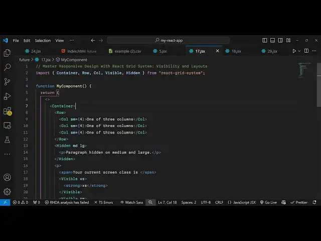
React.js Responsive Design Grid System Bootstrap Alternative Using react- grid-system
Jan 9, 2025
Buy the full source code of application here:
Show More Show Less View Video Transcript
0:00
uh hello guys welcome to this video so
0:03
in this video I will show you a specific
0:05
module uh for responsiveness Designing
0:08
responsive websites in react
0:10
CH so it's actually a grid like module
0:15
so it is also responsive as well so if I
0:20
open this web page you will see it will
0:23
show it's a gridlike structure so we
0:27
have three
0:28
columns and it's completely responsive
0:31
so if I change the screen size you will
0:33
see that some classes
0:36
will will be hidden some elements will
0:38
be hidden based upon the screen size so
0:41
this is the Mobile screen and this is
0:43
the tablet size you will see as I'm
0:46
resizing the device size certain classes
0:49
are hidden certain classes so it is also
0:52
tells you the screen current screen
0:54
classes this is medium size so if I
0:58
increase the size even more now it shows
1:00
your current screens class is
1:02
large and if I make it even
1:06
larger so this is your paragraph hidden
1:09
on medium and large so your current
1:11
screen class is extra large so this is
1:14
the normal size so this is extra large
1:16
size here so this is actually the grid
1:19
like structure it's
1:20
completely free open- source package and
1:24
it basically does the same thing of
1:26
bootstrap but uh the name is slightly
1:30
different if you go to npmjs.com just
1:33
search for this package react grit
1:36
system this is actually the name of the
1:38
package so with the help of this
1:41
component you can package you can design
1:44
some responsive websites responsive
1:46
layouts so this is actually the command
1:49
here I've already installed it it's got
1:53
38,000 weekly downloads so I will show
1:56
you a very basic example on how to get
1:59
started
2:01
so first of all we do need to import
2:03
this package uh at the very top so
2:06
import and it contains all these
2:08
components pre-
2:13
components so I will just import
2:17
it so the naming convention is very much
2:20
similar to bootstrap we have the
2:21
container root class we have row column
2:24
visible hidden so all these are classes
2:27
and we are importing it from this
2:29
package react system so one by one I
2:31
will show you how to use this
2:35
so basically container is the actual
2:38
base component that you will wrap your
2:41
application so then we have the
2:45
row and inside this we have columns so
2:49
you can design your
2:51
layout like this and then we have these
2:54
classes small this is actually an
2:57
attribute and here you can design I can
3:01
just write some random data here so we
3:06
have three columns each column taking
3:11
three four sizes so it avales to 12
3:16
columns so this also will
3:20
take so this SM means here small this SM
3:24
basically it's a screen size so it it
3:27
will only show on small devices so it
3:29
actually meant by this we have these
3:32
responsive classes so it actually only
3:35
show on small devices so SM stands for
3:40
small so if you refresh your page you
3:43
will not see
3:45
this so SM basically it's a completely
3:48
responsive and it will show on all the
3:51
device sizes large medium small as well
3:54
on small devices it will wrap on
3:57
vertical you will see it will look
3:58
something like this so it's completely
4:00
responsive in these column names you can
4:03
have anything so you can see it's
4:05
completely responsive now I can adjust
4:07
the screen size and it
4:09
actually uh adjust itself to
4:13
show on all the screen sizes so then we
4:18
have actually our hidden class so if you
4:21
want to hide
4:23
something on certain screen sizes you
4:26
can use this hidden class which is
4:28
available in this package so here you
4:30
can specify you only want to hide these
4:33
on medium devices and large devices so
4:36
here you can specify multiple screen
4:38
sizes by this MD stands for medium and
4:41
LG stands for large so I want to hide
4:44
this so here you can specify any HTML
4:47
that you want to hide so I will say
4:49
paragraph hidden on medium and large
4:53
devices so in this way you can hide your
4:55
elements based upon the screen size
5:00
and also we can show the current screen
5:03
size of the user as well as they adjust
5:06
the screen size so we'll say your
5:08
current screen class is and then we will
5:14
specify whatever their screen size is so
5:19
for this we will actually use make use
5:21
of the visible class so if you want to
5:24
show something we use this visible
5:27
class so we make this that only show
5:31
this on EX extra small devices if the
5:35
screen size becomes extra small then
5:37
we'll simply show this is your screen
5:40
size is extra small so we will repeat
5:42
this for all the screen sizes which are
5:53
available so what I will do I will just
5:56
copy this
6:07
so in this
6:09
way you can actually use this uh visible
6:13
class and you specify here each and
6:16
every screen size this is extra small
6:19
this is small these are for mobile
6:21
devices and then we come the medium
6:24
device this is tablet size LG stand for
6:27
large and this is extra large
6:30
and this is extra extra large so if you
6:33
have it so based upon the screen size
6:36
now it will show you your current screen
6:38
class is extra large so if I adjust a
6:41
size here you will see it has changed to
6:45
small if I again shrink it you will see
6:49
that your current screen class is extra
6:52
small so you can see it's completely
6:55
responsive as I'm changing the size of
6:57
the browser it is actually changing this
7:00
it's large here so it will automatically
7:03
detect your screen size and based upon
7:05
that it will show and hide elements so
7:08
we have all these pre-made classes
7:10
available inside this package if you
7:13
don't want to use bootstrap it's
7:15
completely free and it's I think it's
7:19
slightly easier as compared to bootstrap
7:21
the syntax we have all these pre-made
7:24
packages available classes available if
7:27
you want to hide something or show
7:28
something BAS based upon the screen
7:32
size and it's similar to the convention
7:36
is similar it uses your gridlike
7:38
structure the row and the column and in
7:40
this way you can design your layouts any
7:43
website you can design using this
7:45
package only without using
7:48
bootstrap so thank you very much for
7:50
watching this video and I will be seeing
7:53
you in the next one and do check out my
7:55
website as well free mediat tools.com uh
7:59
which which contains thousands of tools
8:01
regarding audio video and MH and I will
8:04
be seeing you in the next video