Up next in 10

React.js react-st-Modal Library Example to Show Animated Popup Dialog Modals in Browser Using JSX
Jan 9, 2025
Buy the full source code of application here:
Show More Show Less View Video Transcript
0:00
uh hello guys welcome to this video so
0:02
in this video I will show you a dialog
0:06
alert library inside react CH so if you
0:09
want to show dialog boxes something like
0:12
this this is actually a alert message
0:15
dialog
0:16
box this Library supports multiple types
0:19
it's a confirm dialog box so inside your
0:23
application you can show these awesome
0:24
looking dialog boxes popup boxes for
0:28
your application we also have custom
0:30
dialoges where you can accept in user
0:32
input enter the username then you will
0:35
click submit so this is the library I
0:39
will show
0:41
you the package name is if you go to
0:44
npmjs.com and just search for this
0:47
module which is
0:49
react D st-
0:52
model so this is essentially this
0:56
package which allows you to I've already
0:59
installed it so this is actually the
1:01
command it's almost having 200 weekly
1:03
downloads a fairly new
1:06
package and it's very easy to set up so
1:09
I will show you a complete example so
1:11
first of all just make a simple
1:13
functional
1:14
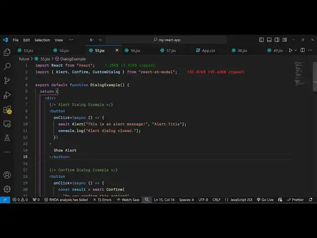
component and now we use the import
1:17
statement to
1:19
import this package which will be coming
1:23
from react St model and various
1:27
different model types which is alert
1:30
confirm and custom
1:33
dialogue so it's almost 155 kilobytes
1:37
and uh now to actually show this module
1:41
uh model windows we come to the js6 and
1:44
we'll be having these three buttons the
1:48
first button we will be showing the
1:50
simple alert dialogue box so when you
1:53
click this button we will bind
1:57
this simple
2:00
function right
2:03
here so now to show this alert box we
2:06
binded this function show alert now we
2:09
just need to Define this function right
2:11
here you can Define
2:12
this show
2:16
alert so we can simply use this function
2:20
so first of all you need to make this
2:22
function as
2:24
async and then we can simply use the
2:26
await keyword and then this is the
2:28
actual alert component that we are
2:30
imported from this package and here you
2:32
can give any alert message let's suppose
2:35
this is an alert
2:38
message and second argument it takes is
2:41
the title that you want to give so you
2:44
can give any
2:47
title so if you refresh your application
2:50
you will actually see this button out
2:52
there if you click the button you will
2:53
see the title of the window and this is
2:56
actually your content and we have a okay
2:58
button so this is is the default styling
3:01
it comes with uh which looks really good
3:03
and you click the okay button nice
3:05
little animation also take place this is
3:07
a very basic alert dialogue window and
3:11
it also supports various others types if
3:14
you want to show a confirm button which
3:17
have two choices so show confirm
3:24
button so here we can bind a simple
3:30
on click function to actually
3:38
show so we can also here
3:42
also in the function itself you can also
3:46
do this as well so we will have two
3:49
choices we'll use this confirm
3:54
component and here you can ask a
3:56
question to the user that do you confirm
4:00
this section and then you will have two
4:02
choices you can give and give it a
4:09
title so you show this and depending
4:12
upon the choice you will comparative
4:17
result so if you refresh now you have
4:20
the second button now click it you have
4:22
two choices do you want to confirm this
4:25
action we have okay button cancel button
4:27
so depending upon which button is
4:28
clicked
4:30
you will see that so you can even create
4:33
your own custom buttons as well so
4:35
custom dialog boxes which
4:39
contains let's suppose user input so if
4:42
you want to accept some user input you
4:44
can even do that as
4:52
well like
4:54
this so for this we will be using this
4:57
uh custom dialogue
5:01
component and
5:04
uh I need to make
5:07
this
5:09
component and here you'll be
5:12
passing these two things first is the
5:14
title of that
5:18
window and then you also need to show
5:20
the close icon you put it to
5:24
true so this dialog can be anything
5:29
so here this is your custom component so
5:33
you can have your own styling
5:36
CSS this is your custom
5:39
dialogue context so here we Define this
5:43
component custom dialog content so this
5:46
is
5:48
actually custom dialogue
5:52
content so actually write a paragraph
5:55
then we have this nice little input
5:57
field then we have a button
6:00
so what happens is that if you click the
6:02
third content you will see this input
6:03
field this is a custom dialogue so here
6:06
we are allowing the user to Simply
6:07
select their name and submit this is
6:10
actually the package react XT model you
6:13
can have you this so thank you very much
6:15
for watching this video and please hit
6:17
that like button subscribe the channel
6:19
and also check out my website as well uh
6:22
free mediat tools.com uh which contains
6:24
thousands of tools regarding audio video
6:27
and image and I will be seeing you in
6:29
the next video
#Other
#Other