Up next in 10

Build a React.js Animated Circular Loading Progressbar Using react-circular-progressbar in JSX
Jan 9, 2025
Get the full source code of application here:
https://gist.github.com/gauti123456/18e85c2d9916a1fc59dc7c323e72f06f
Show More Show Less View Video Transcript
0:00
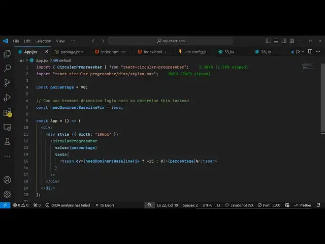
uh hello guys welcome to this video so
0:02
in this video I will show you a react CH
0:05
circular progress Bar library where you
0:08
can basically make these nice little
0:10
loading bars with percentage sign 90% so
0:14
if you are fetching some data from an
0:15
API you can easily show these progress
0:18
paths the name of the package is react
0:21
circular if you just go to npmjs.com
0:25
just search for this package which is
0:27
react circular
0:30
[Music]
0:31
progress bar so this is actually the
0:41
component so various components are
0:43
there SVG scalable vector
0:46
graphics so the command is very simple
0:50
uh this is actually the command I've
0:52
already installed
0:54
it so it has almost 163,000 weekly
0:58
downloads a very popular
1:00
package so now to get started they do
1:05
have given some examples on their quote
1:07
sandbox website so now to get started uh
1:10
just inside your react sh
1:13
application just make a simple
1:15
functional component and then we need to
1:17
import this module so
1:20
import uh
1:23
circular progress bar which will be
1:25
coming from react circular progress bar
1:28
and after this we need to import the CSS
1:31
file as well so which is located inside
1:34
react circular progress bar uh
1:38
/is/ styles. CSS this is actually the
1:42
CSS file so we have imported the module
1:44
and the CSS file and now we can
1:47
configure some
1:57
information oh my mic was not was
2:00
working so you can configure some things
2:02
about the progress pass such as the
2:04
percentage which is
2:05
90% And then need
2:10
dominant
2:12
Baseline fix so you can set this option
2:15
to true so after
2:18
this now we can uh inside our jsx
2:21
wherever you need to display this
2:23
progress bar you have this component
2:25
which is circular progress bar and it
2:28
actually takes some options
2:30
so the first options it takes is the
2:32
actual value which is inside your
2:35
percentage variable that you declared
2:38
then we have the actual text that you
2:40
want to
2:42
show so here it
2:45
can you will show it Dynamic percentage
2:48
so you will simply use this
2:51
tag so 90 percentage that's all so if
2:55
you refresh your browser and just go to
2:57
Local Host 5173 so so it is looking
3:00
pretty big you'll see 90% so I just need
3:03
to resize it so what I will do I will
3:06
just make the width style
3:09
to width 100 100 pixel so now it makes
3:14
sure that it you can see so you can
3:17
easily change the color as well color
3:19
combination that it has you can change
3:22
the percentage let's suppose to
3:28
45% so now it has 45% so if you go to
3:32
their documentation uh they have given
3:34
all these options these attributes and
3:41
uh uh you can have all these attributes
3:45
available uh
3:50
background you can put this property in
3:52
the background if you do want to display
3:54
a background you can put this
3:57
property it's a Boolean parameter so
3:59
will say true so it will now show a
4:04
background as well background
4:07
color
4:11
so then if you want to customize this
4:14
you can add this CSS property which is
4:17
Styles so you can even customize it even
4:21
further such as adding some CSS
4:25
properties such as you can change the
4:27
background to Red so you can change the
4:29
back background color easily if you
4:31
refresh
4:37
here uh I
4:43
think this is actually an object here
4:49
background this is
5:03
so basically if you want to put a
5:06
classes here all these options are there
5:09
max value main value you can even
5:10
provide this as well stroke
5:14
width so even you can see that
5:18
so if I copy this example
5:22
uh so it has given some detailed example
5:26
so if I copy this and paste it right
5:29
right here
5:48
so so we have changed all these options
5:52
so if you
5:57
refresh so it is saying build Styles is
6:00
not defined so just need to import this
6:03
so if you are customizing your progress
6:06
bar you just need
6:07
to import this as well from react react
6:11
circular progress part so now if you
6:14
refresh uh you have seen we have
6:17
customized the look and feel of that
6:20
progress PA so you can change the
6:24
background color right
6:27
here if you want to change it to red
6:32
color we can change it so I have given
6:35
the full source code guys in the
6:37
description you can use this package
6:39
react circular progress bar to make
6:42
circular progress bar very simply so
6:44
thank you very much watching this video
6:46
and do check out my website as well free
6:49
mediat tools.com uh which contains
6:52
thousands of tools regarding audio video
6:54
and image and I will be seeing you in
6:57
the next video
#Web Design & Development
#Development Tools