Up next in 10

Power BI - Gauge card and KPI
Watch more Videos at https://www.tutorialspoint.com/videotutorials/index.htm
Lecture By: Mr. Akshay Magre, Tutorials Point India Private Limited
Show More Show Less View Video Transcript
0:00
Hello, friends and welcome
0:02
In this segment of the video, I'm going to show you how to create Gage, card and KPI visualization
0:09
in Power BI desktop. Now if I move on to my next slide, in this slide you can easily understand what is the revenue
0:16
so far, what is the target revenue and what is the maximum revenue that you can achieve
0:21
out here. So in this segment you can easily visualize that it is showing me revenue achieved versus the
0:28
target revenue out here. So you can make a proper business decision and we can see what is the lack that we are carrying so far
0:36
So this particular region is showing me what is the lag which needs to be achieved
0:41
And how to get this kind of visualization, you simply have to use the gauge visualization, which will give me a report like this
0:49
All right? Moving on with the next one is the card visualization. Now my card visualization is simply a numeric representation of the fields
0:57
Generally the most common usage of this is to keep the number short for an example out here it is 5 billion
1:06
You can make it either 5 billion or you can type as 5 followed along with 9 zeros
1:12
So it is completely up to you that what kind of representation that you want to show in this card visualization
1:19
Another thing that I'd like to add in this card visualization is that we can concatenate it with certain kind of text
1:26
Alright, now as you can see the progress till date and a number following along with it
1:32
So basically what we have to do out here is we have to create a DAX expression in such a way that I will concatenate with certain text and following along with some DAX expression in such a way that it gives me a result like this following along with a text and a number associated with it
1:52
So this was about card visualization and the third one is my KPI indicator
1:56
So what it says sometimes when building reports, you may have to track just one single key performance indicator
2:03
Now out here you can see whenever you have the target column ready with you, you can see what has the goal achieved so far and what is the lag behind
2:13
So it automatically, the KPI visualization will automatically judge your or it will yze the data that you have given and then give me a visualization like this out here
2:25
here so let's go ahead and see how to create all this visualization in our
2:30
practical approach hello friends and welcome in this video we are going to see
2:36
the gauge card and the KPI projection in Power BI alright so let's quickly
2:42
get started off now as you can see there is no projection on my screen I have
2:46
created a new page out here in which we'll be getting the gauge card and the
2:51
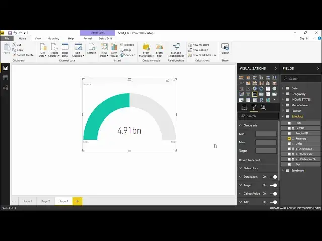
KPI projection all right let quickly start with the gauge projection in In order to create the gauge projection we have to go under the visualization pane and under that I will simply click on this gauge projection
3:02
The moment I click on it, I get an empty projection right in front of my screen
3:07
I will go ahead and add some data to it. In order to add the data, I will refer to the sales fact table
3:13
And under the sales fact table, I will select this revenue and drag it to the gauge projection
3:19
The moment I get dragged it to the gauge projection you can see it is showing you a figure that a 4.91 billion revenue has been generated so far now by default it is taking zero as the starting point and 10 billion as the maximum point
3:37
So generally how this is defined generally it always start with a zero marking and it takes a projection which is double the revenue size or whatever your sales must be
3:49
or units must be so whatever amount it is there it generally occupies the double
3:55
of it and give it as maximum alright so this is what about the basic projection of
4:00
gauge now let's go ahead and add some formatting to it now in order to add a
4:06
format I have to go under this format pane in which you can see there are
4:11
bunch of options now these are the option that we have been seeing out for the
4:15
rest of our previous projection now the unique curve option that we see out here is my gauge axis which is not seen in the previous
4:25
projection so if I click on this drop-down menu you can see I out here I can
4:30
either set a minimum a maximum and a target now let's take for an example
4:35
for this particular gauge projection I want the minimum marking to be as 2 billion
4:40
and a maximum marking of well let's say 8 billion all right and also we are
4:45
going to set a target that means that if you are a projection
4:49
thing that your sales employee would should generate a minimum sales of let's say
4:55
seven billion so we will get a indicator out here in such a way that it should
4:59
read at least the indicator to fetch the target amount all right guys so
5:05
let's quickly go ahead and add the minimum access so my minimum should be two
5:10
billion so it would be two followed along with nine zeros all right the moment
5:15
you click on the the moment you type two billion you can see the projection out here has changed to 2 billion maximum as I have told you that it should be 8 billion
5:24
so 8 follow along with 9 zeros all right as you can see out here the maximum
5:30
projection is for 8 billion and I set a target of let's say 6 billion all right so
5:35
if I say if I set a target of 6 billion you can see that is a marker or an indicator
5:41
that means it should I should reach a minimum target of 6 billion and as we can
5:46
see from this projection there is still a gap left out here So this is how you can create a gauge projection for you depending on what should the minimum what should the maximum and what should be the target out here so this is what a whole about the gauge projection you can do much more other
6:03
things using this particular format pains and changing the color of it changing
6:08
the size of it changing the axis changing the lock aspect the background
6:13
color the title depending on what you want let's say if I want the title
6:17
add to be a center so I'll get the title at center right I'll just increase the font of it so let's make it little much
6:25
more bigger all right so it is revenue so far all right so this is how you can
6:30
create a gauge expression or a great gauge projection now let me quickly
6:34
move on to the card projection and see how it works so next to gauge
6:38
projection I have this card projection I will simply click on this now this is a
6:42
card an empty card out here so what we will be do we have already taken the
6:47
revenue this time I'll take the unit section and bracket here so basically a card is showing me that how many units that that
6:54
does sold so far that is 11 million units has been sold so far and it is
6:58
showing me into a card that's it nothing more about this particular
7:03
projection but what we can do out here is we can create a calculated column and
7:08
get the projection and get the design text on that projection and how it is
7:14
done let me show it to it quickly I will go under the home tab and first I will
7:19
create a new column that is a calculated column all right and this calculated
7:23
column will talk about the progress right which will be equals to the I would
7:29
like to get some text along with it so let's say progress so far all right I
7:34
say progress so far or till date progress till date which sounds good so right
7:44
so progress till date will close the double-intred commas use an ampers
7:49
get a hyphen in between all right using the double codes and and I'd like to get the sum of the sum of let's say the total units all right so from the units
8:01
sales fact table it will pick the units and it'll give me some of all the sales that they have sold so far and the moment I hit enter
8:10
you can see it's working on it and it has created a new column all together that is my progress card the progress column all right now what we'll be doing out
8:19
here I will take a card projection drop it here okay I have the card projection
8:25
and the moment I drop this progress in this card see what happens so it is giving
8:30
me that so far what is the progress till date and it is showing me the sum of all
8:36
the units to be units that has sold so far so isn't that great guys so this is the
8:40
first progress and this is the text that we have given in our formula itself
8:46
and it is showing me the number of units that has been sold that is the sum of units so this is how you can express the proper projection depending on what is the unit that you like to display using a dax expression under the new column all right so you can create a new dax expression
9:07
let's say you would like to calculate the average what should be the target what should be the maximum right and you can create a card for the same as well okay so this was all about the card
9:16
projection using a simple card projection and using a DAX formula or that is a DAX
9:22
expression all right so now we will quickly move on to the KPI projection now
9:29
under the KPI projection we have to go to this particular section which says
9:33
KPI and this is giving you an a projection an empty KPI projection what we
9:39
have to do out here we have to fill this indicators and the trend access all
9:44
right so what we will be doing out here is I'll go to the sales fact and let's say I will first drag the number of years out here in the indicators
9:54
and I will be getting the number of let's take units and I'll drag it to this particular section
10:01
now the moment I will close this I will close this as well and I'll get the
10:07
so let's start with the KPI projection in order to get the KPI projection I will simply
10:13
select this particular projection KPI projection I I get a blank screen or a blank projection out here
10:19
Now out here I have to fill this indicator and the trend axis and if you have a target
10:24
goals we can fill in this as well. Now quickly we will go ahead and give the indicator that it should give me the number of
10:31
units, the number of units that has been sold so far along the number of years
10:36
So the moment I drop these two features out here you can see there is a at the
10:42
behind of this particular KPI gauge you can see there is been in increase in the sales for the starting period of the years but there has been a drop
10:51
which can be seen out here and there's a significant drop out here which can be seen in the
10:55
KPI projection now these all projection are very useful in the automotive sectors
11:01
where they generally use the KPI projection and the waterfall projection now this
11:07
becomes much more an easy job out here which shows me that what is the number of
11:12
units sold so far and it is also showing me the range
11:16
the range that how the unit has been behaving or how it has been selling so far as you can see there is a trend in the beginning and there's a drop out here as well so this is what it's all about about the KPI projection in power BI
11:32
hopefully you guys I like this video where we have learned how to create the gauge card the normal card the gauge projection the card projection and the KPI projection using the visualization pane
11:45
all right guys this was all for this video see you until next time
#Business & Productivity Software
#Jobs & Education