Up next in 10


The WORST Incorrect Maps
Show More Show Less View Video Transcript
0:00
Today we're looking at maps that are just totally incorrect, starting with this world's map found in a Chinese hotel lobby
0:05
So it's put China in the center, which is fine, but it has made China larger than Africa, Asia and Europe combined, not so fine
0:12
And also it's just not in the correct place. They've completely covered so many countries, such as India, Iran, half of Saudi Arabia, which China now borders
0:20
Oh my god, Australia is completely swamped as well. And China's bordering North America
0:25
I can't believe this. The more I look at it, the more incorrect it gets
0:30
It's not even in the correct place with then smaller disproportionate countries around it
0:34
They've just took a correct world map and plonked a giant China in the middle
0:38
Okay, this is insane. But back in 2012, when Obama won the election
0:42
the Wall Street Journal, which is a massive newspaper, published a photo to show who voted for Obama and who voted for Romney
0:50
So presumably the original image had lots of red and blue in each state. but because it was printed in the newspaper, it all came out as one grey colour
0:57
How did that get published? What? That is actually insane. Here's a map that shows which countries have won the Super Bowl
1:05
Yep. This is published in a children's book. It's a map of the United States, though it is missing Alaska, Hawaii
1:13
It doesn't all fit onto one page. And I think many of the lines aren't in the correct places either
1:18
This is an image that was released by the Atlanta Falcons. So let's see if we can work out what's wrong with it
1:23
Well, firstly, they're talking about flying to London, but that's not London
1:28
That's just somewhere at the bottom of Spain. They're not even pointed at the UK. How did that happen
1:32
They're also saying that they're going to fly from Atlanta to Baltimore to London
1:37
then from London back to Atlanta. But even though the route's the same
1:41
according to the line, 577 plus 3,641 does not actually add up to 4,910
1:48
This guy bought some world map themed blinds, But there are many things incorrect
1:52
So, Ukraine has been labelled as Romania. Angola has been labelled as Namibia
1:57
Oh my God. Also, so many countries around aren't labelled and the borders are all the wrong shapes too
2:03
They'd be way simplified. There are two Hawaii's? Oh no. It must have been like on the edge of the design and accidentally ended up on both or something Ah genuinely how does that happen i don know rivers are more visible than borders for whatever reason yeah because that really helpful oh yeah russia just covered in lines that is not necessary from
2:20
this distance what oh my god so they've labeled the arctic circle as just a literal circle in the
2:28
wrong place the arctic circle's like around here right they've just plonked a circle in the middle
2:33
of where they roughly thought it was with nothing even in it that's insane the sun newspaper terrible
2:38
newspaper by the way showed an image to show the middle east but the borders are just totally wrong
2:42
you can see here's google maps version they've put syria and iraq next to each other all the
2:46
way to the mediterranean but that gets rid of jordan israel palestine completely the lines
2:51
don't match up either i don't know where they've got these giant lakes from how did they manage
2:55
this this is such a weird one so this was published by whole foods and it's meant to
2:59
to show some of their global stores. But the map's just wrong. Can you spot the errors
3:03
Feel free to pause it. Okay, we'll start on the fact that Belgium, Luxembourg
3:08
and the Netherlands are just gone. How does that happen, first of all
3:11
Also, Scotland looks weird to me. Feels like the British Isles has a very narrow neck
3:15
all of a sudden. But what we really need to talk about is this. What is going on here
3:19
This is not where Spain and Portugal live. The tip of Spain lines up with this tip of Morocco here
3:25
They've literally moved it to the right. Editor, can I please show what this region actually looks like
3:29
How has this happened? Like, genuinely, how does something like this get published
3:33
Because someone must have purposely edited a map of Europe in order for this to happen. So is it just sabotage
3:37
Is it an employee just trying to make Whole Foods look bad? I don't know. Oh, we've got another 3D map on a wall
3:43
These are always just incredibly inaccurate. So it looks like the separate components are kind of correct
3:48
It's still a bit simplified, you know, like it's missing Madagascar. But they've been placed in the total wrong place
3:53
Obviously, North America should not be anywhere near here. Wait, is that the United Kingdom
3:57
What's it doing up there? There's no sign of South America. Australia is at the wrong axis
4:02
There's a lot of Southeast Asia missing. And then they've just plunked some random bits willy-nilly
4:06
because they weren't shooting. Oh no. What? It's the same thing again. So this was an image shared by the Los Angeles Times
4:13
It's showing some flight crashes in the world. Okay, fair enough. But where's France gone
4:19
Spain and Portugal are now where they should be But France is just nicked off Where France gone How does this happen It got to be people trying to embarrass their boss right Like what else could it be Also the labeling pretty weird They talking about an airline that was shot down in Ukraine
4:33
and Ukraine's been labeled. That's fair enough. But do they label Mali? No, they just label the
4:38
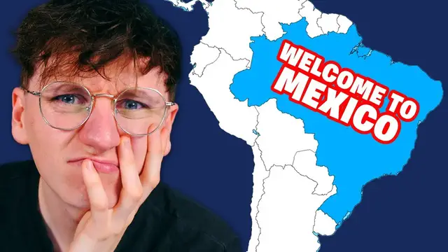
entirety of Africa. Oh, no. So this was found in an airport, presumably in Mexico, but that's not
4:46
Mexico. That's entirety of South America. And Mexico's not even in South America, it's in North
4:52
America. And it's not even a particularly accurate shape of South America either. How does this
4:56
happen? This is the one in an Airbnb. Australia once again just disappeared. But they have included
5:02
New Zealand, or at least some of New Zealand, which is interesting. This is in the official
5:06
textbook of history of my year. There's way too many things wrong. It's so bad when these things
5:11
are actually printed in school books. Let's notice some discrepancies. Well, India, I don't know how
5:16
he ended up over here. His borders also don't look the right shape. How many times am I gonna say
5:20
how does that happen in this video? Someone must have just moved it over and just wiped out all
5:25
the countries underneath in the process because they wanted it in one image. Is that how, why
5:29
This was broadcast on the news. Pretty serious story. Giant hornets kill 42 people in China and
5:36
presumably it was in Hong Kong, which some people say isn't even China anyway. But is this Hong Kong
5:42
No. Is it China? No. Is it Asia? No. Guess where it is
5:46
That's right. It's South America. How does this happen? Oh, no. Once again, broadcast on live TV
5:53
This time, Fox News. Talking about the Middle East, and it looks like the correct area this time
5:58
Fair enough. But why is that Egypt? Egypt's this fella over here. How on earth does this happen
6:04
This one really said New Zealand and Hawaii who. So, I don't mind not including Hawaii, because it's very dinky
6:09
So from this kind of distance on a simplified map doesn't matter too much
6:13
But New Zealand does not deserve to just vanish like that. What? Flying from California to Munich
6:19
So even if they got these the wrong way around, which they have, that's not Munich
6:23
Did they get it mixed up with Moscow? But even then, Moscow's nowhere near this part
6:27
I don't understand. MSNBC reunifies Czechoslovakia. So this can have been a particularly old story because they talking about issues in Ukraine However their map includes Czechoslovakia and where was that country split into 1993 where do people find the maps that they use to create
6:43
these graphics another american live news show cnn we're talking about ebola spreading in nigeria
6:49
well that's not nigeria that's niger nigeria is the one underneath be bigger than the world around
6:55
you little promotional leaflet thing here they've just skipped africa though someone somewhere along
7:00
the line of this graphic design must have removed africa you don't just accidentally delete africa
7:05
i don't understand whoa this one really is incorrect this is like unbelievably wrong so
7:10
they've whacked bulgaria here as this huge country in europe completely getting rid of so many places
7:15
like bosnia croatia albania montenegro they have put serbia above though interestingly even though
7:21
that is not where serbia is and it's massive so many countries have just been obliterated where
7:26
Where did they get this graphic? CNN again talking about Ukraine. They have not labelled Ukraine
7:32
They're not even in the correct continent. They're on the edge of India. I think they're on Pakistan
7:36
How does that happen? Whoa, this is a pretty bad one. So this was on Sri Lankan TV and they've simplified the US
7:42
which you can simplify maps. That's fine. Like you can round off some borders and stuff
7:46
if it's just for visual purposes and it's far zoomed out. But this, that's perhaps a step too far maybe
7:52
Not only is the original shape way too stretched, but it is unbelievably wrong
7:56
CBS talking about Argentina. They have got South America, which is nice
8:00
That's not Argentina though. Argentina's down here somewhere. This is Colombia. And hang on, it says Indian Ocean
8:06
It's not the Indian Ocean, is it? It's the Pacific Ocean, right? Yeah, of course it is
8:10
The Indian Ocean's all the way over here. What? There is just so much to be said here
8:14
Okay, well, let's zoom in. Right, well, I noticed the United Kingdom is just missing
8:18
Fair enough. Looks like Sweden's missing as well, which has made Norway look like the light on an anglerfish
8:23
I'm pretty sure this is maybe meant to be Madagascar, but it's being plonked down as New Zealand
8:29
This is China, but China doesn't go all the way over here. Also, Alaska isn't the same colour as the rest of the United States
8:35
Yeah, this is not great, is it? Okay, I think I'm done looking at terrible maps
8:39
I can't handle it anymore. I've got just so many questions my brain's going to explode
8:43
So thank you very much for watching. Please subscribe if you are new here. Click the like button as well because I never ask people to do that
8:48
All right, thanks. I'll see you later. Bye
#Fun & Trivia
#Hobbies & Leisure
#education
#Maps