Up next in 10


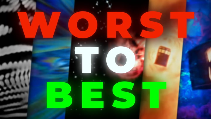
Doctor Who's iconic title sequence has been reimagined many, many times. But which is the best of the best... and the worst of the worst? Let's find out!
Show More Show Less View Video Transcript
0:00
From the TARDIS to the Daleks to the sonic screwdriver
0:03
Doctor Who has many iconic elements which are recognisable to even those who aren't
0:07
diehard fans of the franchise. Amongst those elements is the opening title sequence
0:12
Over the past 62 years, the title sequence has been through many changes and adaptations
0:17
both visually and audibly, whilst also remaining consistent enough to maintain its iconic status
0:23
Some changes have been minor, while others have showcased major progression in special effects
0:28
and elevated the show to a whole new level. So let's take a look at each variation
0:33
plus a few additions from elsewhere in the Who-niverse, and determine which is the worst and which is the best
0:38
I'm Ellie for Who Culture, and here is every Doctor Who title sequence
0:42
ranked from worst to best. Before we get into the main title sequences of the Who-niverse
0:48
let's take a look at some openings within the wider Doctor Who franchise that deserve some recognition
0:54
Kicking things off with Totally Doctor Who. Kids in the UK during the airing of Series 2 and 3 were treated to a fun behind-the-scenes
1:02
slash chat show on CBBC, which explored each new episode of the show
1:07
Hosted by Barney Harwood, Liz Parker for Series 1, and Kirsten O'Brien in Series 2
1:12
this was peak Doctor Who childhood in the mid-2000s, and the energetic comic book-style
1:18
animation of the opening title sequence perfectly highlights that naughties hype and nostalgia
1:23
for the show. This was the perfect intro for a more junior-centric behind-the-scenes show
1:29
full of bright colours and recognisable characters. Sticking with behind-the-scenes shows, next we
1:33
have Doctor Who Confidential. Airing on BBC3 after every episode of Doctor Who between 2005 and 2011
1:41
this show gave a great insight into the inner workings of the production. The opening titles
1:46
were simple yet effective. Opting for a blue variation of the Time Vortex filtered over various
1:52
clips from the upcoming episode and a more upbeat, bouncy version of the Doctor Who theme tune
1:58
It seems fitting that a show focused on pulling back the curtain on the behind-the-scenes magic
2:02
should have a more toned-down and to-the-point opening sequence. Finally, we have The Science of Doctor Who, an hour-long science lesson hosted by Professor
2:12
Brian Cox as part of the 50th anniversary celebrations. Focusing on the science behind
2:17
theories of time travel, black holes, and planets outside of our solar system, it's only fitting that
2:23
the opening title sequence combines science fiction with real science, as the TARDIS flies
2:28
through the time vortex whilst being seemingly chased by scientific equations. In over 60 years
2:33
of Doctor Who, it's actually surprising that we haven't seen something like this in the main show
2:37
itself. And speaking of the main show, let's take a trip into the main Who-niverse
2:42
Number 16, The Eleventh Doctor, 2012-2013. Following the departure of the Ponds, the second half of Matt Smith's final series saw the arrival of an entirely new version of the title sequence
2:56
The series 7B sequence forgoes the standard time vortex structure, as seen in the other openers from the revival era
3:03
and opts instead for a rather dizzying, fast-paced explosion of bright flashes and a lot of red
3:09
While beginning with the TARDIS flying through space, rather than follow its journey
3:13
we quickly lose track of it before being swept away into a series of spinning nebula imagery
3:18
that moves too fast to focus on properly. The TARDIS does then return at the close of the
3:22
sequence, where the doors open to reveal the opening frame of the episode. Now, this is one
3:27
of the smoothest transitions from titles to episode the show has seen, but it isn't enough
3:32
to redeem the mediocrity of what comes beforehand. While the return of the Doctor's face appearing
3:37
mid-sequence is certainly a welcome addition and a great nod to the openers of the classic era
3:41
it does bear wondering why it was decided to reimagine the opening so close to the end of Matt Smith's run
3:47
not to mention doing it midway through a series. It just feels a little bit unnecessary
3:53
Number 15, The Third Doctor, 1970-1973 The first title sequence for John Pertwee's Third Doctor was fairly similar to those of the previous two incarnations
4:04
but with one glaring difference. Color. 1970s Spearhead from Space saw Doctor Who burst into the realm of colourised television
4:12
and this new age of vibrancy opened up a whole world of creative avenues for the show to go down
4:18
While not necessarily a bad thing, it does seem as though the title sequence was perhaps an example
4:23
of the creatives getting overexcited with this new freedom and trying to show off every colour they possibly could all at once
4:30
We have red, we have orange, we have yellow, we have green, we have pink
4:34
You get the picture. The visuals and sequence itself, however, remains relatively unchanged
4:39
save for the replacement of Patrick Troughton's face with John Pertwee's and the introduction of a new style for the logo
4:45
While the explosions of colour were no doubt breathtaking for viewers at the time
4:49
the overall sequence doesn't stand out as anything particularly unique compared to others
4:55
14. The Seventh Doctor, 1987-1989 Right off the bat, the Seventh Doctor's title sequence gets brownie points for its purple colour scheme
5:06
Can you tell what my favourite colour is? But unfortunately, the rest of the sequence is a little forgettable in comparison to the majority of the others
5:13
One element that absolutely fits with the cheeky charm of the Seventh Doctor is the image of Sylvester McCoy winking at the viewer
5:20
And it must also be commended for attempting something different, with the TARDIS caught in some sort of bubble and the reimagining of the logo to lean more into the 80s 3D tech hype
5:30
While the technology used was undoubtedly impressive for the time, the entire sequence does feel a little slow-paced compared to those that came before
5:38
And it's hard not to see the computer-generated space rocks as anything other than three pieces of scrunched-up paper flying through the air
5:44
A perfectly fine title sequence, but not one destined to be remembered forevermore
5:49
13. The 13th Doctor, 2018-2022 The arrival of Jodie Whittaker and Chris Chibnall saw major changes to the modern era of Doctor Who
6:00
The first female Doctor, a new showrunner, changes in production, and a new composer
6:05
Sagan Akinola took over from Morigold, becoming only the second composer in 13 years of New Who
6:11
His version of the theme tune feels far more reminiscent of the Delia Derbyshire original, and this was no accident
6:17
During the creation process, Akinola experimented with sections from Derbyshire's original arrangement
6:22
before incorporating them back into his own version, claiming Derbyshire to be a huge inspiration for his creative process as a composer for Doctor Who
6:31
Not only was the new theme tune an homage to the classic era, so too were the visuals of this new title sequence
6:37
This kaleidoscopic effect feels very much like what the first Pertwee sequence would have looked like if they had the technology and budget of 2018 back in the 1970s While more minimalist than the previous sequences of the modern era
6:51
this version certainly highlights the high production values of the Chibnall era
6:55
and showcases some stunning VFX. I mean, that star field looks particularly mesmerising
7:00
While perhaps not the most memorable of title sequences, this one should certainly be commended for its incorporation of elements from the past
7:07
and for taking a more abstract approach following many years of a fairly tried and tested format
7:13
12. The Eighth Doctor, 1996 The 1996 TV movie does an excellent job of bridging the gap between classic and modern Who
7:24
and this is evident right from its opening. To begin with, the movie features a cold open
7:28
something commonplace in the revival era but extremely rare for classic Who
7:33
before moving into the title sequence. The visuals combine both elements from what came before, such as the return of the Pertwee era logo
7:41
while also introducing elements which would be refined and reused in the future
7:45
like the credits flying up through the time vortex. The most notable difference with the TV movie opening, though, is the theme music itself
7:52
With the prospect of revitalising the franchise and venturing into the United States
7:56
the theme was given the Hollywood treatment, which meant goodbye to the classic electronically produced arrangement
8:02
and hello to a fully orchestrated version from American composer John Debney
8:07
This really helped shift the tone of the show from a wacky British sci-fi show
8:11
to a potential global franchise, and is something that has become commonplace in the revival era
8:16
While the American reboot ultimately failed, there are so many elements in this opening title sequence
8:21
that would go on to influence the successful 2005 revival, and most importantly, pave the way for Morrie Gold's Doctor Who career
8:29
Number 11, The Sarah Jane Adventures, 2007-2011 The Sarah Jane Adventures was peak television for British kids in the mid-2000s
8:41
and yes, I am absolutely speaking from experience here. Following the success of the 2005 revival
8:47
the introduction of a more adult-focused spin-off in Torchwood, and the overwhelmingly positive response to classic companion Sarah Jane Smith
8:55
returning in Series 2's school reunion, it made perfect sense to create a second, more child-friendly spin-off
9:01
led by a fan-favourite character now familiar to both classic viewers and new
9:06
In keeping with the main show, the title sequence for The Sarah Jane Adventures follows a very similar format
9:11
carrying over the journeying through the Time Vortex style of the first four series of Doctor Who's modern era
9:17
Where it differs most obviously is with the inclusion of random letters and numbers
9:21
alongside the Time Vortex. Now, while this certainly looks cool, one does have to question its relevance to the show itself
9:27
At a guess, they perhaps link to Sarah Jane's job as an investigative journalist
9:32
But compared to other title sequences in the franchise, the themes here are a little less obvious
9:37
Now, from series three onwards, the title sequence was reduced to make room for a pre-title sequence
9:42
which featured Clyde Langer giving a brief overview of who Sarah Jane is
9:46
what she does, and who her companions are, alongside clips from the relevant series
9:51
Now, there's a debate as to whether this counts as part of the title sequence or not
9:55
but, regardless of its status, it was a fun addition to the CBBC programme
10:00
and may or may not be ingrained in the memories of many a child of the time
10:05
10. The Twelfth Doctor 2014-2017 If you've ever questioned whether it's worth posting your fan edits online
10:14
look no further than YouTube creator Billy Hanshaw to help you decide that it absolutely
10:19
is worth it. His fan-made title sequence for The Twelfth Doctor was noticed by Stephen
10:25
Moffat, who then hired him to design the real thing for Peter Capaldi's run as the Doctor
10:30
Now, what stands out most about this particular sequence is the choice to put more focus on the
10:34
time travel elements of the show, as opposed to all the previous sequences, which tend to focus
10:39
more on space imagery. Now, while space and nebula imagery is certainly visually appealing
10:44
especially in terms of scope and colours, and is used in this sequence, the imagery of clockwork
10:49
mechanisms and the TARDIS literally travelling through the middle of time itself was a breath
10:54
of fresh air for this famous title sequence, especially following the underwhelming effort
10:58
from Series 7B. The one element from its predecessor that was carried over to great effect was the
11:03
return of the Doctor's face appearing, and Capaldi's attack eyebrow stare fits perfectly
11:08
into the fold. Morigold's theme is tweaked slightly for this new incarnation, but nothing
11:13
majorly significant. Perhaps the greatest disservice to both Gold and Hanshaw is the
11:17
unfortunate sinking issues that seem to occur throughout the run, whereby the music and visuals
11:22
seemed to shift out of sync from week to week, which definitely caused some frustration among viewers
11:27
Despite this hiccup, though, this sequence absolutely deserves praise for its unique approach
11:32
and daring to explore a different avenue within the show's themes. Well done, Billy Hanshaw
11:37
Before we move on, though, let's also take a moment to highlight the silent title card in Series 9, Sleep No More
11:43
which replaced the usual title sequence to keep him fitting with the found footage style
11:47
of the episode. This was a great addition to the episode, and it enhanced the themes
11:51
without suddenly interrupting the atmosphere with the upbeat theme tune. Honestly, it's a shame that things like this aren't done more often
11:59
Number 9. Torchwood 2006-2011 With Torchwood being the Doctor Who spin-off to focus on more adult themes and storylines
12:08
it stands to reason that the title sequence would follow suit. This is one of the quickest title sequences of the franchise
12:14
and strips away all the flamboyance of the main show in favour of a more mature, serious approach
12:20
With its black and red colour scheme and no-nonsense displaying of the cast names
12:24
it's clear from the offset that this is a show for the parents, not the kids
12:28
Like the Sarah Jane Adventures, the first two series of Torchwood also opened each episode with a pre-title sequence
12:34
featuring a speech from Captain Jack Harkness about what Torchwood is, alongside clips from the various episodes
12:41
This also served to highlight that this was a more mature show once again
12:45
with mention of Torchwood arming the human race against the future, including multiple clips of gunfire and displaying creatures much scarier than any scene in Doctor Who
12:54
We get it. This isn't for kids. Torchwood's third series, Children of Earth, went even more minimalist
13:00
opting to forego the opening title sequence altogether in favour of a simple title card which changed the day number with each episode
13:08
Like the Sleep No More title card, this was the right choice for this particular story
13:12
The tone and themes of Children of Earth would have felt less intense
13:15
if each episode had began with a brief interlude to highlight that it's a work of fiction
13:20
Where Children of Earth thrives is in the gut relatability and pure terror the situation evokes Nothing should break that hold Miracle Day could be mistaken for a medical drama based on its title sequence alone
13:32
and yet with context, this does actually fit very well with the theme of the fourth series
13:37
Unlike the simplicity of the first series opener, this one feels very dramatic
13:42
which is no doubt a result of the American co-production of this final series of the show
13:46
Nevertheless, it serves well in building up the tension of the series and maintains the more serious tone that Torchwood holds within the Who-niverse
13:54
Number 8, The 11th Doctor, 2010-2012 The shift from RTD1 to the Stephen Moffat era
14:03
was likely the first experience of major change for many viewers of modern Doctor Who
14:08
As such, there was a fine line to be trodden in order to make sure that those viewers left feeling uneasy by the changes
14:14
wouldn't abandon ship. The new title sequence did this very well. While the visuals were distinctly different
14:19
the overall motion and concept of the sequence wasn't too far removed from the previous offering
14:24
and therefore kept an air of familiarity amongst those changes. The cloud-like variation of the time vortex worked really well with the more whimsical fairy tale vibes of the 11th Doctor's era
14:34
as did the tweaks made by Murray Gold on the theme music itself. The stone-like effect on the text, while maybe not intentional
14:41
also feels very fitting for an era so focused on the Weeping Angels. and the formation of the TARDIS shape using the DW initials was a stroke of creative genius
14:50
It's genuinely surprising that this had never been done before. This sequence remained consistent across Series 5 and 6
14:56
with the addition of Arthur Darville to the credits in the latter. Come the first half of Series 7, however, and things took a turn, and not for the better
15:04
Each week, the Doctor Who title was covered in a cheesy-looking texture
15:08
to fit with the theme of the episode, from dinosaur scales to the Statue of Liberty
15:12
But the most outrageous change for Series 7A was the use of what looked like an early 2010s Instagram filter over the entire sequence
15:21
which seemed to get darker and darker with each passing week. I mean, what were they thinking
15:25
A strong start with Series 5 and 6, but a real mixed bag heading into Series 7
15:30
A mixed bag that only got worse. Number 7, The Fourth, Fifth and Sixth Doctors, 1980 to 1986
15:37
Heading into the 1980s, the Doctor Who title sequence got the full disco treatment
15:43
John Nathan Turner commissioned a reimagining of the sequence, which saw Delia Derbyshire's arrangement replaced by a new rendition by Peter Howell
15:51
and a complete redesign for the visual elements. Taking heavy influence from the success of Star Wars
15:56
gone were the bright, trippy vibes of the 70s, and in came a more simplistic approach featuring star fields and lens flares
16:03
The diamond logo was also replaced with a new neon tube-like design
16:07
which quite literally screams 1980s in neon lights. In keeping with those that came before, however
16:13
the new sequence still featured the faces of the Doctors appearing on screen
16:17
created by the stars aligning to form the image. Although whoever chose the image for poor Tom Baker
16:22
deserves to be sat on by the Absorbalov. What is that? While the sequence remained almost identical for the Tom Baker and Peter Davison version
16:30
it received an upgrade for Colin Baker's run. While the overall contents of the sequence remained the same
16:36
Much more vibrancy was added. The star field became much fuller and injected with much more
16:41
colour, as did the neon logo. As for Colin Baker's image, animation was used to transition from a
16:47
slight smile to a big cheesy grin. For the Sixth Doctor's final season, the Peter Howell theme was
16:52
again replaced, this time with a version arranged by Dominic Glynn, which, dare I say, sounds even
16:57
more 80s than the previous one. Very much a sequence of its time, but when that time is the
17:02
era of 1980s disco, that's one heck of a fun time indeed. Number 6, Class, 2016. Oh, Class
17:12
The potential was there, but the interest was not. Unlike the previous spin-offs, Class fell
17:16
victim to being released online, rather than being broadcast on live TV, which instantly hindered its
17:22
chances of being a hit. Now, while streaming is commonplace now, back in 2016, the idea of BBC3
17:28
being switched to an online-only service was greatly criticised by viewers. As such, Class
17:33
didn't perform as well as it was hoped, and was cancelled after just one series. Now, while the
17:37
external issues might suggest that Class wasn't a good show, the characters and storylines were
17:42
certainly interesting, ending on a gripping cliffhanger no less, and the title sequence
17:47
was a surprisingly solid banger. While Torchwood opted for the more refined, mature style to fit
17:52
with its target audience, Class offered up a fun, catchy sequence to better suit the teen
17:57
young adult viewers. Rather than an original composition for the theme, this sequence introduced
18:02
a first for the Hooniverse, opting to use an existing song, Alex Clare's Up All Night, a song
18:08
with lyrics no less, over its opening title sequence. This could have easily been a disaster
18:13
but paired with the flashy, colourful visuals, fit perfectly with the vibes of the show. Visually
18:18
this sequence has enough similarities to identify it as a part of the Hooniverse
18:22
such as the time vortex-like patterns and nebula imagery popping up here and there
18:27
but also steps away from the norm by including flashes of not just one character's face
18:31
but all the main players. It's very reminiscent of many other teen, young adult TV shows of the time
18:37
And honestly, it's a real shame that Class wasn't given the chance to tell more stories
18:42
Number five, The First Doctor, 1963 to 1967. The one that started it all
18:49
Doctor Who was a revolutionary concept for the BBC back in the 1960s
18:54
Nothing like this had ever been done before, and so it was the perfect production to push
18:58
boundaries and explore the possibilities of science fiction. And this was certainly true of Bernard Lodge's original title sequence, which explored techniques
19:07
that, although simple by today's standards, were groundbreaking and otherworldly for the time
19:11
The pulsating waves were created by using a technique called the Howl Round effect, which
19:17
was achieved by pointing the camera at its own feedback on a monitor. Simple, but extremely
19:22
effective. Delia Derbyshire's original arrangement of the famous theme was also revolutionary for the
19:27
time. Rather than using traditional instruments to create the theme, Derbyshire recorded countless
19:32
electrical sounds, adjusted their pitch, and spliced them together to form a piece of music
19:37
In an age before synthesizers and computers could be used to create music, this was a painstaking
19:42
task, and an absolute triumph for Derbyshire. If only she'd known then how famous her work
19:47
could be over 60 years later. Now, the idea of having the image of the Doctor appear in
19:52
the sequence was explored for this first version, but was ultimately deemed too scary by producer
19:57
Verity Lambert. Of course, it wouldn't be long before that idea was revisited, but it's crazy
20:02
to think that a simple image of a man face would be considered too scary My my how times have changed Though it may be simple in comparison to those that followed it cannot be understated how groundbreaking this sequence was for television
20:14
at the time. So vital, in fact, that when it came time to celebrate Doctor Who's 50th anniversary
20:19
this was the sequence chosen to open the day of the Doctor. 4. The Third and Fourth Doctors – 1973-1980
20:28
John Pertwee's final season saw the first major changes for the Doctor Who title sequence
20:35
Still in the hands of Bernard Lodge, the new sequence introduced perhaps the most
20:39
recognizable element of the Doctor Who titles, something still used today, the Time Vortex
20:44
Gone were the wavy blobs of the HowlRound effect in favour of a tunnel-like visual that really
20:49
elevates the feeling of travelling through a portal to another world. Although a little cheesy
20:54
by today's standards, the image of the third Doctor panning out to a full body shot as it
20:58
travels down the tunnel also adds to the sense that this is a man who travels through these
21:02
space portals. The theme music remained unchanged, but audiences were treated to one of the greatest
21:07
logos the show has ever seen. In comparison to the more simple designs of the previous years
21:13
the iconic diamond logo gave a real sense that the show was upgrading as its popularity grew
21:18
The shape and tint of blue gives a sense that this could somehow be part of the TARDIS and
21:22
feels the most connected to the show itself. And speaking of the TARDIS, when Tom Baker arrived in
21:27
1974, the title sequence saw some tweaks made. Now, while the general concept remained very
21:33
similar, the TARDIS was incorporated into the sequence for the first time. It almost appears
21:38
to be travelling up the time vortex towards the audience, before cutting to a much more flattering
21:43
image of the fourth Doctor than what would appear in his next title sequence. While some of the
21:47
elements introduced here were dropped for a while, it's clear that these particular titles were highly
21:53
influential on the modern era of Doctor Who, and they still hold up very well today
21:57
3. The 14th and 15th Doctors, 2023-2025 With the 60th anniversary marking the grand return of Russell T. Davis as showrunner
22:09
David Tennant and Catherine Tate, and music maestro Murray Gold, there was plenty of excitement and plenty of curiosity about what everything would look like
22:17
In keeping with the diamond anniversary, it was only fitting for the iconic diamond logo to make
22:22
its return. With some minor 21st century VFX tweaking to add more dimension and definition
22:28
this logo is relatively unchanged from the original 1973 version. I mean, if it ain't broke
22:33
don't fix it, right? As for the title sequence itself, this is one of the most visually beautiful
22:38
sequences of the last 60 years. Now, more brownie points here for another purple colour scheme
22:42
which just feels like a perfect fit for the space imagery. It's clear that nostalgia does
22:47
play a part in the enjoyment of this sequence, but it's fun to point out the elements of past
22:52
sequences that have been reimagined for this version. The concept is very reminiscent of the
22:57
sequence of the RTD1 era, with the TARDIS travelling through the time vortex, but it also incorporates
23:03
the more cloudy, fiery visuals of the early 11th Doctor titles too. The music, now back in the hands
23:09
of Murray Gold, is a new arrangement, but also feels like a combination of the theme from both
23:13
RTD1 and the early Moffat era. Now moving into Shooty Gatwa's run as the 15th Doctor, the title
23:19
sequence remained virtually unchanged, save for the addition of a beautiful shot of the TARDIS
23:25
jumping from one portal to another through an asteroid field. It's remarkable how one tiny
23:30
adjustment can elevate something even higher, and this brief addition just puts the icing on the
23:36
cake for the most recent title sequence. 2. The Second Doctor, 1967-1969
23:44
Now, some might consider the placement of the Second Doctor's title sequence so high on the
23:49
list to be a rogue choice. There is a key reason for this decision. While the original title
23:54
sequence pushed boundaries and experimented with absurd ideas, the second sequence took all those
24:00
successes and improved upon them. The Howlround effect is still present, but more refined and
24:06
structured. Delia Derbyshire's theme is back, but with additional sounds to complement the more
24:10
layered visuals. The only major change saw the incorporation of an idea once abandoned
24:15
the image of the Doctor's face. Again, this wasn't an entirely new concept
24:20
but one adapted and re-explored in order to enhance what came before
24:24
There was a lot of pressure riding on Patrick Troughton's run as the second Doctor
24:27
The prospect of swapping out the main actor was a massive risk, and everything about the new run had to prove that this was still the same show
24:34
and that change was the key to longevity. Just like the character of the Doctor
24:38
if the core elements remain consistent across the incarnations, then no matter how many superficial changes are made
24:45
the show will always be recognized and revered by the fans. I think the second Doctor put it best
24:50
Life depends on change and renewal. Number 1. The 9th and 10th Doctors 2005-2010
24:58
Maybe nostalgia does play a part in the placement of the 9th and 10th Doctors title sequence
25:04
here at the top of this list. But it cannot be denied that this is one of the most energetic and adrenaline-pumping sequences
25:10
in the history of Doctor Who. The 2005 revival really was just that, a revival, taking everything that came before and ramping it up with refreshed energy and enthusiasm to revitalise Doctor Who back to its peak
25:24
Stepping into the 21st century, the VFX were unlike anything the show had seen before
25:29
The time vortex looked more vibrant and realistic than ever. The pace was much faster, adding to the feeling of new life and energy being pumped into the show
25:37
The TARDIS was back as the driving force of the sequence, and the new logo, though unbeknownst
25:42
to viewers at the time, linked nicely to the fiery orange redesign of regeneration that
25:47
would become a mainstay in the modern era. And then there's Murray Gold's new take on the theme
25:52
Taking clear inspiration from the 1996 movie version, Gold perfectly combines the full
25:57
power of the orchestra with the iconic electronic sounds to create the most powerful adaptation
26:02
of Delia Derbyshire's classic arrangement. Now, the theme went through some minor tweaks over the years
26:08
and it reached its absolute peak from Planet of the Dead onwards, where more emphasis was put on the strings to bring that extra dramatic beat
26:16
This sequence remained virtually unchanged throughout the entire RTD1 era, which only highlights its strength and popularity
26:23
They hit the nail on the head with this one, and have struggled to reach its heights in the years that have followed
26:28
Some have come close, but none have stolen the crown. And that concludes our list
26:33
please let me know your ranking in the comments down below. And if you like to watch the ranking videos
26:38
then why not check out every modern series ranked? Although we probably need to update that one now that season two has aired
26:45
Hmm. In the meantime, I've been Ellie for Who Culture, and in the words of Riversong herself
26:49
goodbye, sweeties
#Film & TV Industry
#TV & Video
#TV Shows & Programs