Up next in 10

Hey everyone, this is Mason from FilterGrade. Today we’re going to be using the Adobe Lightroom mobile app to edit urban and city photos.
Discover your new favorite mobile presets on FilterGrade: https://filtergrade.com/product-category/mobile-lightroom-presets/
The urban look relies heavily on a moody, desaturated look, and we’ll be going into detail on which tools to use to achieve this look, and how to use them. This is not a be-all end-all of tutorials, because every image is different. Experiment around with some of these settings to achieve your desired look.
Get dramatic and cinematic effects for urban and street photography using these techniques in the FREE mobile app for Lightroom from Adobe.
Download Lightroom Mobile
iOS – https://apps.apple.com/us/app/adobe-lightroom-photo-editor/id878783582
Android – https://play.google.com/store/apps/details?id=com.adobe.lrmobile
Photo Credits
1. https://stocksnap.io/photo/FK7ZUQ3XM4
2. https://stocksnap.io/photo/HQPIUR75UQ
--
Show More Show Less View Video Transcript
0:03
hey everyone this is Mason from filter
0:06
grade today we're going to be using the
0:08
Adobe Lightroom mobile app to edit urban
0:10
and city photos the urban look relies
0:13
heavily on a moody D saturated look and
0:15
when we go into detail on which tools to
0:17
use to achieve this look and how to use
0:19
them this is not a be-all end-all of
0:22
tutorials because every image is a
0:24
little bit different experiment around
0:26
with some of these settings to achieve
0:27
your desired look but hopefully this
0:29
gives you a good baseline we're going to
0:31
start by importing our image into
0:34
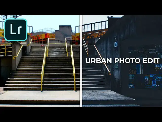
Lightroom so we have this image of a
0:38
stairway lots of concrete we've got some
0:41
yellow lines some yellow details in the
0:43
background but a very city setting here
0:46
so the first thing that we're gonna do
0:48
are bring up our settings we're gonna go
0:50
to the light tab 3 should start we might
0:54
mess with the exposure later but we're
0:56
gonna start by just slightly reducing
0:58
the exposure we want it to be a little
1:00
bit darker in here but we might end up
1:01
adjusting that later next we're going to
1:03
increase the contrast then we're going
1:07
to increase highlights a little bit
1:09
increase shadows a little bit increase
1:14
the whites they're a little whiter and
1:15
then decrease the blacks and then if we
1:19
go into our curves you can set 3 markers
1:23
here and then we're going to want to
1:26
bring up our highlights a little bit
1:28
bring up our mid-tones a little bit
1:30
bring down the black slightly and then
1:33
bring up the shadows just a little bit
1:36
so they're a little bit into the gray
1:38
tones there now we can go to the color
1:42
tab here and the first thing we're gonna
1:45
want to do is give it a slightly cooler
1:47
temperature so we're gonna go a little
1:49
bit into the blues here as you can see
1:52
we're already making a lot of progress
1:54
we have these deep moody shadows and the
1:56
shadows are sort of in there
1:58
blue tones now we're going to go to
2:00
vibrance and we're going to decrease
2:01
that a fair bit so it almost starts to
2:05
become a black and white photo and we're
2:07
going to increase the saturation a
2:08
little bit this is going to make sure
2:11
that the colors that we want to bring
2:13
out our brought out very strongly and
2:15
everything else is more subdued urban
2:17
photography editing benefits from using
2:20
orange tones and subduing everything
2:23
else so if we go into the color mix tab
2:25
here we're actually gonna take our reds
2:28
and yellows and turn them Orange and
2:30
then we're going to reduce everything
2:31
except for our oranges so we take the
2:34
red hue here move it Orange then we can
2:37
increase the saturation and luminance a
2:39
little bit but it's not too big of a
2:41
deal if we go to Orange that looks good
2:44
we're gonna up the luminance a little
2:46
bit so it really comes out if we're
2:48
gonna go to yellow also move that to
2:50
orange and then everything else if we're
2:53
going to turn the saturation all the way
2:56
down so it pretty much just doesn't show
2:58
up now as you can see that blue didn't
3:06
really do what we wanted it to so we're
3:08
gonna bring some of that back up we're
3:09
gonna bring the Blues back into this
3:10
image but obviously we don't want to go
3:13
too far you know let's just keep them
3:19
just a little bit lower than zero and
3:22
then say done now we're going to go into
3:26
some additional effects and we'll need
3:29
to use a couple of these we're going to
3:31
increase the clarity that sort of helps
3:33
give it a a grungy look obviously I want
3:35
to go too far but if we go just a little
3:37
bit up that gives it some extra texture
3:40
and we want to add a vignette a little
3:45
bit yet there and then feather it so
3:48
it's not as harsh
3:51
[Music]
3:53
so we're looking pretty good right now I
3:55
don't love how blown out this bottom
3:58
stairway is though so I'm gonna go back
4:00
to our lighting and see okay we can
4:06
reduce our highlights yeah
4:08
reducing our highlights really brings a
4:10
lot of that texture back but our
4:11
vignette is a little too much now sorry
4:14
go back to vignette and reduce it so
4:16
it's just barely there on the edges now
4:20
we have a lot more texture gives it a
4:22
lot more of a grungy Moody City look and
4:24
now if you want to really give it some
4:28
some of the blue moodiness we can go
4:30
back and we can make the color
4:33
temperature more blue let's undo that
4:35
and then let's go back into here and
4:39
we're gonna go to split toning and here
4:41
we can actually decide what color the
4:42
highlights and shadows should be and if
4:45
we take those two a fairly desaturated
4:47
blue for both of them that can kind of
4:55
give us that dark slightly blue tone
4:59
that we want as you can see the Blues
5:01
are coming out and the oranges are
5:02
coming out this is exactly what we want
5:03
I think the only thing that would make
5:05
this better is actually if we reduce the
5:07
vibrance even more
5:10
maybe the saturation a little bit as
5:12
well we don't need as much saturation as
5:14
it seemed like and here is our final
5:16
product now let's try this one
5:19
this one is a little bit different it's
5:22
brightly lit has a very orange town this
5:26
looks like it might be a bit of a
5:27
challenge to turn into something dark
5:28
and moody because the original photo was
5:30
not dark and moody at all but this will
5:33
show you that it doesn't matter what the
5:36
original photo was you can really turn
5:37
it into whatever you want it to be so
5:39
we'll start with the exposure turning
5:41
that down a little bit and we're gonna
5:43
up the contrast actually I don't like
5:46
how dark that became let's keep the
5:48
exposure at zero for now and then we're
5:51
going to increase the highlights a bit
5:53
[Music]
5:56
you increase the shadows increase the
6:00
whites increase the blacks a little less
6:06
highlights then go into our curves
6:10
create our three points do the same
6:12
thing we did before and arrays
6:15
highlights raise the mid-tones lower the
6:18
shadows bring up the blacks to a little
6:21
more gray we're already getting sort of
6:24
a photo filter look here but we're still
6:27
very orange so we're gonna go to the
6:28
color tab turn that temperature nice and
6:32
blue now we have a nice more neutral
6:35
tone going on and vibrance turn that way
6:40
down saturation turn it a little bit up
6:44
already looking good and if we go into
6:47
the color mix as before we're gonna turn
6:49
the reds and yellows into oranges boost
6:53
the orange saturation then for
6:56
everything else we're going to reduce
6:57
the saturation down to nothing except
7:00
for blue which we so really that's only
7:07
adjusting the center where the buildings
7:09
are you can see so we're gonna keep that
7:12
relatively be saturated but not too bad
7:16
can we make it darker
7:21
and make it a little bit darker ooh but
7:26
we don't want to change the luminance
7:27
much it looks good as it is so I'll stay
7:34
done and so far looking pretty good
7:38
there's the original and here's what
7:40
we've created so we could stop here if
7:43
you wanted to other than adding a
7:45
vignette of course always helps increase
7:50
the feather on that vignette a little
7:52
bit now I've got some pretty good to
7:57
enhance this you could decrease the
7:59
color temperature more if you wanted to
8:01
get rid of some of those warm tones make
8:03
it a little cooler and then you can also
8:06
go into split toning again and make the
8:11
highlights and shadows blue but in this
8:15
case I don't think really adds much to
8:17
the image we're gonna warm that back up
8:23
a little bit and then let's go see if
8:26
clarity does much for us oh yeah clarity
8:29
will give us a bit grungier of a look
8:30
this one's a little too much texture I
8:32
think so we're gonna scale that back
8:34
down to just a little bit there we go
8:38
there's another piece of urban
8:40
photography this one's a little less
8:42
desaturate because there's a lot of
8:44
orange tones in the buildings and
8:46
everything so this one's a little bit
8:48
warmer than the last one but still very
8:50
grungy and urban well hopefully you
8:53
found this video interesting this is of
8:55
course a template if you will for
8:59
editing urban photography as you can see
9:01
I made a lot of adjustments on the fly
9:03
this is not set in stone it doesn't work
9:07
for everything so make sure that you
9:10
take a photo that works for what you
9:13
want to do with
9:15
make sure that you are cautious of other
9:18
colors in this case there was plenty of
9:20
orange to work with but you know if
9:22
there's plants or anything like that
9:23
then you're going to need to adjust your
9:26
greens make sure that nothing looks out
9:29
of place if you desaturate everything
9:31
and end up with a bright green tree that
9:33
is now gray it might look a little weird
9:35
even when you are trying to achieve that
9:37
look so keep in mind that every photo is
9:40
different and go out there and have fun
9:41
editing if you enjoyed this video be
9:45
sure to LIKE and subscribe and leave a
9:47
comment down below and if you're looking
9:48
for professional Luntz lightroom desktop
9:51
and mobile presets Premiere Pro
9:52
templates and more photo and video
9:54
education visit filter grade comm today
9:58
[Music]