Up next in 10

Build a Stunning Nifty Indices Heatmap Dashboard using Python & Streamlit | NSE Data Visualization
May 6, 2025
Want to visualize the Indian stock market in seconds? Learn how to build an interactive Nifty Indices Heatmap Dashboard using Python and Streamlit — perfect for traders, investors, and data geeks.
In this video, we’ll walk through:
✅ Live data from NSE (without any paid API)
✅ Treemap heatmap visualization of index constituents
✅ Filters for Gainers, Losers & All stocks
✅ Market breadth donut chart (Advances, Declines, No Change)
✅ Simple, clean UI built in Streamlit
Whether you're a beginner in Python or someone building your own trading tools, this project is a great hands-on learning experience.
📘 Read the full blog post and download the code for free here:
👉 https://fabtrader.in/build-nifty-indices-heatmap-visualization-using-python/
💬 Have questions? Drop a comment below! If you found this useful, Like 👍, Share 📢, and Subscribe 🔔 for more Python and trading-related content! 🚀
I would love to hear from you! 😊
Email : [email protected]
Website: https://fabtrader.in/
Telegram Channel : https://t.me/fabtraderinc
Show More Show Less View Video Transcript
0:00
Hello everyone, welcome back. Um, if you
0:02
had just say 10 seconds to figure out
0:03
what's going on in the market, like
0:05
which sectors are hot, which ones are
0:06
dragging and where the momentum is, uh,
0:08
could you do it? Right, if you're like
0:10
most traders or investors, you're
0:12
probably juggling between three or four
0:13
tabs, maybe a market overview page, a
0:15
charting platform, or your broker app
0:17
just to make sense of, you know, the
0:18
day's action. It's kind of very messy
0:20
and it wastes a lot of time. That's
0:22
exactly why I decided to build something
0:23
simple, clean and what I believe to be
0:25
uh a useful tool called the nifty
0:27
indices heat map dashboard uh just by
0:30
using Python and Streamllet. And the
0:32
best part is it doesn't require any API.
0:34
There's no complex web scraping
0:35
required. Uh it's all done using
0:36
publicly available data and in less than
0:38
100 lines of code. In this video, I'll
0:40
walk you through the exact features of
0:42
this dashboard, how it works, and why
0:43
it's a great project even for beginner
0:45
Python users and how you could build it
0:46
or use it for free. So, let's jump in.
0:50
If this is your first time here,
0:51
welcome. My name is Vive and I'm a
0:52
finanially independent algo trader. This
0:54
channel is all about building a
0:55
community of algo traders. We discuss
0:56
everything about a trading using Python
0:58
building and practicing trading
0:59
strategies, market updates and much
1:00
more. Please do visit our community
1:02
website fabtrader.in. Also, do check out
1:04
my other YouTube channel Fabe where I
1:06
talk about my own financial independence
1:07
journey and share tools, methods, and
1:08
strategies that help me achieve my
1:10
financial freedom. Thank you.
1:14
As usual, the details of what I'm
1:15
covering uh in this video along with the
1:17
full Python code is available on our
1:18
community website faprader.in. I will
1:20
share the link to this article in the
1:22
description and the comment section
1:23
below this video. So, what exactly is
1:24
this tool? Um I was working on a side
1:26
project uh which involves building a
1:28
dashboard that can give quick deep
1:30
insights of the market. Um as part of
1:32
it, I built this small tool and I
1:33
thought that there could be probably
1:34
people out there looking looking to
1:35
build something similar. Hence, just
1:36
wanted to share my code with you. The
1:38
index heatmat dashboard is pretty simple
1:40
and gives you a quick visual pulse of
1:42
the Indian stock market. The tool is
1:43
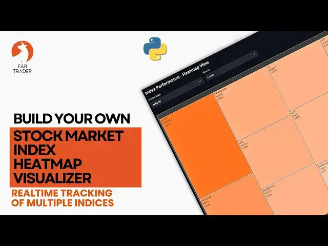
pretty simple. Uh at the top you have
1:45
this dropown which contains all the
1:46
currently available uh NS indices here.
1:49
Uh in future anything gets added it's
1:50
customizable. You can add it to the list
1:52
and then whenever you select uh an index
1:54
here from this list the tool
1:55
automatically pulls up data from the NSE
1:57
website uh things like you know what
1:58
what stocks are constituents or of the
2:00
the particular index that you've
2:01
selected what it latest price
2:02
information and all that and then
2:04
presents that in a in a heat map format
2:06
right here. Since I've selected the
2:07
slice by as market cap, uh each box
2:09
basically represents the the relative
2:11
market cap size of these stocks and then
2:13
the color coding is as such that
2:14
anything that is negative is is on the
2:16
reddish uh tone and anything that is
2:18
positive is on the green tone and
2:19
everything in between. So with one
2:21
glance, you can instantly tell which
2:22
stocks are leading uh in the index and
2:24
where the momentum lies. Even better,
2:26
you have three display modes here. The
2:27
the first one as I explained is the
2:28
market cap which basically displays
2:30
based on the market cap and then you can
2:31
go by the gainers the top gainers within
2:33
that indices along with how much
2:35
percentage it is gained and then
2:36
similarly for losers uh within that
2:38
index as well. I have a general appeal
2:39
to make uh close to 80% of the people
2:41
who watch my videos don't seem to be
2:42
subscribing. As you're aware this
2:44
community is just one person initiative
2:46
dedicated to help people on their fire
2:47
and wellbuilding journey. Running and
2:49
maintaining this community takes time,
2:50
effort and resources from my side. Um
2:52
one way you could support this community
2:53
is by subscribing, liking and also
2:54
sharing this content with your friends.
2:55
This will motivate me to do more such
2:57
videos and keep this community alive.
2:58
Thank you. It's also perfect for
3:00
scanning specific sectors. In this case,
3:02
Nifty farmer I've selected. So this way
3:04
you can identify where the intraday the
3:06
trading opportunities are or just
3:07
understanding where the the market is
3:08
overall moving. I've also added a little
3:11
donut chart to show the overall market
3:13
breath here. Uh which basically gives
3:14
you the number of advancing stocks,
3:15
declining stocks and how many basically
3:17
have stayed flat. Uh and yes, the you
3:19
can style all of this just the way you
3:20
want to. Change the colors, layout,
3:22
size, uh even add auto refresh
3:24
functionality if you like. And the best
3:26
part is this entire project is beginner
3:27
friendly. If you know basic Python and a
3:29
bit of Streamlit, you can uh install
3:30
this and get it working in a few
3:32
seconds. So go check it out, play with
3:34
the dashboard and customize it uh for
3:36
your own use. And uh if you want me to
3:38
extend this project, maybe add a few
3:39
price charts, live news alerts, some
3:41
volume trends. Uh you know, let me know
3:43
in the comments. I'm already planning a
3:44
version two on this one. So I I'll
3:46
definitely include that to my backlog
3:47
and I'll build it in my uh you know, in
3:49
the dashboard and I'll I'll cover that
3:50
in the next video. A quick look at the
3:52
the code implementation here. It's
3:53
pretty straightforward. There are only
3:54
two main aspects that you need to worry
3:55
about. One is the the index list. So
3:57
I've like I said I've added all the
3:58
available nsdes here. So if anything
4:00
comes in the future or gets changed, you
4:02
can always change this and automatically
4:03
the the information will be available to
4:05
you in the drop down in the the tool
4:06
itself. The the second most important
4:08
part is this particular function. Uh
4:10
this is the function where for any index
4:11
that you've selected, it basically
4:13
scrapes the NSA India website, gets all
4:14
the relevant information from there real
4:16
time uh and and uh supplies that into
4:18
the the dashboard itself. Apart from
4:20
that, the the code is very very simple
4:21
as you can see is is really
4:23
straightforward. If you're someone who's
4:25
new to Streamlit, uh the way you run it
4:27
is uh you know uh just just type stream
4:29
run and then whatever program that
4:30
you're trying to run and then once once
4:32
you run this, it basically open up uh a
4:34
separate web page uh with with a
4:36
dashboard on it. Thanks for watching the
4:39
video. If this project sounds useful,
4:40
please make sure you uh subscribe and
4:42
share it with your friends. Uh this will
4:43
motivate me to bring more such tools to
4:44
you in the future. Until next time, stay
4:46
curious, keep building and trade smart.
4:48
Cheers. If you haven't joined our
4:50
Telegram group, please do so. I share
4:51
market insights, algo trading tips, and
4:53
new video notifications. And this way
4:54
you can stay up to date with our
4:55
community news and events. If you
4:57
genuinely found this video useful,
4:59
please consider subscribing and liking
5:00
the video. And I will see you soon in
5:01
another video. And until then, take care
5:03
and happy trading.
#Computers & Electronics
#Programming
#Finance