Up next in 10

The "Custom Checkbox Tutorial" is an instructional video aimed at web developers seeking to create visually appealing and customizable checkboxes for their websites or applications. Throughout the tutorial, viewers are guided step-by-step through the process of designing and implementing custom checkbox styles using HTML and CSS. The video covers essential concepts such as checkbox structure, styling using CSS properties like borders, backgrounds, and transitions, and enhancing interactivity with hover and active states. By following clear demonstrations and explanations, viewers can learn how to create checkboxes that match the design aesthetic of their projects and improve user experience. Whether you're a beginner exploring front-end development or an experienced developer looking to enhance your UI design skills, this tutorial offers valuable insights into creating custom checkboxes with HTML and CSS.
Show More Show Less View Video Transcript
0:00
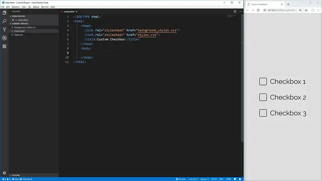
Hello everybody, welcome to another CSS challenge video. In this video, I'm going to be covering the surprisingly difficult yet
0:06
extremely common problem of creating custom checkboxes. As you can see on the right here
0:11
I have three custom checkboxes that all have hover effects, all work when you click them
0:16
all uncheck when you click them again, and they work exactly the same as a normal checkbox
0:21
You can even tab through them as you can see I got a little shadow effect when you tab to it
0:25
They all work exactly like a normal checkbox would and they'll even work for people that are
0:30
using screen readers or other such devices to tab through the checkboxes or to read the labels from
0:35
the checkboxes as they go, which is one of the things that is commonly forgotten when creating
0:40
custom checkboxes. So to get started here, let's create the HTML that we're going to need for these
0:45
checkboxes. Luckily, this is pretty simple, we just need a div that is going to wrap our checkbox
0:50
so we'll give it a class here, we'll just call it checkbox container, and inside of here we're
0:57
going to put our actual checkbox contents. So first we want to put the input element for the
1:02
checkbox, we're going to give it a type here and it's going to be checkbox, and then we'll give
1:07
it an ID here, we'll just call this one checkbox1 here, close that off, and then we're also going
1:13
to need a label for our checkbox, so let's put a label. We need to give it a for tag, the for
1:19
attribute says what is this label for, and it is for our checkbox1 input right here, cb1, so we say
1:26
for cb1, we essentially just put the ID of what this label corresponds with, and then inside of
1:32
here we're going to put checkbox1, we'll save that, open that up with live server, and then since we
1:40
use this for attribute, clicking on the actual label will check the checkbox or uncheck it as
1:46
we want it to. So I'm just going to copy this checkbox container here, paste it down two more
1:51
times so that we have three checkboxes just like in the example before, and I'll just change the
1:56
IDs and numbers here to be sequentially in order, so we got checkbox2 up there, and then down here
2:02
we'll have checkbox3, and if you save that we now have three checkboxes just as we do over here
2:07
and we're ready to jump into the styles to style these actual checkboxes. The first thing I want
2:13
to do is set up our box sizing to be border box just so that sizing our actual elements will be
2:19
easier with our widths and heights, and then we can go on to styling the container, so we'll use
2:24
checkbox container here, and we're going to use flexbox in order to lay out our checkbox input
2:31
element and our label because flexbox makes it extremely easily to vertically align our elements
2:37
As you can see over here our checkbox is actually at the top of our text, if we zoom in here you can
2:42
see that it doesn't line up quite right with the bottom of our text, so what we want to do is make
2:46
it so that it's positioned exactly in the center, so we'll use display of flex here, and then align
2:52
items center in order to center those things vertically, and now you can see our checkbox is
2:56
dead center with our text which is exactly what we want. Now we can move on to actually styling
3:02
the label for our checkbox here, so let's go to our checkbox container class here, and we want to
3:08
select the label inside of that, and all we want to do in here is essentially make it so that our
3:13
label has a pointer when we hover over it because we want to indicate that it's clickable, so in here
3:19
we're going to change our cursor and we're going to make it pointer, so now when we hover over our
3:24
label we now get our pointer icon, and we're also going to want to do the same thing on our checkbox
3:28
so let's create another selector here, and this time it's going to be for an input element
3:33
and we want to only select our checkbox inputs, so we'll say when the type is equal to checkbox
3:40
then we want to use another cursor of pointer here, so now hovering over the checkbox or the actual
3:47
label will give us a pointer icon so that we would know it's clickable instead of just the normal
3:52
cursor. The next thing that we're going to want to do is we're going to want to hide this actual
3:56
input element for the checkbox because it's not easy to style these across different browsers
4:01
so we're going to create our own checkbox icon from scratch, so inside of our checkbox selector
4:06
here the first thing you'd think of doing is just using display none to completely remove this
4:10
element, and that will work, but now we can no longer tab through our different checkboxes
4:15
and screen readers won't actually pick up these checkbox items since they're no longer being
4:19
displayed, so instead what we want to use is we want to set the opacity to zero, and now it'll be
4:25
disappeared, but we also want to make it so that our checkbox input element is not in our document
4:31
and taking up space. If we were to change this to be 50 opacity you see this checkbox icon is still
4:37
here, and it's taking up space even when we change it to zero, you can see the text doesn't move over
4:42
to fill in that space, so if we use position of absolute now our element is no longer inside of
4:49
the document taking up space, so our checkbox elements are now exactly where they need to be
4:54
so if we change this back to 0.5 you can see it's just overlaying inside of our label, which is fine
4:59
for our use case, we can change it back to zero, and now this is essentially the same as if we had
5:04
done display none. This is one of the steps that is commonly overlooked when creating custom
5:09
checkboxes, and is incredibly important in order to support tabbing, which is very common, as well
5:14
as screen readers for people that have problems seeing. The next thing we want to do is create our
5:18
new checkbox icon. In order to do this we're going to select our label element, and we're going to
5:25
use a pseudo element selector of before, which essentially adds in content before our label
5:31
so if we use the before selector here, and we need to supply content for any type of pseudo element
5:37
such as before, and our content is just going to be blank since we don't want anything inside of
5:41
our icon, and then what we want to do is we want to give it a width and a height, we're just going
5:47
to use 1em, that way our checkbox will scale with our font size and always be the correct size no
5:52
matter if our font is as big as a heading or as small as a paragraph. We'll do the same thing for
5:57
the height so we have a perfect square, and then we'll give it a border here so that we can see
6:02
what we're working with. We'll also use em with this so that way it'll scale with our font size
6:07
we'll make it solid black, and if you save that you'll see that our checkboxes actually don't
6:12
have any width being applied to them, and that's because these pseudo elements here inherit the
6:18
display of their parent so right now our pseudo element for our label is inline since labels are
6:24
inline by default and inline elements can't have any width. So let's go up to our label here and
6:29
we'll change this to display flex which will make displaying our checkbox icon where we want it
6:34
easier in the future, and if we save that you now see that we have these three checkbox icons which
6:39
is perfect. They don't do anything right now when we click on them but we'll add that functionality
6:43
in a little bit. Let's finish styling up our element here by adding a border radius to it
6:48
to slightly round the corners we'll just say 0.15 em again so that it will scale with the size of
6:55
our font, and then lastly we'll use a margin on the right side of 0.5 em and if we save that we
7:01
now have checkbox icons that look very similar to the checkbox icons over here. In order to add a
7:07
hover effect to our icon we'll go down here select our label and we'll say when we hover over our
7:12
label we want to change the before element of our label and we want to give it a background color
7:18
here and we'll just use a light green background color here and if we save that hovering over our
7:26
label will now cause our checkbox to have that background color which is exactly what we want
7:32
but because we used an opacity of zero and position absolute for our checkbox element
7:37
you see when we hover over here our checkbox element is hidden right here with the opacity
7:42
of zero. I'll make this 0.5 so we can see it you can see when we hover over that we no longer get
7:47
our background color and that's because we're no longer hovering over our label we're hovering over
7:52
our checkbox element. So we'll add another selector here using the checkbox container again and this
7:58
time we'll use it to select the actual checkbox instead of the label so we'll say input with the
8:04
type equal to checkbox and then we want to select when it's being hovered and then we want to change
8:10
our label which is the very next child of our element so we'll use the plus selector which
8:16
selects the very next sibling next to this element which will be our label so we'll say label and the
8:23
before element is what we want to change and now when we save that hovering over our actual checkbox
8:28
icon we'll also do the highlight on our new checkbox icon that we created which is exactly
8:34
what we want and essentially this selector is saying inside of our checkbox container look for
8:39
our checkbox input element when we hover over it select the very next child that is a label and
8:46
take the before element and give it this background color and this works because our label is after
8:51
our input if we instead made our label before our input we would no longer get that hover effect
8:57
when we went over this element so we need our label to always be after our input in order to
9:02
get this hover effect using the plus selector here let me change this opacity back to zero so we no
9:08
longer see those checkbox icons and the next thing that we want to do is make it so that when we
9:13
click on our checkbox it will actually do something it'll add the check and change our background color
9:18
so let's go down here we'll select our checkbox container again we'll select the input element
9:24
with the type of checkbox and instead of hover we want to say checked which will be selected
9:31
whenever our checkbox is checked and then we again want to select the label before element
9:39
so now in here what we want to do is change the background color to be a slightly darker green
9:44
color get that right here so now if we save that you can see when we hover it it's a slight green
9:52
and we check it it's a slightly darker green color which is perfect and that'll work for all
9:56
of them and they'll stay that way even when we unselect them and then if we uncheck it you'll
10:00
see that this dark green color will go away and it's already starting to act a lot like a normal
10:05
checkbox next what we want to do is add in that actual checkbox icon and in order to do that we
10:11
want to use the content selector here and that'll tell us what content do we want to be inside of
10:16
our element and we want a checkmark icon and in order to get that checkmark icon in css all we
10:22
need to do is use this icon code which is 002714 which stands for a checkmark icon so now if we
10:30
save this and go and click on one of our boxes here you'll see we now get our checkbox icon
10:35
inside of our checkbox and if we uncheck it it'll go away and it'll stay there for all of our
10:40
different checkboxes but currently this checkmark icon is not displayed very well so we want to
10:46
change our display a little bit in order to make it so that it's centered inside of our icon so
10:50
we'll go down here we'll use display of flex inside of here we'll justify the content into
10:57
the center to make it so that it is center aligned horizontally as well as we'll align the items
11:04
in the center to vertically align it center and now our checkmark icon is perfectly in the center
11:09
of our checkbox and the last thing we need to do is change our text color to be white so that our
11:14
checkmark icon will show up a little bit better than the black icon now you'll see when we go and
11:19
use these checkboxes they'll all work exactly as expected but normally when you click on a checkbox
11:24
before releasing something should happen to show that you've clicked on it so in order to do that
11:29
we're going to use the focus state this will also allow us to see which checkbox we have
11:34
hovered over when we use tab in order to select our checkboxes instead of the mouse cursor so in
11:40
order to select that we'll go into our checkbox container here we'll use our input element to
11:45
select our checkbox and then we'll use the focus attribute in order to say which checkbox are we
11:53
currently focused on and then since we want to style the label we'll use that sibling selector
11:58
to get the before element of our label and what we want to do in here is use a box shadow in order to
12:04
use that shadow effect that we see here when we click on an element and focus on it or tab through
12:10
our elements so in order to do that we want to use the first property of our box shadow which is our
12:16
offset in the x direction which we want to be zero since we want our box shadow to be in the dead
12:20
center of our x-axis as well as zero for the y-axis offset and then this third property is going to be
12:28
the amount of blur we want our shadow to have so we want to use 20 pixels so that it'll blur a little
12:33
bit away from our checkbox but not too far and then lastly we'll just use a color of black here
12:40
and if we save that now when we click on it you see we get this shadow around our checkbox and
12:45
this works for all of our checkboxes as well as when we tab through them. Now the only thing left
12:51
to do is go back into our index.html here and add in some line breaks here in order to space out our
12:58
checkboxes and if you save that our checkboxes now work exactly the same as our checkboxes over
13:04
here on this page and that's exactly what we want. This is perfect. The best part about these checkboxes
13:09
is not only do they look good but they function exactly the same as normal checkboxes and they're
13:15
completely accessible to people using screen readers or people that are using their tab and
13:19
spacebar to select their checkboxes as opposed to the mouse. The code for these checkboxes may look
13:26
deceivingly difficult due to these extremely long selectors that we have but it's actually a lot
13:31
simpler than it looks. Essentially all we're doing is selecting our input element inside of our
13:35
container that we created for our custom checkboxes and then we're just determining which type of state
13:40
we want to style. Do we want to style when we're hovering? Do we want to style when we focus on it
13:44
Or do we want to style it when we have it checked? And that's all that we're really doing with these
13:48
big long selectors. So there's really not much code that goes into creating these checkboxes
13:54
and the most important part of this code is right here where we change the old checkbox to be an
13:58
opacity of zero and position absolute which allows us to have accessible checkboxes for people using
14:05
screen readers or the tab key as I've mentioned earlier. This is something that's very often
14:09
forgotten but is crucial when creating these checkboxes. We also used ems in order to style
14:15
our actual checkbox sizing so if we go up to our label element and increase our font size to be for
14:20
example 50 pixels, save that, and zoom out you'll see our checkbox actually scales to be the exact
14:26
same size as our checkbox text here and all the spacing is exactly the same. So I hope you guys
14:32
enjoyed this video and learned something about making scalable and accessible good-looking custom
14:37
checkboxes. If you guys did enjoy it please leave a like down below and let me know what kind of
14:42
CSS challenges you want me to complete in the future. Thank you guys very much for watching and have a good day
#Software
#Operating Systems
#Software Utilities