Up next in 10

Build a React.js react-input-autosize to Change Size and Appearence of Text Field in Browser
Jan 9, 2025
Buy the full source code of application here:
Show More Show Less View Video Transcript
0:00
uh hello guys welcome to this video so
0:02
in this video I will show you a react
0:04
CHS package with the help of which you
0:06
can control the width and the height of
0:09
the text input field so if you want the
0:12
variable size uh input text Fields you
0:17
can use this package you can control the
0:18
width height look and Fe everything
0:20
about this so there is a custom
0:22
component inside the react CH
0:25
specifically designed for controlling
0:27
the width and the height of the input
0:29
fields so the package name is react
0:31
input Auto size so from the name
0:35
itself from this package you can control
0:38
the size of the input field so Auto
0:41
resizing is allowed at Dynamic times
0:45
this is actually the package I've
0:47
already installed it it's almost got
0:49
over a million downloads 1 million
0:52
downloads so it's a pretty popular
0:54
package so I will just show you a very
0:56
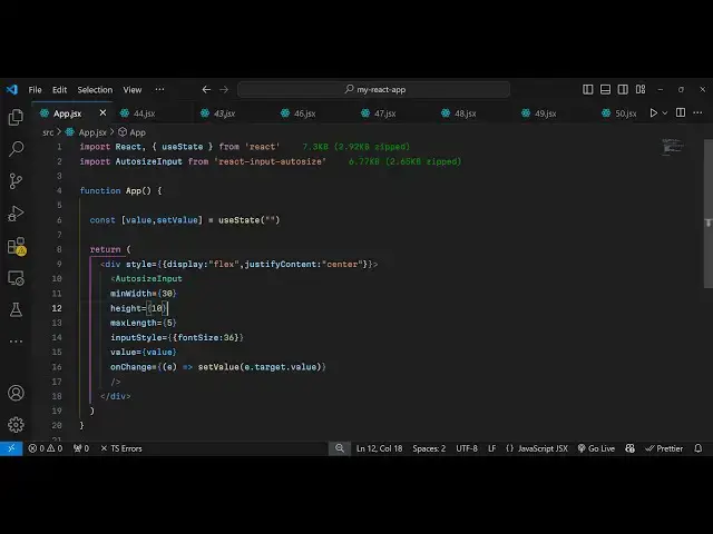
simple example from scratch so so first
1:01
of all you need to create a functional
1:03
component and just include this package
1:05
by using the import statement and just
1:08
uh Import Auto siiz input and we are
1:11
importing this package if you see it's
1:14
6.77
1:15
kilobytes so now we'll just create a
1:18
simple variable for keeping track of the
1:22
value that the user
1:24
writes using the UST State hook for this
1:27
and in whichever location you want to
1:30
print this uh embed this first of all I
1:33
will just make it in the center position
1:36
display flex and justify content to
1:40
Center and then here you'll be embedding
1:43
this component Auto size input and these
1:46
components actually take some options
1:48
here you can control the minimum width
1:51
you can provide a minimum width let's
1:53
suppose of 50 so now the input field
1:56
will be of minimum width of 50 so if you
1:59
see the you can see minimum width is
2:02
almost 50 so by default and if you want
2:06
to allow the input field to grow as the
2:10
input changes now you can bind this
2:15
uh input style as
2:17
well let's suppose I control the phone
2:20
size to be uh
2:24
36 and I provide the value I bind the
2:28
value here the variable
2:30
so now as you write something it
2:33
will automatically change so you do need
2:36
to bind this onchange event handler as
2:39
well so whenever the value changes what
2:42
happens so inside
2:46
this uh call back function you will have
2:49
this e parameter uh you simply say set
2:52
the value e. target.
2:55
value so that's all that we need to do
2:58
and if you see now if I write something
3:00
you will see the auto completion will
3:02
happen and the size will dynamically
3:05
change as the size is increasing the
3:07
input field size is also being
3:09
increasing so in this way you can have
3:11
this package and you can even put a
3:15
maximum width as well so let's suppose I
3:17
also put a maximum width or maximum
3:20
length oh sorry I I will put five
3:24
correctors so after five correctors you
3:26
can't write inside this so if I write 1
3:30
2 3 4 5 after this I can't write so you
3:34
can even control the length of the input
3:37
as well using this package you can put a
3:39
restriction that only this much of
3:41
correctors will be allowed so it's a
3:43
very handy package in that of s
3:47
sense and same goes with the height as
3:50
well I
3:51
think we can control the height which
3:55
let's suppose 30
4:01
uh let's suppose I change it to
4:12
20 so in this way you can do this very
4:22
simply so this is actually your package
4:25
here I've shown you complete example of
4:28
this package so so thank you very much
4:30
guys for watching this video uh if
4:32
you'll hit if you just visit my website
4:35
freem mediat tools.com which contains
4:38
thousands of tools regarding audio video
4:40
and image and I will be seeing you guys
4:43
in the next video