Up next in 10

Build a React.js react-accessible-accordion Example to Create Collapsible & Expandable Panels
Jan 9, 2025
Buy the full source code of application here:
Show More Show Less View Video Transcript
0:00
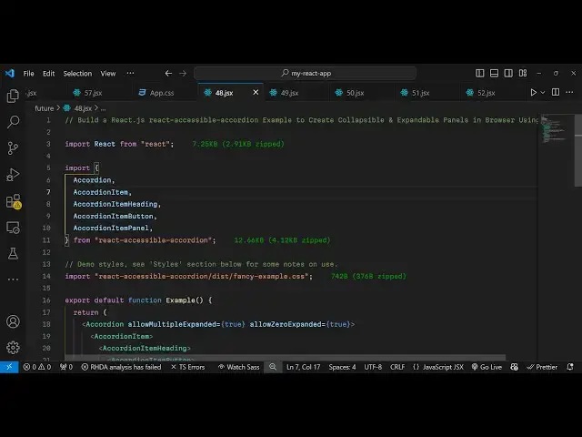
uh hello guys welcome to this video so
0:02
in this video I will show you how to
0:04
make this nice little accordance and
0:07
collapsible panels inside react CH so if
0:10
you have a lot of text to display this
0:12
collapsable widgets accordion you can
0:16
make this nice little using this package
0:18
so we have this two panels right here
0:22
collapsible panels so here you can click
0:24
on individual panel so if you click it
0:26
you can see the details of this panel
0:28
you will see more text and you can
0:30
collapse it accordion widget so actually
0:34
the package used for this for making
0:37
this react accordion this is actually
0:39
the package react accessible
0:42
accordion and if you just go to
0:44
npmjs.com and just search for this
0:46
package react accessible
0:51
accordion so this is the accordion
0:54
component for especially react CH
0:56
application and it's almost this is
0:58
actually the command I've already
1:00
installed it so it's almost having
1:03
39,000 weekly downloads so I will just
1:05
show you a very basic
1:07
example so just make sure that
1:11
you make a functional
1:13
component and after this you need to
1:16
require this package so we simply
1:20
require
1:21
this things which will be coming from
1:24
this react accessible
1:27
accordion and we need to require some
1:29
things for for this first of all the
1:31
accordion then we need to require the
1:34
accordion item and then the accordion
1:37
item heading and then lastly accordi
1:41
item
1:42
button and accordi item panel these
1:46
things will be coming from this
1:49
package and we just it a size is 13
1:53
kilobytes so now we come to the jsx and
1:56
also we need to import the CSS file of
1:58
this as well so this package comes with
2:01
its own CSS file styling you need to
2:05
require this in the disc folder we have
2:08
this fancy example
2:11
do CSS so it's almost 742 bytes the CSS
2:16
file so we are simply importing this and
2:19
now we come to the jsx and right here
2:21
wherever you need to show this we grab
2:24
everything inside this parent tag of
2:28
accordion and then it takes actually
2:30
your accordion item whichever item that
2:33
you want to display and then it takes
2:36
the accordian item
2:37
heading so here you will provide inside
2:41
your accordian item heading we have the
2:43
accordian item button and you can simply
2:46
say whatever thing that you want to
2:51
write so I will
2:56
say so this will be the heading here
2:59
which will be dis displayed once you
3:01
load the page so if you refresh the
3:04
application now you will see this
3:05
heading will be displayed and there is
3:07
this button available to you and now the
3:10
user will click it if uh we now need to
3:14
display the additional details after
3:16
this heading so now let's suppose the
3:18
user clicks on that collapsable panel so
3:22
we have this panel right here we can
3:24
define a simple little paragraph
3:26
explaining more about this thing
3:48
so we just Define a simple little
3:50
paragraph so when
3:53
you want to see more details of it you
3:56
rather you click this collapsable more
3:59
ed
4:00
you can see the this paragraph will show
4:03
so now to make sure whenever we click
4:05
the collapsible widget for the second
4:06
time then it hides it for this Behavior
4:10
we need to go to the this accordion
4:12
parent tag and we need to pass this an
4:15
additional option which will be allow
4:18
zero expanded to be
4:21
true so if you make this option uh what
4:24
happens is that you click it for the
4:26
second time then it hides you can toggle
4:29
this visibility of the accordian
4:31
collapsible widget panel so now in this
4:35
way you can create multiple collapsable
4:39
widgets
4:42
so this is one item that you
4:45
see so we can repeat
4:47
this copy this and paste it for the
4:51
second time then we can change this
4:53
heading to
5:09
so in this way now if you refresh the
5:11
page you will see the second item this
5:14
is the first this is the second so in
5:16
this easy way you can create these
5:18
collapsable panels widgets inside your
5:20
website so if the user clicks on that
5:23
you will they will see some more details
5:25
about it so you have seen the widgets on
5:27
the websites so in this way you can
5:30
design this using this package react
5:32
accessible accordion so thank you very
5:34
much for watching this video and do
5:37
check out my website as well free mediat
5:39
tools.com uh which contains thousands of
5:42
tools regarding audio video and MH and I
5:46
will be seeing you in the next video