Up next in 10

Build a React.js Project to Create Animated Tooltip Messages on Hover Using react-tooltip in JSX
Jan 9, 2025
Buy the full source code of application here:
Show More Show Less View Video Transcript
0:00
uh hello guys welcome to this video so
0:02
in this video I will show you a react
0:05
tool tip how to create a nice little
0:07
tool tip inside react shars using a
0:09
package called as react tool tip so
0:12
essentially whenever you hover onto any
0:14
element or any HTML paragraph heading
0:17
and it will show this nice little tool
0:20
tip that is shown in the bottom section
0:22
and it has some kind of styling so
0:25
whenever you want to something show a
0:27
tool tip whenever user h on any form any
0:32
heading you can just configure this to
0:35
appear right here there is a specific
0:37
package in re react shars which allows
0:39
you to create this react tool tip so
0:42
essentially this is actually the package
0:44
name they have their own website as well
0:46
react tool tip.com
0:48
and actually if you see if you go to
0:51
getting started you need to install this
0:52
module by executing this command I've
0:55
already installed it so I will just show
0:58
you a very basic example on how creating
1:00
this so first of all you need to create
1:02
a simple functional component and then
1:05
we just need to import the actual module
1:09
by using the import statement so we
1:11
simply write here
1:14
import tool
1:16
tip and we'll be importing it as react
1:20
tool tip and it will be coming from this
1:23
package which is react tool tip so
1:27
essentially if you see the size of this
1:29
package is is 35 kiloby and also we do
1:33
need to import the CSS file of this
1:35
package as well and it is present inside
1:38
the dis folder
1:40
react tool
1:42
tip. CSS so we are importing the CSS
1:45
file which is 1.82 kilobytes so just
1:48
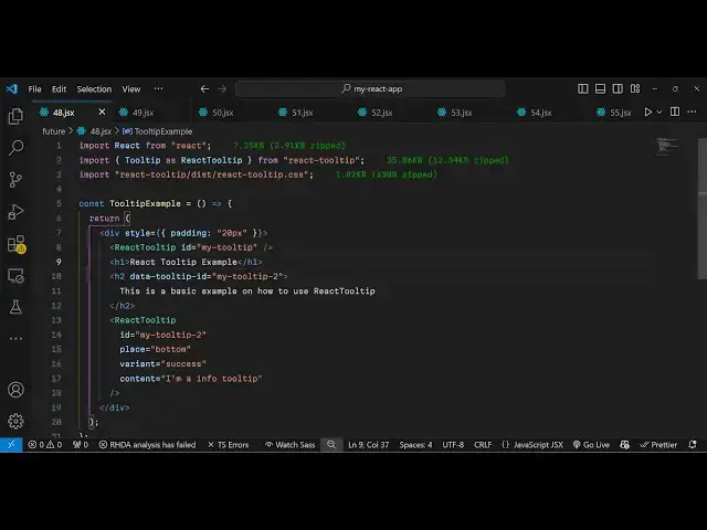
imported this and now we inside our gs6
1:52
so right where you need to show this
1:54
tool tip let me give it a style to this
1:57
diff simple padding of for 20 pixel and
2:01
inside this I embed this react tool
2:04
tip and essentially I will give it an ID
2:07
here so I will just give it a ID which
2:12
is my tool
2:14
tip so my tool tip so I've just given
2:17
this ID here unique ID so now we just
2:19
need to Define this wherever location so
2:23
we have will be having an heading here
2:26
we'll say react tool tip example and
2:30
after this we will show this tool tip we
2:33
will have an H2 tag so when the user
2:36
hovers onto onto this uh S2 tag you will
2:40
they will see this tool tip appearing so
2:42
now to configure this tool tip we need
2:44
to give it an ID here to this H2 element
2:47
so right here we will create a data
2:50
attribute which I will call this data
2:52
tool tip you will see all these
2:55
parameters are supported data tool
2:58
tip- ID so you you need to give the same
3:00
ID that you configured if you see my
3:03
tool tip so you've given the same ID you
3:05
need to give here also so I will say my
3:09
tool
3:14
tip so if you refresh now so what
3:17
happens is
3:18
that if you uh hover onto
3:23
this
3:25
ID just refresh your application just
3:28
wait
3:39
does not provide a name Tool
3:42
tip uh just wait I think oh sorry T is
3:46
not Capital here which is tool tip just
3:49
make the T small that was a mistake and
3:53
now if you refresh you will see
3:56
this S2 heading appearing and as you h
3:59
onto this so what will happen if you
4:05
check we need to configure
4:08
this we have given the same data tool
4:11
tip ID just make sure that you given the
4:14
same ID yeah so after you give this uh
4:19
this ID here we need to configure this
4:21
so now make sure that it is declared
4:24
earlier on so this this will be coming
4:27
first and then we are configuring the
4:30
react tool tip and it actually take some
4:33
options first is the actual ID so you
4:35
will give the same ID that you given
4:37
right here so I will just write my tool
4:40
tip and then it takes the place wherever
4:43
you want to show this tool tip it
4:45
actually take all these options all
4:46
these positions bottom bottom and right
4:50
top so I will show it at the top
4:52
position the tool tip and variant is
4:55
actually it can be any variant let me
4:59
create a success which will appear in
5:01
the green color so whatever is the
5:03
content that you want to show so I will
5:05
say this is a basic tool tip so now what
5:10
happens is that if you go to the you
5:13
will see this tool tip appearing at the
5:15
bottom sorry top position you can change
5:18
this let's suppose to error so now this
5:21
will appear in a red color and I change
5:24
to bottom so now what
5:28
happens you will see this to dip appear
5:31
here in red color so you can check out
5:33
the documentation it has all these
5:35
examples available you can check the
5:37
variants you'll see all these classes
5:39
are there so warning error info success
5:43
light dark State you can check out their
5:47
documentation their website react
5:48
top.com to check out the more
5:50
documentation so in this way you can
5:52
simply configure the tool tip you give
5:55
it an ID here whichever element that you
5:57
want to configure and then you target
5:59
this in inside your react tool tip
6:01
component you give the same ID then you
6:03
provide the place and the variant and
6:05
the actual tool tip that you want to
6:06
show the content that's all so thank you
6:10
very much guys for watching this video
6:12
If you like this video then please hit
6:13
that like button subscribe the channel
6:16
and also check out my website as well
6:18
free mediat tools.com uh which contains
6:21
thousands of tools regarding audio video
6:23
and image and I will be seeing you in
6:26
the next video