Up next in 10

Python 3 Matplotlib Script to Create Data Visualization Charts From CSV File & Export to Image & PDF
Jun 1, 2025
Get the full source code of application here:
https://codingshiksha.com/python/python-3-matplotlib-script-to-create-data-visualization-charts-from-csv-file-export-to-image-pdf/
Show More Show Less View Video Transcript
0:00
uh hello guys welcome to this video So
0:02
in this video I will show you how to
0:05
plot uh colorful charts from uh a CSV
0:09
file How to visualize that CSV file into
0:12
different charts It can be bar chart pie
0:15
chart line chart and then also export
0:17
those charts into images and PDF as well
0:20
So this is actually a Python script that
0:21
I developed here You will see from
0:23
mattplot lib library If I just run this
0:26
Python script it will instantly
0:30
create the bar chart pie chart all those
0:35
charts from the CSV file and also it
0:38
will create a PDF and PNG file as well
0:41
for each
0:43
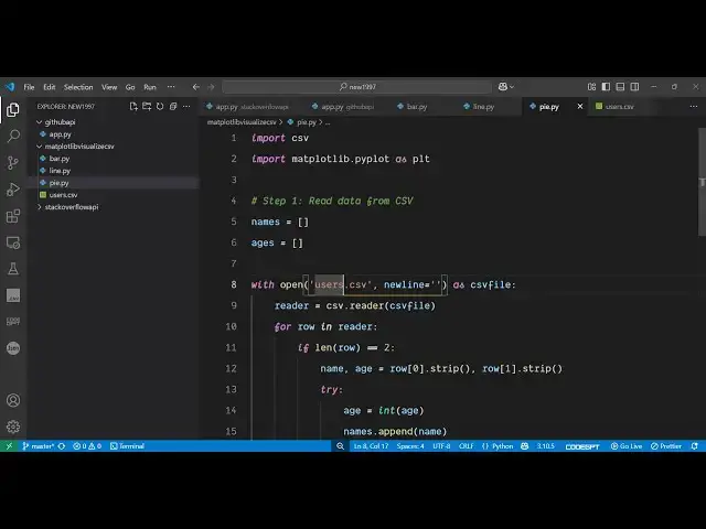
chart So this is actually our users CSV
0:46
file This is simply simple data I'm
0:49
taking here which contains two columns
0:51
name and age
0:54
It's a simple commaepparated value file
0:57
here And this is actually the bar chart
0:59
which looks something like this You will
1:01
see on the x-axis we have the names On
1:04
the y-axis we have the
1:07
ages This is in PDF This is actually the
1:11
actual image file This is your line
1:17
chart And this is your pie chart
1:22
So I will show you this s single Python
1:25
script which will generate all this
1:27
stuff for you instantly And for this you
1:30
just need to install one package here
1:32
which is used to actually generate all
1:35
these charts which is Matt plot
1:38
lip library of Python which is a very
1:42
popular library for generating these
1:45
charts You simply install this Uh after
1:49
installing it uh now just create a
1:52
simple users CSV file in the same
1:54
directory where we have the data here It
1:58
can be any
2:01
data So first of all we will delete it
2:04
and start from
2:06
scratch So the very first thing we need
2:08
to do we need to import the necessary
2:10
packages First of all the CSV package
2:14
which is a built-in package and then we
2:16
also need to say mattplot
2:19
lib like this Then we also need to
2:22
import operating system
2:25
package and then we declare names and
2:28
ages which are the two parameters which
2:31
we are taking for plotting this So one
2:34
by one we will be reading this data
2:36
first of all by opening this CSV file by
2:39
using the open
2:45
method in read
2:53
mode So we'll be reading it line by
2:59
line So for this we'll be using the this
3:03
method here dictionary
3:06
reader So after reading it we will be
3:09
initializing the actual names and the
3:15
ages by the append method
3:32
So in this way first of all we store the
3:36
names and ages inside those arrays After
3:38
reading it then we need to create a
3:41
directory
3:42
here In the same directory we'll call
3:45
this
3:46
as output and inside this directory we
3:50
will be creating all the charts one by
3:53
one So the first chart will be the bar
3:55
chart So it contains a function here for
3:58
figure and here we need to pass the size
4:01
of the chart here So I will say 8a 5 and
4:07
then it has various methods here You'll
4:09
see bar chart pie chart
4:12
So we've passed the data here names and
4:16
ages and then you can even control the
4:18
color of the chart as well So let me say
4:20
red So the color of the bar chart will
4:23
be red
4:27
And then you actually can also change
4:31
the title of the chart as well So I will
4:33
say bar
4:42
chart and then you can plot the actual
4:45
data So whatever data you need to plot
4:49
in the x-axis horizontal axis I will say
4:51
name And similarly on the y-axis y label
4:56
you would say
4:58
age Then you can even adjust the layout
5:02
of the chart So we have this function of
5:04
tight layout And lastly we can save this
5:08
figure as PNG on PDF
5:12
file So the chart will be saved as a PNG
5:16
image file and the PDF file as well So
5:18
in this way you can export this chart So
5:22
this is complete here for bar chart If I
5:24
run this script here what you will see
5:25
it will create an output
5:28
directory And inside this it is saying
5:32
no such file or
5:39
directory Sorry
5:42
I this needs to be output because the
5:45
directory name is output Sorry just make
5:47
this
5:49
change again and run
5:51
this You will now see it created
5:54
this PNG file here image file This is
5:58
your simple bar chart and this is inside
6:01
your PDF file So in this easy way you
6:05
can actually export charts in PDF and
6:08
image files and you can visualize any
6:11
data inside your
6:13
CSV file This can be coming from a
6:16
database or API as well
6:20
So similarly using this we can export
6:23
this to a pie chart line chart as well
6:28
So all these charts are supported by
6:30
this mattplot library Let me paste it
6:34
All the source code is given in the
6:36
description of the video So if I run
6:38
this here you will see it will generate
6:40
the rest of the charts as well
6:45
So this library makes it very much easy
6:48
to generate the visual representation of
6:51
the data So if you have the data then
6:53
you can easily generate the charts using
6:56
this library inside
7:01
Python So you can see it has generated
7:03
this This is your line chart which looks
7:06
something like
7:08
this And this is your pie chart
7:12
So these are different repres
7:13
representation of representing the same
7:15
data but uh these are popular charts So
7:20
thank you very much for watching this
7:22
video and also check out my website
7:24
freemediatools.com
7:27
uh which contains thousands of tools
#Drawing & Coloring