Up next in 10



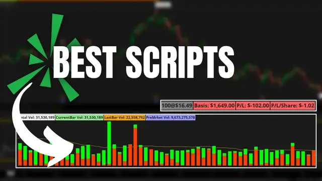
In today’s video we’ll be going through a few of my favorite custom scripts for ThinkorSwim. These scripts will include advanced volume bars, cost basis and profit/loss information, and a quick reference for the percent move of a stock.
Timestamps
0:00 Intro
0:40 Advanced Volume Bars
3:30 Cost Basis / Share Quantity
7:51 Position Quantity Label
8:42 Today’s Volume Label
9:26 % Change Stock Info
11:25 Ex Dividend Date Column
One of my favorite features on ThinkorSwim is the ability to load outside scripts. These scripts allow you create studies and features that wouldn’t normally be available on the platform. The things you can create and do using thinkscript is near limitless.
However, in todays video I’ll be showing some of my favorite scripts for the platform that you may want to use for yourselves. I’ll also be posting each of these down below in the pinned comment for you to copy and then add to your own platforms.
Advanced Volume Bars http://tos.mx/vZao14f
Cost Basis Visually on Chart and P/L
http://tos.mx/YubVGoA
Show More Show Less View Video Transcript
0:00
One of the really cool features within Thinkorswim is the ability to load outside scripts
0:05
and these scripts allow you guys to create and add studies and features that you wouldn't
0:09
normally be able to access within the platform. You'll see here in a minute
0:13
but the things you guys can create and do using ThinkScript is near limitless at this point
0:17
However, in today's video, I'll be showing you just a few of my favorite scripts for the platform
0:22
and ones that you guys may want to use for yourselves. I'll also be posting each of these
0:27
down below in the pinned comment for you guys to copy and then add to your own platforms
0:31
Now for me personally, in my case, you can actually see I have all of these custom scripts
0:36
down here in the lower left-hand corner in my scratch pad. So to begin with, we'll go ahead and
0:41
copy and paste the very first script in the list here. And in this case, that is the advanced volume
0:45
bars. In order for us to actually load this into the platform, I'm going to go ahead and copy the
0:50
shared item here. And it's always going to begin with this HTTP link. So we'll go ahead and right
0:55
click on that and say copy. From there, once we actually have the script copied, and of course for
1:00
you guys to do this, you will need to look in the pinned comments below this video, but once we've
1:05
got that copied, we'll simply come up here to the setup menu in the upper right hand corner and then
1:10
find and click on open shared item. Once that pop-up window comes up, we simply need to click
1:16
in this little black search box here and then hit ctrl v to paste in that shared item that we just
1:21
copied. We can then see the shared item right here, that HTTP link, and if I hit preview, we can
1:27
actually see what it is I'm about to load. So in this case, we can see the name of the script is
1:33
going to be advanced falling bars, and this is how we're actually going to find it in our studies
1:37
menu once we add it. We'll then come down here and hit import, and then now that it's been added to
1:43
our platform, in order to access it like any other study inside of Thinkorswim, we need to come up
1:48
here to our studies menu. Once we've got the edit studies window pulled up, we can actually see all
1:54
of the studies available to us over here on the far left hand side. This is going to include the
1:58
ones that Thinkorswim has made for us and have added for us, as well as the ones that we just
2:02
create for ourselves. In my case, I don't want to look through this long list and try to find the
2:07
one we just added. So I'll come up here to the search box and go ahead and type in the word
2:11
advanced. Looking in the list down below, I can actually see it. It is the third from the top. So
2:16
we'll go ahead and click on advanced volume bars and then hit add selected in the lower left hand
2:21
corner. Once it has been added we can see it appears over here on the right hand side as a
2:26
lower study. Now that simply means it's going to appear below our chart. It's not going to appear
2:31
overlaying the chart itself but rather below it. Let's actually go ahead and hit okay so we can
2:36
take a closer look at this study that we just added and now we can see it down here below. It's
2:41
these volume bars. You'll notice that these volume bars are far more advanced than the ones that come
2:46
automatically with thinkorswim. These ones are going to show you both the buy side and sell side
2:51
volume for that period that we're measuring, as well as the average volume, which is that line in
2:55
the background. Then looking up here in the upper left-hand corner, we can also see these custom
3:00
labels, which is showing us the total volume for the day, the current bar's volume, the last bar's
3:05
volume, and the pre-market volume for today. So again, you guys are probably going to find this
3:10
far more useful than the standard volume bars which simply show you how many shares were traded at a certain time period for the day These ones are going to show you buy and sell side volume for that period as well as when there unusual volume for a period when it breaking out above the average So definitely take a closer look at this one You guys might find it useful
3:29
in your trading. Moving on to the next study we're going to be adding is actually going to be a cost
3:34
basis study. So we can actually see how many shares we're currently holding, the price we hold those
3:38
shares for, and then how much we're up or down right here from the charts page. So moving on to
3:43
that one next. Looking down here in my scratch pad, you can actually see the second one is going
3:48
to be that one, cost basis visually on the chart. So we'll go ahead and highlight that study. Go
3:54
ahead and right click on it and hit copy. Just like before, we're going to come up to the upper
3:58
right hand corner, the setup menu and select open shared item. We'll then go ahead and click in this
4:04
box again, hit control V to paste the script and hit preview. We can then see the name of this new
4:10
study we're about to add is cost basis chart visual and that is how we're going to find it
4:14
in our studies menu. So let's next go ahead and hit import to actually add it and then come up
4:20
here to the studies menu to find it. It's coming up here to the search box. It'll be under cost
4:25
I can then find it is the only one in the list right now. So we'll go ahead and click on that
4:29
and hit add selected. This one is actually going to be overlaying the price chart itself. So you
4:34
can see it is in the price section, meaning it's going to overlay the chart. But now that it has
4:39
been added, we'll simply come down here and hit OK. And now we can see it displayed in the upper
4:45
left-hand corner as all of these labels and that red dashed line going across the top. Beginning
4:50
with the labels in the upper left-hand corner, the first label is going to tell us how many shares
4:54
we actually have and what price we own those shares at. In my case, looking here at this
4:59
paper money account, you can see I currently hold 100 shares of American Airlines, AAL
5:03
at an average traded price of $16.49 a share. Looking just the right of that
5:09
you can see the total cost basis for this position. So basically 100 times 1649
5:15
the total cost of this position being $1,649. You can also see just the right of that
5:21
how much I'm actually up or down on this position. So right there, you can see it is a red box
5:26
telling me I am currently down and I'm down $102. Looking a little bit further over to the right
5:32
you can see that as a total cost of $1.02 a share. But again, I think you guys will find
5:37
that these little labels in the upper left-hand corner can be a little bit useful to actually keep an eye
5:41
on how many shares you currently hold and then how much you're up or down currently
5:45
There's also one other part to this study that I haven't mentioned yet, and that's that red dashed line
5:50
going across the screen right now. That dashed line is actually gonna show us
5:54
the average traded price for our stock. So in this case, it is $16.49
5:59
And we already knew that by looking at the label up here. But another cool feature about that dash line
6:05
it'll be red or green depending on if we're in a profit or a loss currently on this position
6:10
So in my case, like we just said, I'm currently down $102 on these shares
6:14
but if I were to go back in time a little bit, let's go to a yearly chart
6:19
you can actually see here where the dash line was green and that's because the price of the stock
6:23
was above my traded price. You can also see looking back a little bit further
6:27
there was a time that I owned these shares at an average cost of it looks like $20.28
6:32
That why this red dash line is kind of got like a jagged move up here on the left side But again one of my favorite scripts to have on my chart just to have a good idea of what I currently holding and how much I up or down on that position
6:46
The next two that we're going to be discussing are actually very similar to the last two we just talked about
6:51
However, these ones are far more simplified. So before we actually add them to our chart and go through it
6:57
let me go ahead and actually delete these two scripts that we currently have on our chart
7:01
just to start with a blank slate. Moving on from that, if we now look over here to the left-hand
7:06
side of the scratch pad, we can see the next two scripts we're adding are called today's volume
7:11
label and position quantity label. Again, these two are very similar to the last two, except they're
7:17
a lot less cluttered. It's literally only going to show you today's current volume, and it's only
7:21
going to show you your current position rather than all of that extra stuff. So let's go ahead
7:26
and add these both very quickly. We'll just go ahead and add both of them at the same time. Let
7:30
go ahead and set up, open shared item, go ahead and paste it in the box here, make sure everything
7:35
looks right, and hit import. I'm then going to go ahead and add the next one in the list here
7:40
go ahead and copy it, come over here to setup, open shared item, paste it in just like before
7:47
make sure the name looks correct, position quantity label, and hit import. Once we have both of them
7:52
on our platform, we'll come up here to the studies menu, and now I'm going to search for them. So the
7:57
first one's going to be today's volume label. We'll go ahead and add that. I'm next going to add
8:02
the position quantity label and type that in as well. Find it in the list here and go ahead and
8:08
add it. You'll notice that the position quantity label is actually going to overlay the chart
8:13
It's going to be a label in the upper left-hand corner, whereas the volume or today's volume
8:17
label will appear in the volume subsection. In order for us to actually see that, let's go ahead
8:22
and hit OK. And beginning with the quantity label, we can actually see it up here in the upper left
8:28
hand corner. At the moment, you can see I currently hold 100 shares of American Airlines and you can
8:32
see it as a green label, meaning I actually hold those 100 shares. If that label were instead red
8:38
that would mean I was short 100 shares of American Airlines. So it is color coded. The other label
8:43
that we added, today's volume, actually will not appear unless we show a volume subgraph down here
8:48
below. So let's go ahead and do that. Coming up here to the setup menu, we'll come over here to
8:53
equities and then select show volume subgraph so we can actually see this label right here
8:58
Like I mentioned earlier, this is obviously a lot more simplified than those more advanced volume
9:03
bars. The ones that showed you all of the buy and sell side volume, pre-market volume, all that great
9:08
stuff. This is more for you guys who prefer more of a simple layout. You guys just want to see the
9:12
volume for that period and then maybe see the current volume for today. But I really recommend
9:17
you guys use whatever it is you're most comfortable with. If you guys like the simplified version
9:21
use that. If you like the more advanced versions, use those. Again, it's just whatever floats your
9:25
boat. Now moving on from the actual charting studies, the ones that we actually added to the
9:30
chart itself, we're actually going to be moving on to the monitor page next. So these next scripts
9:35
that we add are actually going to be column headers right here in the monitor page, basically
9:39
giving us more information about those equities that we currently hold. Looking down here below
9:44
in the scratch pad, you can actually see they are very similar to one another. It looks right here
9:48
percent change week to date percent change month to date and then percent change year to date What these columns are basically telling us is how much these stock or equities are up or down for these time periods So how much is American Airlines up or down for the last week
10:02
for the last month, or for the last year? This will allow us to very quickly see that information
10:07
Now in order for you guys to load these, you will do the exact same thing. You would simply highlight
10:11
and copy the script, come up here to set up, and then open the shared item. In my case, I actually
10:16
already have all three preloaded, so I'm just going to come down here to the little gear icon
10:21
on the far right hand side and select that. Looking here in my columns list I can actually
10:25
see all of the columns that are available to me over here on the left hand side and we can see the
10:30
three that we're talking about right here. So what I'm going to do is actually just go ahead and add
10:33
those really quick and then once I've got it added to the right hand side I'll just go ahead and hit
10:38
okay. Now looking here on my monitor page you can see a bunch of red columns going vertically down
10:44
my screen. Again what those are showing me is how much those stock are up or down for the last week
10:49
for the last month, and for the last year. So using American Airlines as our example
10:54
we can see it is currently down 4.6% this week, 13.43% this month, and 13.86% this year. Of course
11:03
that is not great, but if we were to look down a little bit further, we can actually see that
11:07
SoFi is down currently 61% this year, and this year beginning on January 1st. Looking right below
11:14
that, we can also see that Square is currently down 52% year-to-date as well. But these columns
11:19
are not showing you anything crazy. They're simply informational columns that you guys might find
11:23
useful in your trading. Now, finally, the very last one in my list here, I actually already have it on
11:28
my watch list. You can see here it is called the ex-dividend date watch list. Looking down here
11:33
below, if you guys wanted to add this yourself, again, you would simply copy this script, add it
11:38
as an open shared item, and then differently than what we've done before, if you guys wanted to add
11:42
it as a column in your watch list, you would simply click on the gear icon here, hit customize
11:48
You would then come over here to the look up a column window and type in, in my case
11:52
X dividend date, and then add it over here to the right hand side
11:56
Once you do that, if we go ahead and hit OK, we can actually see all of the upcoming dividends
12:01
for these stocks. So in this case for Cisco, we can see they've got an X dividend date coming up of July 5th
12:07
If we scroll up, it looks like Target has August 16th, and it looks like Lowe's is July 19th as well
12:13
If you guys look through this list, you guys will probably notice there are a lot of dividend
12:17
paying companies with a blank little block right here. So like Home Depot, I am certain pays a
12:22
dividend. Micron just recently started paying a dividend. A lot of these guys do pay dividends
12:27
but the screen is completely blank for those. That is because Thinkorswim can only display
12:32
the information that they actually have available. So these companies that pay dividends but have a
12:36
blank box next to them simply means that they have not announced their next dividend. As soon as that
12:41
dividend does get announced, it will immediately appear in this column right here. For those of
12:45
you dividend investors out there, you guys may or may not find this column useful, but it's another
12:49
one that I like to have on here. Now, like I said at the very beginning of this video, the things you
12:54
guys can create within ThinkScript are near limitless. These were just a few of my favorite
12:59
scripts, but I'll definitely be adding more to these in the future. Also, please let me know if
13:03
you guys do have any additional questions for me or recommendations for other videos you guys would
13:07
like me to discuss, and also please hit that like button if you did find this video helpful
13:12
Otherwise, have an amazing rest of your week and I'll catch you guys on the next video
#Business Services
#Software
#Finance
#Investing
#Stocks & Bonds
#Crafts
#Jobs & Education