Up next in 10


Skip the waitlist and invest in blue-chip art for the very first time
by signing up for Masterworks: https://masterworks.art/generalknowledge
Purchase shares in great masterpieces from artists like Pablo Picasso,
Banksy, Andy Warhol, and more. See important Masterworks disclosures:
http://masterworks.io/cd
In this video I go through a few interesting maps of the United States, such as house prices, salary comparisons, forest area, deforestation, animal predators, extracted resources, main and most profitable industries, popular restaurant cuisines, tax percentages, county sizes, population density, and female representation in congress.
TIMESTAMPS:
00:00 Intro
00:50 House Prices
01:53 Salaries Needed To Afford Homes
03:05 Forest Area
04:05 Masterworks Sponsorship
05:51 Largest Predator
06:38 Resources (1942)
07:20 Most Profitable Industries
08:09 Most Popular Restaurant Type
09:07 Sales Tax
10:11 County Sizes
Show More Show Less View Video Transcript
0:00
Maps are the best. I keep repeating this in videos, but I really think it's true
0:06
I could look at almost any type of map for such a long time without getting tired of it
0:11
And the reason why is that when you look at a map, you're always learning. Regardless of what
0:15
the map is about, it presents you with some type of data regarding the depicted territory. So in
0:20
this video, we're going to do exactly that and use around 10 maps to learn some interesting pieces
0:26
of information about the United States. There's an infinite amount of data maps we can use in a
0:32
situation like this. I chose 10 that I came across online and that I found particularly interesting
0:38
allowing us to draw some specific conclusion from them. They are also unrelated to each other
0:43
A quick disclaimer, I got these maps off Reddit, Instagram, and other places online. Remember
0:48
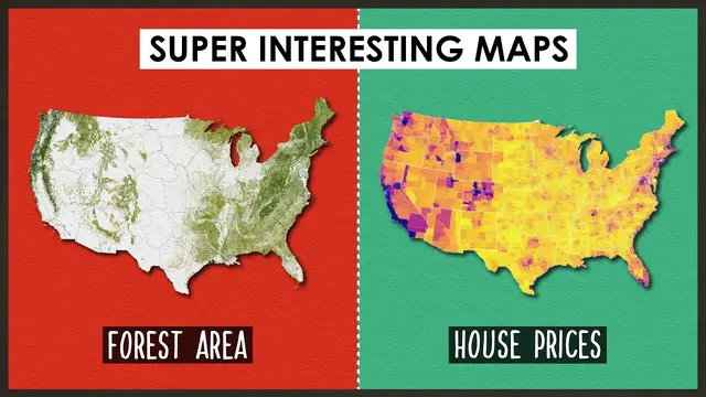
there might be some inaccuracies. Let's start with the two on the thumbnail. First, house prices
0:53
Looking at this map, we realize that houses seem to be much more expensive in the western part of the United States
1:00
This surprised me, I knew urban centers were very expensive in the west
1:04
but I assumed altogether the east coast states had a higher cost of living
1:09
Apparently, this isn't exactly the case. California seems to be the most expensive state overall, maybe only Connecticut rivals it
1:16
Although this map is divided by counties, which allows us to get a grasp of the different realities within the same state
1:22
This is especially interesting in the East Coast, in places like Florida, New York, Pennsylvania
1:28
or Virginia, where the vast majority of the state is much cheaper when compared to the
1:33
main urban centers. The whole state of New York is much cheaper than the Manhattan area, known for its ridiculous
1:39
housing prices, and the same happens for instance in Tennessee. I was surprised by some of the most expensive places, honestly, I had no idea that Colorado
1:48
was also expensive, Hawaii was more expected. An interesting map associated with this one is the next, which points out the salary you need to afford the average home in each state
1:59
This presents an interesting comparison with the previous map because it takes into account another important aspect in house purchases, salaries
2:07
If in a given state prices are super cheap, but the salaries are super low, then maybe they end up having a worse housing situation than a super expensive state that has medium-high salaries
2:17
Colorado stands out, again, as one of the worst here, but none beat California. In five states
2:23
you need a salary of over $90,000 a year to purchase the average home. California, Colorado
2:29
New York, Hawaii, and Massachusetts. Washington, Oregon, and Utah are the next higher level. The
2:35
best relation between house prices and salaries seems to be in Ohio and West Virginia, then Montana
2:41
Idaho, and Nevada, along with Virginia, Connecticut, and Florida, which range between $70,000 and $80,000
2:46
Texas, Minnesota, Arizona, Alaska, North Carolina, Delaware, New Jersey, Vermont, and New Hampshire
2:53
are in the halfway mark on the scale. Texas surprised me, I thought it would be higher
2:57
up And then in yellow and green we have the places where lower salaries will be able to buy you a house under the terms pointed out in the title of the map Then we have the second map on the thumbnail Forest Area This map surprised me for two reasons One I always knew the US had a lot of desert but I didn expect this whole white area
3:15
in the middle to be so empty of forest. The high degree of vegetation in the west coast was expected but it also surprised me the east
3:23
coast areas are so densely full. This is the area of the US that's most inhabited and usually more humans equals less nature
3:31
I'm glad to see this isn't the case. There are some conflicting maps about this though
3:35
although I think the key differences lie in one being a map of virgin forest
3:39
meaning naturally occurring, and the other including all, meaning also the ones that were planted by humans
3:45
This series of three maps, one from 1620, the other from 1850
3:49
and the last from 1926, shows us how devastated the virgin forest of the US has been
3:54
with the majority of it disappearing and being cut down. The areas roughly coincide in all the maps, with the desert areas always being there
4:01
Is the first map accurate in representing forests today? Let me know in the comments
4:06
Now, before we keep going, a quick message from today's sponsor, Masterworks
4:10
By now, we've studied the economies of countries all over the world, and we know some events transcend time and location
4:16
In the last few years alone, we've seen some old villains resurface
4:20
Pandemics, wars, inflation, market crashes. It's like a terrifying crossover episode. Times like these are confusing and scary, but we can try to weather the storm with a few lessons from the past
4:31
In a previous video, I talked about precious metals and how gold became a popular store of wealth
4:36
as a commodity, a physical asset, which can retain or gain value, even in times of economic downturn
4:42
But there's another asset that has been historically valued due to similar factors, fine art
4:47
You probably know that rich people have collected art for centuries. It's not just a decoration, but an interesting investment
4:54
In fact, the last time inflation was near its current levels, between 1973 and 1981, art prices appreciated at an average rate of 17.5% per year
5:04
Until recently, only the very rich investors have been able to invest in art, but thanks to Masterworks, almost anyone can invest without buying an entire million-dollar painting
5:14
I can't stress this enough, this isn't an NFT, this is a real museum-quality art
5:20
By legendary artists like Picasso, Monet, and Banksy, Masterworks buys the paintings
5:25
upfront, qualifies them with the SEC, allowing investors like you and I to invest in shares
5:31
of a painting. In their last 9 exits, Masterworks has delivered net returns over 13.9% to their investors
5:39
Nearly 600,000 people have signed up so far, and offerings have sold out quickly so there's
5:44
a waitlist, but my subscribers can gain priority access and skip it through the link in the description
5:49
Now, back to the video. Oddly enough, the forest coverage doesn't seem to affect
5:54
or create any associated trend in the presence of animal predators, which is what this map shows us
6:00
the largest land predator by U.S. state. Most of the South has the American alligator as the largest
6:06
while Florida has the American crocodile. I for one didn even know the U had crocodiles I thought it was only alligators and assumed that only Florida and Louisiana had them Most of the continental US have the black bear as their largest predator It important to point out this is the largest not the most common or most dangerous
6:23
If you have the coyote, Nebraska the mountain lion, and three others the grizzly bear
6:27
In Alaska, it's the polar bear, and in Hawaii, it's the domestic cat, a very big threat
6:33
We essentially conclude that there are few states in the US where some type of bear isn't
6:37
the biggest predator. This next map is old, it's from 1942, and it shows us the resources of the
6:43
United States. It mixes extracted but also produced resources so it's a little confusing
6:48
but it's interesting to see what came from where at the time. It doesn't specify a lot, for instance
6:53
all the ores are grouped up, but we get to see how mineral extraction was somewhat common
6:58
throughout the entire territory, and also point out a few regional tendencies. The northwest and
7:04
northeast seemed to be the main origins of timber, while the south was where all the cotton came from
7:09
with grain being more common further north. California seemed to be the only state where
7:13
fruit was produced, and sheep and pigs were mostly produced in the middle western area
7:18
Of course, this is now incredibly outdated. The closest version of this map that I could find was
7:23
this one. It shows the most profitable industry per state. The middle west of the country still
7:28
has meat as its biggest industry, which shows perhaps animal farming is still prevalent
7:33
Surprisingly, a lot of states have aerospace as their most profitable sector
7:37
maybe this includes air travel, with even more having mechanics and machinery
7:41
Extraction is also fairly common, like in Texas and automotive too. Maine stands out by being the only continental state in which fishing is number one
7:50
only Alaska also has it, just like Massachusetts with precision instruments, whatever that is, or Wyoming with chemicals
7:58
A lot has changed between the 20th and 21st centuries, but it's cool to see how some connections in industries still exist in specific states
8:07
as well as how much things have changed. Another map that shows us different categories per state is this one
8:12
which tells us the most common restaurant cuisine in each state. I guess it takes the number of registered restaurants
8:18
categorizes them by type of food, and then shows us which is more common, if it is accurate
8:24
Mexican food seems to be the most common in the southwest, while pizza is most common in the northeast
8:29
East, although Italian in general is also big in New York and around it
8:33
Maine has seafood, makes sense if they fish so much, as does Louisiana
8:37
Asian is very common in Washington and Alaska, apparently, while a lot of northern states
8:42
have pub, I'm not really sure what this means, maybe some English influence, and Hawaii has
8:47
Hawaiian food as the most common. It's interesting to see how the presence of specific immigrant communities may impact
8:53
the results in some states. The East Coast, having so many Italian heritage families, likely causes their choice of restaurants
9:00
as must be the case with Mexican ones in the South, closer to the border with Mexico
9:04
Fast food, however, does break this trend in a few states. These are places that sell food and when you buy something you have to pay a sales tax
9:12
That was a good transition, right? Here is a map that shows us the sales tax percentage by county in the US I not sure if the grey ones are 0 I highly doubt it or if there was just missing information Again if you know let me know in the comments
9:25
It's weird to see how inside the same country, a tax rate can vary so much. Although, I guess we
9:30
need to remember the US is a federal state and they're almost a group of countries together
9:35
so it makes some sense that they each have their own laws. In Europe, I don't think any countries
9:39
have different tax rates for different areas within themselves, even in federal countries
9:43
like Germany for instance, but let me know if I'm wrong about this. These southern states seem to be
9:48
the highest here in red, although Arizona and California as well as Washington have high
9:54
percentages too. New York seems to be the only east coast state where they're higher, and Maine
9:59
seems to be the lowest along with Alaska and Hawaii. This isn't necessarily bad, I guess it
10:04
depends on your point of view about taxes. Also the percentage isn't as important as the base cost
10:09
of the products. And differences in counties are infinite. The most obvious one is the size of them
10:15
in terms of area. Counties in the east coast of the US are much smaller, while as you move west
10:21
they become larger mostly because they are less populated and more filled with nature
10:26
even if it's desert. Some bigger states maybe have 10 to 15 counties, while small ones reach
10:31
up to 30. The east of the US was colonized first, and so its history goes further back
10:36
having had more time to grow and develop, this along with other factors led to more people
10:42
settling there. The biggest explanation for this difference really is population density
10:46
as we can see here on this other map. But there are some exceptions. This shows us how 144 counties
10:53
have more population over half of the country's total than the remaining 2,998, which really goes
11:01
to show how concentrated the population is. Although it does put into question the argument
11:06
I just made, a lot of these more populated counties are in the West and they have large sizes. So why
11:13
aren't they separated or organized into smaller ones? Perhaps the answer to the question lies more
11:18
in the time in which the Eastern states were created and organized earlier in history in
11:23
comparison to the later establishment and territorial organization of the Western and
11:28
center ones. And finally, this map shows us every place in the US that has had or has a woman in
11:34
Congress. Some have had at least one woman in the House of Representatives, others have had at least
11:39
one in the Senate, and some have had them in both houses of the US Congress. Although it's
11:43
interesting to see how some have had neither, it's really surprising to find that some states
11:48
the ones in gray, have had very few women to represent them politically. Mississippi and
11:52
Vermont, for instance, have never had either, according to this map. A very shocking discovery
11:57
for me if this is accurate. So, those are a few, in my opinion, super interesting maps that teach
12:03
some super interesting pieces of information and statistics about the United States. Did any of
12:09
these surprise you? Let me know in the comments, along with any other statistics you'd like to see
12:13
in another video like this, either for the United States or another country or even continent
12:18
Thanks so much for watching this video. Subscribe if you want, and I will see you next time for more general knowledge
#Hobbies & Leisure
#education
#Maps
#Ecology & Environment
#Other