Up next in 10


Become a member on Patreon & get exclusive content! https://www.patreon.com/generalknowledge
▶ A special thank you to my Patrons: Richard Hartze, Yasin Chaykh, Stuart Tunstead, The Wanton Dogfish , Cesar Lopez II, Steve the Goat, Yeti , KR, Edward Pucci, Jan Krause, Jeffrey F., Juan Rodriguez, Kalvin Saccal, Kris Rizakis, Lastmatix, Robinhio84, Rogaine Ablar, Ryan Keith, Ryan McMurry, Sandro, Sebastian Karlo, Señor Valasco
Timestamps:
00:00 Maps Are The Best
00:27 Most Sold Vehicles By State
01:54 Biggest Energy Source In Each State
02:50 Concentration & Number Of African Immigrants
04:07 Patreon
05:04 Most Popular Attraction In Each State
06:35 Distribution / Location Of National Parks
07:31 Exaggerated Relief Map
07:59 Percentage Of Passport Ownership In Each State
08:47 Biggest Religious Group In Each County
09:34 State Borders Rearranged By Watershed Areas
10:49 Summary
Show More Show Less View Video Transcript
0:00
Maps are incredible
0:01
I've said it once and I'll say it again because with them we can learn tremendously
0:05
interesting things about what they depict. In this video we're going to take a look at 9 maps of the United States, most of them
0:11
being statistical and or data maps that show us key differences between states and the
0:16
country's territory in general. Let's start with two on the thumbnail
0:30
First what is the best selling vehicle in each state? Straight off we can tell through the color legend that three brands dominate the top
0:38
selling vehicles in the US, Chevrolet, Ford and Toyota. In 16 states, the Chevrolet Silverado was the best selling vehicle in 2022
0:48
In 14 states, it was the Ford F-Series, both of them being pickup trucks and being mostly
0:54
dominant in interior states. In 13 other states, with particular dominance on the east coast, it was the Toyota RAV4
1:03
Keep in mind that these states in which the Toyota is the best seller have more people
1:07
than the ones where the Chevrolet and the Ford are, so it's likely that despite being
1:12
number one in less states, they still sold more total numbers. Next is the Ram with their own
1:19
pickup truck model, which is the most popular in Wyoming, Nevada, and Alaska. And then we have
1:25
five other states that move away from the trends. Florida has a Toyota as the best seller too
1:30
but it's a Toyota Corolla, just like Hawaii, which instead of the RAV4 has the Tacoma pickup truck
1:37
while Arkansas is the GMC Sierra, another pickup truck. I guess Americans really like those
1:43
And finally, California is the only state in which the Tesla Model Y was the best-selling
1:48
vehicle in 2022. Do you think these trends maintained themselves in 2023 or did they change
1:54
Then the other one on the thumbnail, what is each state's main energy source? This map includes
2:00
Canadian provinces, but we're going to ignore those and focus on the US here. First, we can
2:05
look at how these energy sources are divided percentage-wise, in total. Throughout US states
2:10
6% have hydro as the main source of power, only 4 states, Vermont, Idaho, Oregon, and Washington
2:17
19% have nuclear, here in pink, and I was surprised about this. Illinois, the top producer of nuclear
2:24
energy in North America, apparently. Tennessee, South Carolina, Maryland, and New Hampshire. 9
2:30
have wind, South Dakota, Iowa, Kansas and Oklahoma. Surprisingly 22% still have coal, all of these in
2:37
dark grey on the map, and the remaining which make up 38% use mostly natural gas, those in gold on
2:44
the map They are mostly the southern US states but also many in the northeast as well as Alaska This other map shows us the distribution of African immigrants where they are and how many
2:54
there are in each place. The data here is also referring to 2022, keep that in mind
2:59
since it might be outdated now. First, it tells us that 10% of US immigrants in total
3:05
are from Africa. Then it shows us how many people of African origin live in each part of the country
3:10
the bigger the circle, the bigger the amount of people, and the brighter the purple
3:14
the bigger the percentage they represent of that local population. For instance
3:19
Minneapolis has the largest community of Africans in the country in terms of absolute numbers
3:24
while the place with the highest percentage are the Washington DC suburbs and Hennepin County
3:29
in Minnesota. It's very interesting to see how there's a clear concentration of African immigration
3:35
in the northeast, I would expect the southeast instead since it's physically closer to Africa
3:40
and should they come by boat, it would be the first point of entry. It's also curious to see
3:45
how Minnesota has such a high group, when it's not that populous of a state overall and it's away
3:52
from the coast which might be the arrival points. Apparently this is because Minnesota has a long
3:57
history of welcoming refugees and immigrants since the end of World War II and has one of the highest
4:02
rates of immigrant employment in the country, leading more people to move there
4:07
But before that, a quick word from our sponsor, you. Without you guys watching, none of our videos would be possible, and many of you go above
4:15
and beyond through our Patreon, supporting us directly and helping us make better videos
4:19
every week. In exchange for your help there, you get some cool benefits, such as the opportunity to suggest
4:25
video ideas, having your name in the video description and the end credits of each video
4:31
as well as early access to videos each week, behind the scenes looks on the script writing
4:35
and editing process, polls to influence titles and thumbnails, not to mention exclusive live
4:41
streams with Q&A's and other topics, and the opportunity to directly message me with
4:47
anything you want to say. So if you want to help out the channel and access all of these exclusive perks, join
4:53
the Knowledge Army today either as a medic, infantry, cavalry, artillery, or even an officer
4:59
You can find everything in the link at the top of the description. Now let's get back to the video
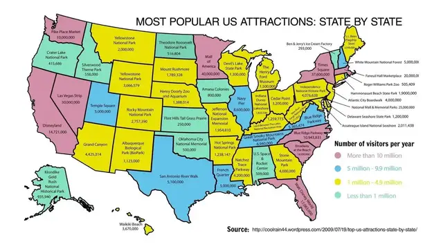
5:04
Moving on to this other map which shows us the most popular attraction in each state
5:09
This is a pretty interesting topic because of the historical background of each of these attractions
5:14
So let me know if you want a full dedicated video on each of them. This map is interesting in two ways too because in addition to showing us the most popular tourist attraction in each state
5:24
it also color codes the states depending on how many visitors those attractions have
5:29
This not only tells us which attractions are most popular, but also which states have the
5:33
most tourism in general as the two are usually related In pink we have states where the main attraction has more than 10 million visitors like Disneyland in California Pike Place Market
5:45
in Washington, the Las Vegas Strip in Nevada, or the Mall in America in Minnesota, which was
5:51
surprising to be honest. Although keep in mind, these are total visitors and not just external
5:56
ones, so states with higher populations might be higher because of that, plus these also change
6:01
every year. Then in blue are those with between 5-10 million yearly visitors like the San Antonio
6:07
Riverwalk in Texas or the French Quarter in Louisiana. In yellow, the most common color
6:13
are those between 1 and 5 like the Yellowstone National Park, the Grand Canyon or Cedar Point
6:18
Finally, in light blue or green are those visited by less than 1 million people a year and most
6:24
likely the least visited states altogether, the Theodore Roosevelt National Park in North Dakota
6:29
the US Space Center in Alabama, or Ben & Jerry's Ice Cream Factory in Vermont
6:35
Something else that is really fascinating to look at is the distribution of national parks across the country and in each state
6:42
and I find it odd that more of them aren't the most popular destination in some states in the previous map
6:48
This map, though, shows us all the main national parks in the US, each signaled by a tree
6:53
This other map in low resolution shows us how much space they effectively take up in terms of area in the country
7:00
Yellowstone, Death Valley, the Everglades, and then those in Alaska seem to be the biggest
7:05
But it's interesting to go back to the first map and see how they are mostly concentrated in the less urbanized
7:11
Western half of the country in total And if you wanted to see them all you need to visit 31 states and two US territories
7:18
American Samoa and the US Virgin Islands altogether there are 429 national park sites in the US although just 63 have
7:27
the actual national park designation in their names. And another territory related
7:32
map is this one which shows us an exaggerated relief map of the country's
7:36
topography. It really shows how different the elevation is in different parts of
7:41
the US. The east is all plain save the medium rise in the Appalachian Mountains
7:46
but as you go west it's so rugged terrain that one really understands why
7:49
some of these states are so empty of people. Pretty much all of the western third of the
7:54
US's continental territory are mountains, save the actual west coast itself. Going back to state comparisons, this map shows the percentage of people in each state
8:03
that owns a passport, from the 60% plus of California, New York, New Jersey, Delaware
8:09
Massachusetts, and Alaska, to the under 20% of Mississippi. There are a lot of correlations
8:15
and causations that we can take away from this. First one immediate one is that states where less people have passports travel less to
8:22
the outside of the US that is objectively true but then we can look at the causes of that In some cases it might have to do with specific states being less prosperous so people just
8:33
can't afford to travel aboard and so don't need a passport, as well as the effects, some
8:37
people say that those who travel more outside the US tend to be more in favor of progressive policies
8:43
I can't say if that is true, but it is an interesting topic to study
8:47
Next religion, this map shows us the greatest religious denominations in each county of the
8:52
US, each color points to a specific religion, the tone of it shows whether or not they are
8:57
a majority or just a plurality which means it's the biggest religious group in that county
9:02
but not over 50%. Surprisingly to me, Catholicism is tremendously prevalent here in purple, southern states
9:09
are mostly Baptist which is still Christian, just a branch of Protestantism, other Protestant
9:14
groups can be found up north in blue like the Lutherans, non-denominational which I believe
9:19
means atheist here are in pink, prevalent in the northeast coast. The other only thing that calls my attention is the grey which represents Mormonism, mostly
9:29
in Utah, but also spreading to some counties in surrounding states. And finally, most of the maps we looked at here are separated by state borders, but what
9:38
if those state borders were different and instead of following mostly arbitrary human-drawn
9:43
lines, they were made taking into account the watershed areas of the country's main
9:48
Well, the contiguous 48 would certainly look very different. Oregon would seemingly lose its coast and Washington would be almost divided in half
9:58
In fact, odd shapes would be common all around like Utah's super strange borders here, common
10:04
to Louisiana and Arkansas as well. California would stay very similar but losing its straight line interior borders, as is
10:11
the case with every single state. Nevada would become super small while other states like Oklahoma would now become gigantic
10:19
Some southern states would extend into Mexico as well, and all the northern ones would stretch into Canada too
10:25
Florida would be much smaller, just consisting of the peninsula, and the east coast entirely would look completely different
10:31
And some states would almost be dislocated, like West Virginia, which essentially moves upward
10:37
The US's state lines are a little questionable right now, with its ridiculous straight lines that don't take any local issues into account
10:44
so while this wouldn't be ideal it would at least have, I believe, a little more logic to it
10:49
So, those are some interesting maps of the United States that teaches key differences between states
10:54
or just between different areas of the country. Did any of them surprise you
10:58
Do you think some of them are outdated or just wrong? Also, which other country's maps should I make a video on next
11:05
Let me know in the comments. Thanks for watching this video, remember to subscribe to catch future ones
11:09
and I will see you next time for more general knowledge
#Autos & Vehicles
#Hobbies & Leisure
#education
#Geographic Reference
#Maps
#Science