Up next in 10

"How to Style a Modern Website (Part One)" is an instructional video that delves into the process of styling contemporary websites using CSS. The video presents a step-by-step tutorial on various aspects of modern web design, including layout structuring, typography selection, color scheme creation, and responsive design implementation. Through clear demonstrations and explanations, viewers are guided through the creation of visually appealing and functional web layouts. This video serves as an invaluable resource for aspiring web designers and developers seeking to enhance their skills in creating modern and visually striking websites.
Show More Show Less View Video Transcript
0:00
Hello everybody, welcome to the first video on how to design a modern website
0:04
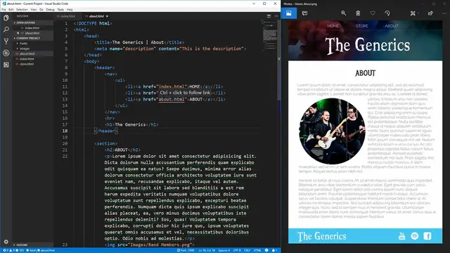
In this video, we're going to be taking the band web pages that we created in the introduction to
0:08
HTML course and style the about page to look exactly as this image on the right here. To give
0:14
you an idea of what we're starting with, over here is going to be our about page that we have
0:19
currently designed with just the HTML and no CSS. Also, as a side note, before watching this video
0:27
if you know nothing about CSS, make sure you watch my learn CSS in 20 minutes video in order
0:32
to get primed on what you'll need to know in order to watch this video and follow along
0:37
Now let's get started into the CSS design for this page. The first thing I want to note is that I've
0:43
added a fonts folder into our project and included the two fonts that we're going to be using to
0:48
style some of our elements. I also, in our images folder, changed our bandmembers.png to be a square
0:54
image so that it'll fit perfectly inside of a circle, and I changed our footer images, the
1:00
Facebook logo, Spotify logo, and YouTube logo to be white instead of black so they're going to show
1:06
up on top of our light blue background that our footer will have. Now that we have that out of
1:10
the way, let's create our CSS file that we're going to be writing all of our code in. We're
1:15
just going to call this styles.css. Then, inside of our about.html page, in the head, let's add in
1:23
a link, give it a rel of stylesheet, and an href of style.css. Now if we save that, nothing over
1:40
here will change because we don't actually have anything loaded into our styles.css
1:44
but to test this, let's just give our HTML a background color
1:48
and we'll make it red. If we save that, perfect, our background changes to red, which means that
1:54
everything in our styles.css is being loaded into our about.html page. Now let's clear that out of the way and get started. The first thing that we're going to
2:05
want to do is we're going to want to style the header portion of our site
2:10
If we go into our about.html page here, we see that in our header we have our navigation
2:14
which is these three buttons at the top here, as well as our header for the generics, which is our
2:19
band name. The very first thing that we're going to do is give our header element a background
2:24
image that is equal to the background image that you see over here. In order to do that, let's
2:29
first give our header a class and we'll just call it main header. In our styles.css, we'll use
2:39
styles.css, we'll use a selector to select that class, and then use the background image property
2:47
to set an image for our background. Now this background image property works very similar to
2:52
the href for an anchor tag. We'll use url and then inside of the url we'll specify where our image
2:59
comes from. In our case, the image comes from our images folder over here, this header background.jpg
3:06
so we'll just put instead of here images slash header background.jpg. If we save that and go back to here, we'll see that our image is going to be behind here
3:19
Right now this doesn't quite look right though. In order to fix that, we're going to use the
3:24
background size property and set this to cover. What this is going to do is it's going to tell
3:30
the background to expand as much as it can until one of the borders is at the very edge of either
3:36
the width or the height, so it'll expand either as wide as it can or as tall as it can until it
3:42
can't get any larger without surpassing the size of the image. So if we save that, you see that our
3:49
image has expanded all the way as wide as it can and as tall as it can, and the last edge to hit
3:55
is the width. This is the full width of our image, and it cut off the top and the bottom of our image
4:00
That's exactly what we want our image to do. This means that if we resize our page
4:05
our image will grow and shrink as needed without us having to add to any extra code
4:12
As you can see in our example photo, the background image has a slightly darker hue to it
4:17
than over here, so in order to do that, we're going to add a second background
4:21
This time we're going to use a background color, and we're going to set it to RGBA, and we'll just use black with a 60% transparency
4:34
Now if we save that, you'll see that nothing actually changed about our background
4:38
This is because by default you can only use either a background color or a background image
4:44
To get around this, we're going to use what's called background blend mode. This is essentially telling the browser how do you want to blend these two different
4:54
backgrounds together, and we're going to use multiply, which is essentially just going to
4:58
combine these two together over top of each other, and as you can see on the right
5:03
we now have a grayish dark color to our background instead of it just being entirely opaque
5:10
Now all we need to do is add a little bit of padding underneath of this lettering down here so that we match the spacing we have over here
5:17
and to do that we can just use padding bottom, and we'll set it to something like 30 pixels
5:22
If we save that, we now have a nice gap on the bottom here. You may also notice that around our background image we have some white spacing between here
5:32
even though in our about.html this is the very first thing in our body. This is because CSS styles are being defaulted onto certain elements such as the html element
5:42
and the body element. If we go into our style sheet and at the very top here just put html
5:48
and body as our two selectors, and we set the margin to zero and the padding to zero
5:55
we save that, we'll see that now those margins and paddings go away on the side here
6:00
but we still have a margin on the top. This is because our ul element also has a default margin
6:06
on the top, so if we go in set our ul element to have a margin of zero as well and save that
6:14
you now see that our background takes up the entire width and goes all the way to the very
6:17
top of our page. Generally though, you don't want to style using elements such as getting
6:23
rid of the margin on all uls, so in our about here we're going to give our nav a class of nav
6:30
to indicate that this is our navigation, and here we use the nav class that we just created
6:37
followed by ul to say that all the uls inside of the nav will now have no margin. If we save that
6:43
this will look exactly as before, but now all of our normal uls will still have a margin
6:49
but the uls inside of a navigation class will not have a margin. Now before we get started on
6:55
styling the nav, we're going to want to use the everything selector to set a few general
7:00
styles that will apply to all the elements in our html. The first one that we're going to want to
7:04
use is box sizing, and we're going to want to set this to border box. What this does is it makes it
7:11
so that the size of our elements are determined by the padding and the margin as well as the actual
7:18
size of the content. So if we had a box and we set the width to be 200 pixels and we set the padding
7:24
to be 20 pixels, without border box the width of that object would be 200 pixels wide plus 20 pixels
7:32
on the right for padding and 20 pixels on the left for padding, making it 240 pixels wide
7:38
With border box though, the width attribute takes into account the padding as well, so if we set a
7:44
width of 200 pixels our element will be exactly 200 pixels wide and the padding will be on the
7:49
inside of those pixels. If that doesn't make any sense, we'll be able to see more examples of this
7:55
as we continue on styling this page. Another attribute that we want to apply to all of our
8:01
elements is going to be our font family. This will be the default font family that we're all of our
8:05
text is going to use. In our case we're going to use the railway font, but since this font is not
8:12
generic font that can be used on websites we need to import this font. In order to do that we're going
8:18
to use google fonts and import it using this url. This url can be found on the google fonts web page
8:24
and you can search for any font on there that you want and then all you have to do is click on that
8:29
font, click the import, and it'll give you this link to copy and paste into your css. Now if we save this
8:35
you'll see all of our font will change to railway. The last thing that I want to apply to all of our
8:40
elements is a default text color. In general black on white is very high contrast and can be tiresome
8:46
on your eyes to read, so I like to use a more subtle text color of 777 here which is just going
8:52
to be a light gray which is much easier on the eyes to read. Now that we have that out of the way
8:57
let's style our navigation element. First let's go to our about.html and remove this hr tag
9:04
This hr tag was only there to add an underline for our navigation but we'll do that in css as
9:10
borders are much easier represented in css. I also want to give our navigation another class
9:16
of main nav. This is because we will have multiple different types of navigations that we want to
9:21
style similarly but we only have one main navigation that's going to be at the top of our
9:26
page. So now if we go back to our styles.css let's style our actual nav class first. We've already
9:34
made it so that the margin is zero so that our nav will no longer have any margins around it
9:39
but we want to maybe make our elements so that they are in line with each other as opposed to
9:44
on separate lines as they are over here. To do this we'll select the nav element and then we'll
9:51
select the li elements under that nav and we will give them a display of inline. This tells us
9:59
that the browser should render all these elements in line with each other as opposed to on separate
10:04
lines which is the default for a list. Next we want to style the actual links themselves that
10:10
are in our navigation element. To do this we want to give them some padding so let's say we'll use
10:16
a padding of 0.5em which will just space out these elements a little bit from each other
10:22
We also want to give them a white text color to match our mock-up that we have of our image and
10:28
then lastly we want to set it to text decoration none which will remove that underline from
10:34
underneath of our elements over here and if we save that we see that our text decoration has
10:40
removed the underline from these elements changed the color to white but our padding has only added
10:45
padding to the left and right and not the top and bottom as padding should do when you give it just
10:50
one number. This is because these are inline elements and inline elements cannot apply padding
10:57
on the top or bottom. What we need to do is we need to change the display to be inline block
11:03
Inline block is very similar to inline except for it allows you to do certain things such as add
11:09
padding and height to elements that inline elements do not allow you to do. So now as you see we have
11:15
padding on the top bottom left and right of all these elements due to the being inline block
11:21
The last thing we want to do is we want to make it so that it is easy to tell which element we're
11:25
hovering over to give the user some feedback. To do this we'll style the a tag again and we'll use
11:32
the hover selector to say when we hover over the element we want to do something and all we want to
11:37
do is change the background color and we'll just use a light grayish color here so we'll use white
11:51
but we'll use transparency of 30 percent so the white will show mostly as gray
11:58
As you can see when we hover over these elements we are now getting a background color that tells
12:02
us hey this is being hovered. This is all the styles that we want to apply to our general
12:07
navigation though. Now we want to move on to our main nav class because this is going to be styles
12:13
that are applied to only the main navigation and not all of our other navigations. The first thing
12:18
that we want to do is we want to make it so the text will be in the center of our screen
12:24
since our navigation should be centered at the very top of the screen. We also want to make
12:28
it so the font size is a little bit bigger so it is easier to read. We'll just use 1.1 em which will
12:33
make it about 10 bigger and then we'll change the font weight to be lighter as opposed to the
12:40
stronger font weight so that way it blends a little bit better into the background. And then lastly we want to add a border bottom to our element to replace that hr that we deleted
12:51
and it'll be one pixel wide completely solid and we'll just use another light gray color here
13:07
and if we save that we now see that we have a border on the bottom and our elements at the
13:12
very top. The last thing that we need to do is space out our elements from each other because
13:17
right now they're very close to each other. To do this we'll use the main nav again and we'll
13:23
select the li elements and we'll just give them a little bit of padding so we'll say padding of
13:28
zero on the top and bottom and five percent on the left and right. There we go now our elements are
13:34
spaced out from each other and as our screen grows the elements stay spaced out from each other and
13:39
as it shrinks they stay spaced out again. The last thing we have to style on our header is going to be
13:46
the actual name of the band here. If we go back to our mock-up over here you see that this is going
13:51
to be much larger and of a completely different font than we have right here by the default
13:57
So to do this let's go back to our about page and let's add a class here and we'll just call it
14:03
band name. We'll also add a second class of band name large because we have two instances where
14:11
our band name will be rendered once in the header where it is very large and a second time in the
14:16
footer where it is a more normal size. This is why we are going to use this band name class to style
14:22
all of the elements that we need to make the band name look good and then this band name large class
14:28
to make the band name in the header larger. Let's first start with the just normal band name class
14:34
In this class we're going to first want to make the text align center
14:40
This will cause it to appear in the center of the screen and then we want to remove all margins
14:46
from this element because h1 elements by default have margin. If we save that it'll get squished a
14:51
little bit closer together and then we want to increase the font size
14:56
and since this is just going to be our normal band name and not the large one
14:59
we're just going to use this font size of 4em and save that. Then we want to change the font family
15:11
This font family is going to be booter 0 0 but if we save that you'll see on my local
15:20
machine this updates to be the correct font that's because I have booter 0 0 installed on my computer
15:27
Normally this will not be the case especially when you upload your website to be hosted somewhere
15:31
else. In order to load this style in we first want to grab our font files here and we want to
15:39
import them using the at font face property. Using the at font face property in here we want to use the font family
15:54
This essentially tells our browser what name do we want to use for this font. We are going to use
15:59
booter 0 0. This is the name that you will set when you set the font family down here
16:09
Then we need the source. This essentially tells the browser where is this font coming from
16:13
This is just like the background image url so we're going to use fonts slash booter 0 0 and
16:21
we'll use the first one here the woff and tell it that this format is woff. Then we want to import
16:31
our other source which is url fonts booter 0 0 waft 2. Let me get rid of these back slashes here
16:44
We'll use the format of woff 2. This tells the browser that we have these two different types of fonts here the booter 0 0 woff
16:57
and booter 0 0 woff 2 and it tells it which format is each one. The reason we have multiple sources
17:04
is because some browsers don't support all types of sources such as woff 2 or just the normal woff
17:09
Now with having multiple sources here the browser will take the very first source and if that one
17:16
works it'll use it and then if that one's not acceptable it'll go down to the second source
17:21
here. Lastly we want to put a font weight which tells us what weight is this font and it is just
17:28
normal and same with font style this is just a normal font not italics or anything so we'll put
17:34
normal here. Now we have that font loaded into our page so we have booter 0 0 that is normal and
17:41
normal style but over here you see that our font is bolded and doesn't quite look the same as our
17:46
mock-up. This is because h1 tags by default bold their font. To get around this we're going to set
17:54
the font weight to be normal and if we save that our font now looks exactly as it does over here
18:02
The last thing we need to do is set the color of the font to be white and if we save that
18:07
this now looks almost exactly the same as our mock-up does over here and that's everything
18:13
that we need to do except for this font is a little bit too small this is why we use that
18:18
band name large class. Inside of the band name large class we're going to set the font size
18:27
and we're going to make it 9em and if we save that that is now going to be much larger
18:32
and it is going to look almost identical to how large it is over here and if you want you can
18:38
play around with this number make it 8em for example and save it and it'll look great either
18:44
way. Now that we have the header completely styled let's move on to styling the section
18:49
content of our web page. Over in the about.html page let's add a class to our section and we're
18:56
just going to call this content section essentially clarifying that this section is just for content
19:03
and we can reuse this on all of our other content sections across our index and our store page
19:09
I also want to give it a class of container which we'll use to specify a maximum size as well as
19:15
some paddings on the outsides of our text so that way it's not quite squished up all the way against
19:20
the edge of the screen. Back in styles.css let's use the .content section
19:27
class that we just created and give it a margin of 1em. This will give us a little bit of spacing on the top left right and bottom of our element
19:37
so that way it distinguishes itself from the previous element. Then we'll use our .container
19:43
class that we just created and in here we'll style a max width which says that the max width of our
19:52
element is going to be 900 pixels wide. This means if our element tries to get any larger than 900
19:57
pixels it'll just stay at 900 pixels. If I save that and increase my screen size you can see
20:04
that this element stops at 900 pixels. But as you saw it was showing up on the left side instead of centered
20:15
To center it we're going to set the margin on top and bottom to 0 and then we are going to use
20:21
auto as the left and right margin. This tells it that the margins on the left and right will be as
20:26
large as they need to be and be exactly the same so that way the text will be always in the center
20:32
And if we bring this all the way over to the side you'll see that we have a large margin on the right
20:36
and left which centers our text on the middle. And then lastly we just want to add a little bit of
20:43
padding back to this container to push it away from the sides so we'll use 0 on the top and bottom
20:49
and 1.5em on the left and right in order to give us a little space so that our text does not run
20:54
right up against the edge of our web page. Next we need to style the actual heading for this element
21:01
We can use another class on our h2 here and we'll just call it section header
21:10
There we go. This is because all of our sections are going to be styled with the same exact header
21:14
so we will use this class again on our home page and our about page. Now on our styles.css
21:22
let's grab that section header class and in here we're going to just use a font family
21:29
and this font family is called metal mania which again is not on the computer by default
21:36
so we have to use another import url from google fonts and this import url like I said before
21:44
you can find by going onto the google fonts web page and searching your font. This is what the
21:49
url is going to be for the metal mania font and if we save that you see that our text changes
21:55
You can also see that we have the same problem where our text is bolded as it was over here
21:59
in the generics so we'll just change the font weight to be normal and now if we save that
22:08
you'll see that our text is no longer bolded but it still doesn't look exactly as we want it to
22:13
and this is because we need to change the color on this to be slightly darker we'll use just 333
22:19
which is about halfway between our light gray and completely black and then we want to center this
22:25
text in the middle of our screen text align center if we save that you'll see that our
22:32
section header is now in the middle of our screen it's the right color but it's slightly too small
22:37
and we'll use the font size property 2.5 em to make it about two and a half times bigger
22:43
save that and there we go our heading is perfect now the next element we need to take care of
22:50
is the image in our about section as you can see on here the image is a circle and it's displayed
22:56
towards the top of our text the text just flows perfectly around the image no matter how large or
23:02
small the image is in order to do this let's first add a class to our image and we'll just call it
23:09
our about band image because this is a class we're only going to be using for our about band
23:18
and then in here select that about band image and now in order to make it so that our text flows around this image what we want to do is
23:28
we want to use the float property and tell it to float left this means that the image will remove
23:34
itself from the flow and float completely to the left side of the document also as you can see our
23:40
image is quite large here so let's give it a height of 200 pixels and a width as well of 200 pixels
23:50
and if we save that you see that our text is flowing perfectly around this but we want it to
23:56
flow from the top so in our about here let's move our image above our p tags and save it and now as
24:03
you can see from the very start of our text it is flowing around the image but our text is right up
24:11
against our image and we don't want this in order to fix this let's give our image 15 pixels of
24:17
margin on all sides in order to push the text away from the image lastly in order to create a circle
24:23
we're going to use the border radius property this property tells us how far we want to curve the
24:29
edges of our border and in our case 50 will make a perfect circle since we curve from 50 all the way
24:38
to the next 50 so if we save that we have a perfect circle with our text flowing around it as we
24:44
expected if we go over here as you can see it doesn't quite look exactly the same because our
24:50
image is not at the very center of our text it's at the very top but it's much easier to style from
24:55
the very top of the text and I personally think it even looks better this way as for the actual
25:01
text of our content we don't need to change anything because in our generic everything
25:06
selector we already set the font family and color to be exactly the same as what is over here
25:12
so the last thing we have left to do is address the footer which we want to use a light blue
25:17
background around with our band name on the left as well as our three elements on the right for our
25:22
buttons to go to YouTube, Spotify, and Facebook. In order to do this we're going to need to supply
25:28
some classes to the footer we're going to use the class of main footer similar to how we used main
25:34
header to specify that this is the main footer on our web page then we are going to use the band name
25:41
class and apply that to our band name and if we save that and go back here you'll see that our
25:49
band name has already updated to be white text and the correct font and font color and font size
25:55
just because we already created that band name style before which is the power of using classes
26:00
since they're so reusable to create many different elements and just copy and paste them along your
26:05
page as you see fit. So now let's go back to our styles.css and style that main footer element
26:12
Our main footer is overall very simple all we need to do is add a background color that's going
26:21
to be that light blue color here which I just copied over and then we're going to make all the
26:26
text in this main footer white so we're going to use a color of white and then lastly we want to
26:32
have a little bit of padding between our elements and the edge of the background so we'll use a
26:36
padding of 0.25 em on the top and bottom and then zero on the left and right and if we save that
26:44
scroll down you see that we now have that light blue background as well as all of our text is
26:48
white but we have the problem of our footer being stacked vertically when we want it to be stacked
26:55
horizontally. In order to fix this problem we're going to go back to our about.html
27:01
and we're going to use a second div element in here with the class of container and main footer container
27:14
that will wrap all the content inside of our footer. There we go and now in our styles.css we'll make the main footer container
27:29
The purpose of this main footer container is to wrap our elements in a display flex element
27:37
A flex display or also known as flexbox is a very complex layout element that you can use in CSS
27:45
but we're only going to skim over the top of it because in this video we don't have the time to
27:50
cover the full complexities of flexbox but in the future I will make a video covering flexbox in
27:56
depth. If we scroll down here we see that already our elements have lined up next to each other on
28:01
the left and the right which is great but we want our right side element to take up as much space
28:07
as possible while our left side element should be as small as possible. In order to do this we'll
28:13
make it so that main footer container the ul inside of it which is our navigation on the right here
28:20
we want it to grow to take up as much space as possible so we'll use flex grow and give it a
28:26
value of one to tell it to grow. Then we also want to align our text in that element to the end of
28:32
the element so we'll use text align end to tell our text to be on the right side instead of the
28:38
left side. We also want it so that our youtube spotify and facebook links will be centered
28:44
with this band logo on the left here. To do this we'll use the align items property
28:51
and set it to center to say to center everything vertically inside of this flexbox
28:57
Next all we need to do is style our navigation which we've already created a class for so on
29:03
our ul we'll add a class of nav as well as footer nav so that we can use specific stylings for our
29:11
footer and save that. As you can see it has already changed so that we have the background
29:16
hover and the elements have lost their period on the left side denoting that it's a list item
29:22
Now all we need to do in here is change our footer nav li so that we have a different set
29:28
of padding around these elements we'll use a padding of zero on the top and bottom and 0.5 em
29:34
on the left and right to give these elements a little bit of space around each other. Next we're
29:39
going to make it so the images are going to be quite a bit smaller than they are right now
29:43
since they're a bit oversized so we'll use the footer nav select all the images give them a
29:49
width of 30 pixels and a height of 30 pixels and if we save that we see that now everything is
29:57
center aligned together inside of the footer our images are smaller they have the hover element
30:02
which is the same from this navigation up here and they also allow us to click them and go to
30:07
their links. The great thing about this web page is that it's also responsive on different sizes
30:14
so if we increase the size of our page you see that everything flows great around each other
30:19
without breaking everything's working everything looks great whether it's full size or small
30:26
it doesn't matter it'll work flawlessly. This web page is though not designed specifically
30:33
with mobile sizing in mind so it doesn't look as good on a small screen size as it does on a
30:38
slightly larger screen size but either way it looks great no matter which size the browser is at
30:45
and that is all there is to creating the about band page for this website. We have all the stylings so
30:50
that our page looks almost exactly the same as the mock-up that we had before and it is even scalable
30:56
to different browser sizes and looks good on all those different sizes. The best part about this
31:02
is since that we used very generic named classes such as container, band name, and nav we're able to
31:09
apply these classes to the rest of our pages such as the home page here and the store page here in
31:14
order to get a head start without having to restyle the elements such as this navigation
31:20
and the footer every single time. If you guys want to follow along with this project and use the exact
31:26
same code that I have to style this about page here all this code is going to be available on
31:30
my github which will be linked in the description below. From there you can get these font files that
31:35
I'm using as well as the different logos and background images that I'm using and even the
31:40
actual code for this video is available on my github. If you guys enjoyed the video please leave
31:46
a like and subscribe and let me know down below how your styling of the about page for your band
31:51
website goes after watching this video. Thank you guys very much for watching
#Online Goodies
#Skins, Themes & Wallpapers