0:00
These are the top 10 dumbest redesigns
0:02
of all time. Number 10 is the Minecraft
0:04
movie. Even though I enjoyed the movie a
0:06
bit, I'm still not a fan of the designs
0:08
for most of the mobs. They look so
0:10
creepy to look at. Number nine is
0:12
Barney. Even though I'm not a fan of the
0:14
Barney franchise in general, I still
0:16
acknowledge these designs looking so
0:18
much worse than the original. The eyes
0:20
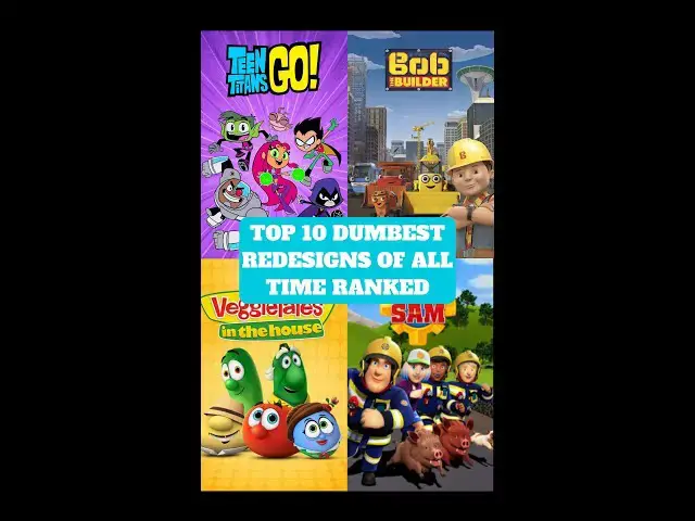
especially look creepy. Number eight is
0:22
Teen Titans. These guys look so much
0:24
more like seven-year-olds than actual
0:26
teenagers, not to mention them looking
0:28
like paper cutouts. Cyborg is also
0:30
missing the blue on his shoulder pads.
0:32
Number seven is My Little Pony, which is
0:34
basically the Teen Titans Go of this
0:36
show of them being all cutesy and
0:37
unappealing to look at. It's also them
0:39
just trying to milk the remainder of G4
0:42
before starting G5. That also turned out
0:44
as a complete disaster on its own,
0:45
honestly. Number six is Veggie Tales. It
0:48
looks like they were trying so hard to
0:50
go for that anime style, but it failed
0:52
miserably and they just looked terrible.
0:54
But thank god they got the original
0:56
designs back in the Veggie Tales show in
0:58
2019 with much better animation. Also,
1:01
side note, they were originally going to
1:02
make a liveaction Veggie Tales movie in
1:04
2019, and it was actually going to be
1:06
produced by Michael Bay until it got
1:08
cancelled in favor of the new show in
1:10
that same year. And it's for the best
1:12
because these designs look even more
1:13
worse than the ones in the Netflix era.
1:15
They look straight out of something from
1:17
Annoying Orange. Number five. I know
1:20
they fixed it, which is why it's not
1:21
higher, but Sonic's redesign is such a
1:23
nightmare to look at. Number four is
1:25
Thomas the Tank Engine. Because while
1:27
these designs are way too cartoony and
1:29
unlike the original, at least they tried
1:31
to make them look somewhat cute and
1:33
appealing in the show to the point that
1:34
if this was 3D, then it would have
1:36
looked so much worse. For the top three,
1:38
hit that follow button real quick.
1:41
Number three is the backyards. Not only
1:43
do these just look so much like Coco
1:45
Melon ripoffs, they also look so AI
1:47
generated. Number two is Bob the
1:49
Builder. Words cannot describe how
1:51
egregiously bad these designs are. I
1:54
have not seen a single movie or TV show
1:56
reviewer that reviewed the original Bob
1:57
the Builder review the reboot on Deviant
2:00
Art. And again, it's for the best
2:02
because not only is the reboot a
2:03
disaster, it looks like an excessively
2:05
realistic and downright creepy looking
2:07
disaster. But my number one 100% goes to
2:10
the Jupiter redesign from season 15 of
2:12
Fireman Sam. I'm skipping the firemen
2:15
Sam designs because while they look very
2:17
realistic, there isn't that much of a
2:18
difference apart from Sam and Dillis.
2:20
But man, I absolutely despise this
2:23
Jupiter redesign so much with a fiery
2:25
passion. How did you go from a fire
2:27
truck to a literal bus looking thing?